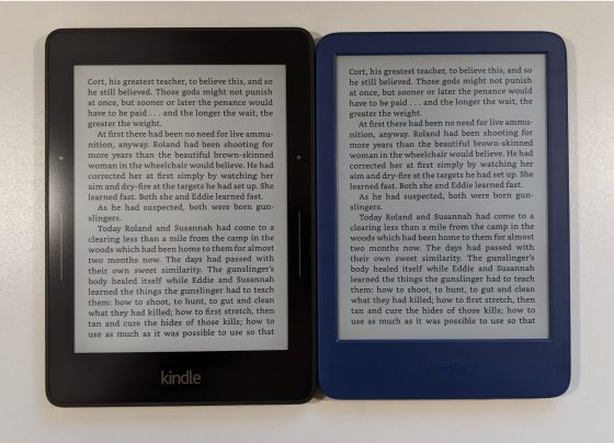
With the release of the new Kindle for 2022, Amazon finally increased the screen resolution to 300 ppi after 15 years of only offering 167 ppi screens on entry-level Kindles.
It’s nice to see the basic Kindle finally get a good quality screen; it’s a noticeable improvement over the previous generation Kindle. It still lacks the warm frontlight option found on other more expensive Kindles, but the screen itself is on par with similar 300 ppi ereaders. I was eager to see how the screen stacks up with other Kindles so here’s a quick screen comparison review.
New Kindle vs Kindle Voyage
The Kindle Voyage is known for having the best screen of any Kindle ever released. There’s something about front glass layer that doesn’t degrade the clarity of the E Ink screen. It doesn’t have a great frontlight but the screen is superb, with darker blacks and sharper text than any other E Ink device I’ve ever seen. For some reason even newer Carta 1200 screens can’t beat it.
Some were hoping the new Kindle would be able to match the Kindle Voyage’s screen since it doesn’t have an added layer over the top. But after comparing the two side-by-side, it’s clearly obvious the Voyage still has darker blacks. The new Kindle is close, but the Voyage’s screen still has slightly better contrast. However, the new Kindle’s screen refreshes better so there’s less ghosting, and it’s also noticeably faster to turn pages and refresh the text on the screen, and it also offers Dark Mode, which the Voyage lacks.
New Kindle vs Kindle Paperwhite
My guess is the new Kindle uses the same screen panel as the Kindle Paperwhite 3 and 4, but without the added plastic front layer it looks better than the Paperwhite 4. To my eyes it looks closest to the Paperwhite 3’s screen.
When compared to the latest Kindle Paperwhite, the text appears to be a bit darker on the Paperwhite’s screen. I get the same impression when comparing it to the new Kobo Clara 2E. My conclusion is the new Kindle uses a 300 ppi E Ink Carta screen, but not the newer Carta 1200 screens that have slightly darker blacks. To my eyes the Paperwhite 5’s screen does look better even with the added plastic layer over the top. However, the Paperwhite does show more glare with the added layer.
New Kindle Screen Comparison Video
I think this is the last “screen comparison” video I’m going to do because the differences with E Ink screens are so subtle it’s hard to see in videos and pictures; it’s really something you need to see in person to get a feel for—and sometimes one screen will look better under bright light and another will look better in lower light, and the frontlights can affect the perceived contrast too (that’s why I’m only comparing the screens in this video and not the frontlights).


Leave a Reply