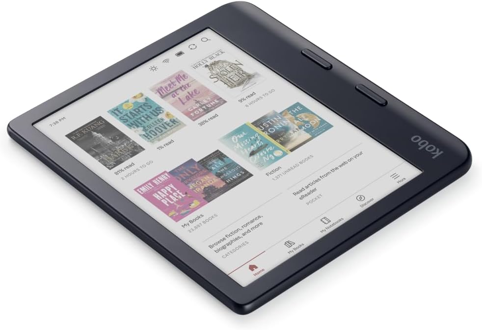
With devices like the Kindle Colorsoft and Kobo Libra Colour getting released last year, color E Ink has started to become more mainstream. A few years ago color E Ink was something that many people scoffed at, but now there are dozens of ereaders and eNotes available with color E Ink screens.
One thing that I find interesting about color E Ink is the fact that it seems like the more you use a device with a color E Ink screen the more you get used to it. It’s like passing through different levels of acceptance.
I think the transition is harder at first if you’re coming from an ereader with a regular black and white E Ink screen, and if you keep comparing it to a color screen you might never get passed it. But some people do and end up preferring color E Ink, while other people just can’t get used to it.
Most people don’t know that color E Ink screens are really just regular black and white E Ink screens that have a color filter layer applied over the top (you can see the color film toward the end of this Kindle Colorsoft teardown video). From a technical standpoint it’s pretty cool how they’re able to add color to a BW screen, but it does come with some obvious drawbacks.
Most notably, the color layer lets less ambient light through and it adds a grid over the display that you can see if you look closely, which gives the screen a darker and slightly fuzzier appearance. You can turn up the frontlight to help mitigate this, and using dark mode helps make the grid less visible, but some people just can’t get used to the look of color E Ink screens.
Other people don’t mind the darker screen. They just turn up the frontlight and don’t even notice it. They’d rather have covers and images and highlights in color than a slightly brighter screen with slightly better contrast.
I use ereaders and eNotes with color E Ink screens for a few weeks while reviewing them, and while I notice myself getting used to color E Ink the more I use it, none of them have turned into my full-time ereader. I always end up back to using devices with black and white screens.
It always feels a little disappointing going back to a BW ereader where everything is rendered in grayscale like an old 1950’s TV after getting used to color covers and color images, but I mostly just read regular ebooks that don’t benefit from color most of the time anyway.
I think if I didn’t have any other ereaders sitting around I could probably get used to color E Ink. The Kobo Libra Colour is sitting on my desk right now and the screen looks fine and the text is easily readable with the frontlight at 30%. And yet, as I look closer and start to read, something just seems a little off. The problem is I’m too used to reading on regular black and white E Ink screens, where the text stands out a bit more, and there’s a slightly clearer quality without the color filter layer.
What about you? Have you gotten used to color E Ink screens?
It surprises me how much I’ve gotten accustomed to the Colorsoft. I own a 2021 Paperwhite, Colorsoft, and Scribe 2. The visual difference between the 2021 Paperwhite and Colorsoft is minimal at best, to my eyes. Your mileage may vary. However, I clearly notice the sharper text on the Scribe. The Scribe is too large to travel, but even at home, the Colorsoft remains my main Kindle. I so rarely use the Paperwhite, I don’t even know why I still have it. A back up? Potential trade-in for the future?
I think the Colorsoft is my main because even before color e-ink screens were becoming mainstream, I disliked the boring black-and-white covers compared to the vibrant covers on the Kindle app on my tablet and phone. Reading on either of them is nowhere near as pleasant as my Kindle.
If a Colorsoft Gen 2 ever comes out, I’ll probably trade it in for a bigger screen or, by some miracle, if the color technology improves. The 2024 Paperwhite was not a big enough upgrade to make me trade in my 2021 model.
I don’t have a color eink device and won’t be getting one until their screens are as good as those of the black and white ones. I don’t need or want color – almost everything I read on my eink readers is black and white. I don’t want to read on a device with a darker screen where I’d have to turn the light higher up. So I’m going to wait. The technology is not yet good enough for me.
I bought the Colorsoft to use for art books/tutorials on-the-go. I prefer most of these type books in hard copy for use at home, but if I’m going out for a short time, I’d like them along; I havee an iPad mini, but really hate it.
Oddly, one art book I have, a tutorial, doesn’t allow me to adjust the font. I go into the font tab at the top of a page, but once into that 2nd screen the choice for a new size isn’t there.
That’s never happened before. I’ve also checked with other art books in my library, and I can change the font in them. Additionally, I checked in the first book on my B/W paperwhite, and there, too, isn’t a choice for changing the size.
I tried it and this is dependent on type of content.
For colored content like comics, I thought its ok but it’s so much better on an active display for most content.
Most books I read are all b/w and then the display is just average and lacks the crispness of b/w. Which is the main reason for me to love reading on e-ink over a smartphone. And with a lot of frontlight it loses that paper like crispness.
Last for pdf, it can be good but sluggish to navigate so again a compromise. Maybe if they can introduce the sharpness in color e-ink I’d consider it again.
It took me an hour to get used to my colour e-reader. For a year I used it almost exclusively. Now I use it interchangeably with my monochrome e-readers. It’s just another one, with different characteristics. Personally, I use it to give colour to certain elements of the text of the novels I read: headers and footers, chapter titles, notes and quotations, mainly. I find colour very pleasant when applied to novels.
I don’t have a “need” for a color e-reader, but I can see how it would be useful for comics or other books with pictures or photos—heck, for textbooks, too. Although I guess I’d just use my iPad or iPad Mini if I wanted to see colored images.
After I got my refurbished Oasis a year or two ago, it’s become my main reading device when I’m holding a Kindle. One of my Signature PW Kindles is in my bedroom with the stand and page-turner. The other one is in a drawer. I don’t care for the touchscreen experience with turning pages because it takes me out of the reading zone. All of my current Kindles have excellent screens with crisp fonts. (I was totally surprised when the Oasis arrived and the screen was amazing.)
I know many feel the way you do about page turning, but I prefer it. I read in bed all night, usually on my right side, and hold my kindle in my right hand. My kindle sits mostly in the Vee between my thumb and forefinger, and I “swipe” with my right thumb. It’s an automatic process for me.
No. I tried the Kobo Libra Colour and didn’t like it. Yes, it’s a nice touch to see the book covers in colors, but the screen is to dark and the screen door effect is there. Once you see it, it’s hard to unsee it. I prefer the Clara B&W. Not only for its screen, but also for being a bit smaller, and lighter. I’ve put a popsocket on the back, and it’s the perfect ereader for me. I added the Nickel Clock and a great dictionary with etymology https://github.com/BoboTiG/ebook-reader-dict.
Personally I don’t have a problem with the lower color resolution, I don’t even mind the screen door effect either, but the significantly lower contrast compared to a BW screen is a deal breaker.
I need a device to read books with the best possible readability. Color screens fail to deliver that.
Maybe my eyes are getting older but I don’t really notice the difference between the Paperwhite and the Colorsoft in terms of sharpness or contrast. But I’m pretty platform agnostic in general; I’m equally comfortable on a phone or tablet indoors. I do enjoy the color highlighting available on the Colorsoft. That plus the covers makes me prefer it to the Paperwhite overall. I wouldn’t mind pen capabilities for the next generation.
I don’t think I’ll be getting a color ereader anytime soon. Not because of the usual complaints you hear though. Its price. For now since it’s so new and treated as niche even though everyone has come out now with a color ereader it’s still more expensive than the entry model b/w one. Once the price goes down maybe.
The Kobo Clara Colour is only $20 more than the BW model. I think that’s pretty reasonable.
I’ve gotten used to a Kaleido 3 screen because I read with the frontlight on all the time, then I’ll pull out my Go 10.3 and marvel at the sharpness and contrast.
I’ve got Kobo Clara Color, at some point decided to have in my bag Clara Color and Clara 2E and just switch randomly between devices. Long story short, no issues with darker Color screen since in most cases I had to turn on the backlight on both devices and in this case the picture quality differences starting to become negligible. AND I LOVE my color book covers. After all the navigation is more intuitive with color book covers, finding something you need is quicker that way.
PS: regretting that I was on the fence about color display and bought Clara Color instead of Libra Color.