This post will explain how to add different fonts to any Sony Reader and how to override the CSS file in a DRM-free ebook to display those fonts. For DRM encrypted ebooks you have to strip the DRM for this method to work.
It only takes a few minutes to get this up and going if you already have Calibre installed on your computer. If not, you’ll need to start with this post: getting started with Calibre.
This Sony font hack comes via this PDF from the good folks at the MobileRead forums. Download the PDF if you’re having trouble getting this to work or want more detailed instructions. I wanted this post to be as simple as possible so I removed some of the technical stuff that may be needed in some circumstances, such as defining specific tags. But in most cases the method below works just fine.
Step #1: Adding Fonts to the Sony Reader
First things first, you need add some fonts to the Sony Reader.
- Plug the Sony Reader into your computer with the USB cable.
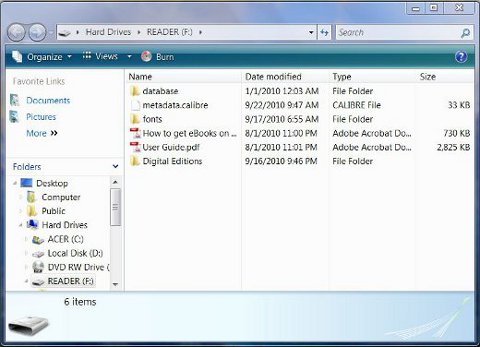
- Open the “Reader” drive if it doesn’t automatically open. This will show the root folder for the Sony Reader. There should be a few other folders like database and Digital Editions already present.
- Create a new folder and name it fonts, all in lower case letters.
- Open your computer’s search bar and type in fonts. This should quickly bring up your computer’s font folder. On PCs it’s located at Hard Drives > (C:) > Windows > fonts.
- Add whatever fonts you want from your computer’s font folder to the one you just created on the Sony by dragging and dropping them or by copying and pasting. You can preview the fonts by double clicking on them. And you can download more from the internet.
- That’s it. Now it’s time for some experimenting.
Step #2: Override an eBook’s CSS File with Calibre
- Open Calibre and add the ebooks you want to change fonts. You might want to download a few public domain titles from Feedbooks or somewhere else for testing to see which font you like best.
- Select an ebook and click “convert”.
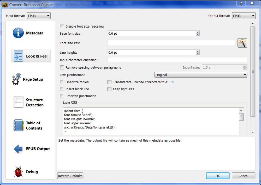
- Click the “Look and Feel” tab as shown above and then copy the CSS template code below and paste it into the “Extra CSS” box.
@font-face {

font-family: "Arial";

font-weight: normal;

font-style: normal;

src: url(res:///Data/fonts/arial.ttf);

}
@font-face {

font-family: "Arial";

font-weight: bold;

font-style: normal;

src: url(res:///Data/fonts/arialbd.ttf);

 }
@font-face {

font-family: "Arial";

font-weight: normal;

font-style: italic;

src: url(res:///Data/fonts/ariali.ttf);

}
@font-face {

font-family: "Arial";

font-weight: bold;

font-style: italic;

src: url(res:///Data/fonts/arialbi.ttf);

}
body, div, p {

font-family: "Arial";

}
- Important: This is just a template so you need to change all the “Arial” tags to whatever font family that you choose. And then you need to change the file name for the specific font in the “src” part. All you have to do is change the file name at the end. Like this: src: url(res:///Data/fonts/file name here). To do this, open the fonts folder on the Sony Reader and copy the font names for each bold, italic, etc. and make sure it has the extension at the end (.ttf or .otf).
- Click convert, wait for it to finish, then click send to device, and enjoy.
Update: For the Sony PRS-T1, you need to use a different file path instead of the one shown above. Here is an example:
@font-face {

font-family: "Arial";

font-weight: normal;

font-style: normal;

src: url(res:///ebook/fonts/../../mnt/sdcard/fonts/arial.ttf);

}
More information about the Sony PRS-T1 and fonts can be found on the How to Add New Fonts on Sony PRS-T1 post. The PRS-T1 has some built-in fonts you can use as well.
Examples
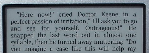
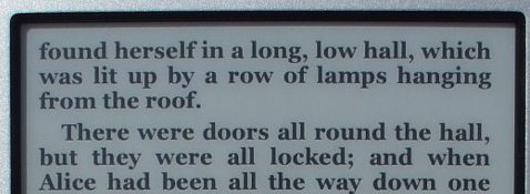
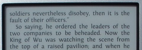
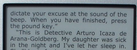
You can also use Calibre’s look and feel section to modify font size, line-spacing, etc. I found that setting the default font size to 10 makes the font on the PRS-350 just the right size with the medium setting, as shown in the pictures below.


Thank you!
Now I just have to figure out the DRM part.
I’m going to do a post for that too, but it’s a convoluted mess in more ways than one, so it might be a couple of weeks before I get around to it. Got a lot of reviews to work on this week and next.
Great.
I`ll be watching for it.
Great stuff! Thanks for this.
One thing to note. At first this didn’t seem to work. I then realised that when cutting and pasting the CSS from Firefox into Calibre, the quotes are not recognised. I had to re-type them and then all was fine. I’ve had this before when cutting and pasting quotes chars from web pages.
Thanks for pointing that out, Neill. I went ahead and added code brackets so that shouldn’t be a problem anymore. Apparently WordPress automatically turns regular quotes into these slanted ones ” ” that don’t work for CSS and HTML editing. Bah!
Hi i tried this and the font comes up in all capitals. I was wondering if i can change it.
That’s odd . . . What type of font are you using?
i had a nook and I liked the amasis font. so i bought the amasis medium font. i wasn’t sure if maybe it was the font.
i also wasn’t sure what to put in under family name.
Amasis is the family name. Perhaps it happens to be in all caps? You can usually click on the font file to see a preview.
Be careful about buying fonts. There are a lot of websites that have a wide variety of free fonts.
hi i figured out what happened. it was the font and actually it wasn’t the amasis font. it was another one i had already applied and i think since i kept reusing that epub it never took the amasis font.
other than my own mistake, thanks for the guide. it made it very easy to change the font.
I bought a second reader for a family member, and she is using another computer (not mine).
For some reason on her computer Calibre requires that text about fonts be entered in Extra CSS window each time a new book is being converted. I do it by Copy & Paste from previous book.
On my computer this information was entered once and it is there since.
It is probably something with the settings, but I cannot figure what. Any idea as to how make text in Extra CSS to be there for all new books automatically?
Thanks.
Thanks, Anna. I’m glad you brought that up. I always copy and pasted from a previous book, not knowing there was a way to set the code in the Extra CSS box by default as you mention. But I did some checking and you can set the code to show up for all books and new ebooks.
Just open Calibre, click on the “Preferences” icon, then on “Common Options”, and then add the code to the Extra CSS box and define the other settings as you wish, and hit apply.
Thaks, Natan.
It worked!
Anna
Great advice, but…………
The charm of e-Books is that readers can choose their own font-size, font-type, page layout, etc.
Writers and publishers can, of course, choose to set a certain layout for their books, but in general you must give users the freedom of “creating” their own reading experience.
So in this case it means that Sony should expand their reading app. and add the possibility of choosing different font-types, just like the iBooks app does on the iPad and iPhone.
True. But until a next generation Sony reader allows to choose a font, I’m extremely happy with the mentioned Calibre tweak.
Especially Georgia looks so much better than that lame built-in Sony font…
If you have vista or above, you’ll have the new cleartype-optimized fonts from Microsoft. I haven’t tested it myself, but I imagine Cambria would work quite nicely on an e-reader 🙂
If you don’t have vista or above, you can download the fonts for free and for legal by installing the powerpoint viewer.
For anyone who likes good typography, make sure you select the Smarten Punctuation option in Look and Feel. It gives decent typographic quote marks and apostrophes. And I agree that 10pt is a good setting for the M view. Just with these two changes I am so much happier looking at my screen of my 650. I can now settle down to read. Personally I don’t have a problem with the default font, but then I find most fonts things of beauty.
Sony: the S is too small,the M too big.(If you’re listening) And non-typographic marks are ugly.
Wow, all this is quite helpful. I’d just like to thank the site’s creator and the contributors here.
This is a great tutorial. But the default question is not clearly answered. I do not want to “convert” any of my public domain PDFs. I want a new ereader system default font for all non-DRM PDFs. Looking at Nathan’s post from 10/12/2010, 12:05 PM I see this:
[ Just open Calibre, click on the “Preferences” icon, then on “Common Options”, and then add the code to the Extra CSS box and define the other settings as you wish, and hit apply. ]
1) Can someone confirm. Is this *all I need to do* set a default font change? Just make the CSS change once, in “Common Options”?
2) Could I also just reference the ereader’s internal sans font in the CSS rather than install a new font?
Hi, thanks for the hint. There is only one problem in epub/Sony. If I embed the normal, italic and bold fonts (eg of Calibri) it works fine. If the fonts are in Sonys /fonts the italic and bold fonts doesn’t work. All other normal fonts in my FONTTEST.epub are OK.
@font-face {
font-family: Calibri;
font-weight: normal;
font-style: normal;
src: url(res:///Data/fonts/calibri_n.ttf);
}
@font-face {
font-family: Calibri;
font-weight: normal;
font-style: italic;
src: url(res:///Data/fonts/calibri_i.ttf);
}
@font-face {
font-family: Calibri;
font-weight: bold;
font-style: normal;
src: url(res:///Data/fonts/calibri_b.ttf);
}
Hey Dietmar,
I think the problem is in your font names.
You need to have the actual file names, which:
– for bold is calibrib.ttf (so without the underscore)
– for italic is calibrii.ttf (same)
– for normal is just calibri
That said, that is on my computer…
Thank you very much. I have been using Sigil to make my own epub books and with each book I had to include fonts. I am getting annoyed but the tedious work of adding huge font files (Chinese, Hebrew, etc) into each small HTML text. And I googled to this page. This trick will saves me lots of time, I will only need to include a style sheet (made once for all) and very little editing now. Hats off and thanks.
I love the Sony PRS-x50, but the lightweight default font is horrible. I have to use a book light in dim(ish) light, and in the same conditions I can read the Kindle perfectly well. So,thanks for this simplified guide. My font-altering conversion attempts have been unsuccessful, unfortunately.
I added a few fonts to the Sony, in a newly created ‘fonts’ folder. I copied and pasted your Extra CSS into both the ‘Extra CSS’ section of the individual conversion box, and when that was unsuccessful, into the ‘Extra CSS’ of Preferences in Calibre. I changed every instance of Arial to Calibri, Garamond, and Gil Sans, each in turn, using the file names as they appear in the Sony. I used .ttf for the file extension on Calibri and Garamond. The new conversions looked exactly the same as old versions of the (differently named) ebooks when viewed on the ereader. I even tried Arial, so that I could use your CSS exactly as written. Obviously I am doing something wrong. Can anyone help?
I’m curious….pasting and altering the the Extra CSS code worked for me fine on my ‘test’ conversion, but is there not a place somewhere in Calibre I can save the Extra CSS code so I can remove it if I don’t want to change a font, and hence, replace it when I do want to use it.
I suppose I could save it intact anywhere outside of Calibre and import it when I want it, but how about in Calibre?
@Kerry, as Nathan suggests in the comments above, add it to Extra Preferences:
“Just open Calibre, click on the “Preferences” icon, then on “Common Options”, and then add the code to the Extra CSS box and define the other settings as you wish, and hit apply.”
Then when you convert a book, in the individual preferences, you can delete the Extra CSS if you don’t want it.
I’m late to the party here, but in trying to change the fonts on my Sony 300 has anyone tried it using a Mac? I found the fonts, created the font folder in the Sony’s root folder. Kthink I’ve followed all the steps because I see the new font (Helvetica Neue) when I open the book using Calibre, but when I move it over to the Sony the font doesn’t change. Maybe the Sony doesn’t recognize Mac fonts?
The fonts need to be .ttf or .otf to work.
I have successfully “installed” my desired font on my reader (Sony PRS-600). Everything is fine except for the book title (in Vietnamese). It’s got some strange symbols (mostly boxes) in it. May I ask if anybody here knows what the default (system) font for book title on Sony PRS-600? How can I change that font to read book titles properly in Vietnamese? Ideas and hints would be very much appreciated.
Does this guide still work with the latest (14080) version of the firmware?
Indeed it does.
I tried the instructions here in your post, and everything worked! Thank you for this very informative and useful post. It has helped a lot. I’m looking forward to more posts like this in the future. 🙂
Now all I need is a Sony 😉
Hi,
Could you plz tell me, does it work for PRS-650 buy from Japan?
Thank you very much!
Thanks so much for this tutorial. Been jealous of the Kindle’s Caecilia font for some time now and just put it on my PRS-350. Although, the font family I got from fontpark.net included heavy and light versions in addition to normal and bold. I found that including these in the css would default to either heavy or light fonts, so I removed them and it worked perfectly. Thanks again.
I~m new to the Sony eReader and appreciate these tips. One of the first things I started researching after getting my reader was whether font style could be changed. Question–can I change the font on books purchased through the Sony bookstore. If so, how do I get the book from Reader Library to Calibri. (question marks not working today)
Hi
Your instruction is so much easier to follow than the PDF. Much thanks!
I tried and and tried with PRS-T1 of mine.
It seems to me I can change line space and margin but not the font!!
I’m wondering what I’m doing wrong… I made a folder “fonts” in my case, M:\ and followed the direction step by step.
I’m wondering if you could kindly show me my mistake…
—————
@font-face {
font-family: “CaeciliaLTStd”;
font-weight: normal;
font-style: normal;
src: url(res:///Data/fonts/CaeciliaLTStd-Bold.ttf);
}
@font-face {
font-family: “CaeciliaLTStd”;
font-weight: bold;
font-style: normal;
src: url(res:///Data/fonts/CaeciliaLTStd-Heavy.ttf);
}
@font-face {
font-family: “CaeciliaLTStd”;
font-weight: normal;
font-style: italic;
src: url(res:///Data/fonts/CaeciliaLTStd-BoldItalic.ttf);
}
@font-face {
font-family: “CaeciliaLTStd”;
font-weight: bold;
font-style: italic;
src: url(res:///Data/fonts/CaeciliaLTStd-HeavyItalic.ttf);
}
body {
font-family: “CaeciliaLTStd”;
The Sony PRS-T1 uses a different file path. I don’t remember it off the top of my head. There is a thread about it somewhere at MobileRead. I’ll try to find it and update.
Nathan, thank you so much for the tip!
maybe this one????
———————————–
Genius!!! I think internal flash just means standard internal memory. Create a directory called /fonts in the int.mem root directory, i.e. in the same dir which also contains /Books /DCIM and /Sony_Reader. Then copy any fonts you like in there. Then you can reference them in your epub css something like…
Customise serif to Arno Pro
@font-face { font-family: serif; font-weight: normal; font-style: normal; src: url(res:///ebook/fonts/../../mnt/sdcard/fonts/ArnoPro.ttf);}
@font-face { font-family: serif; font-weight: normal; font-style: italic; src: url(res:///ebook/fonts/../../mnt/sdcard/fonts/ArnoPro-Italic.ttf);}
@font-face { font-family: serif; font-weight: bold; font-style: normal; src: url(res:///ebook/fonts/../../mnt/sdcard/fonts/ArnoPro-Bold.ttf);}
@font-face { font-family: serif; font-weight: bold; font-style: italic; src: url(res:///ebook/fonts/../../mnt/sdcard/fonts/ArnoPro-BoldItalic.ttf);}
Customise sans-serif to Fontin:
@font-face {font-family: sans-serif; font-weight: normal; font-style: normal; src: url(res:///ebook/fonts/../../mnt/sdcard/fonts/Fontin_Sans_R_45b.otf);}
@font-face {font-family: sans-serif; font-weight: normal; font-style: italic; src: url(res:///ebook/fonts/../../mnt/sdcard/fonts/Fontin_Sans_I_45b.otf);}
@font-face {font-family: sans-serif; font-weight: bold; font-style: normal; src: url(res:///ebook/fonts/../../mnt/sdcard/fonts/Fontin_Sans_B_45b.otf);}
@font-face {font-family: sans-serif; font-weight: bold; font-style: italic; src: url(res:///ebook/fonts/../../mnt/sdcard/fonts/Fontin_Sans_BI_45b.otf);}
Customise monospace to Dark Courier:
@font-face {font-family: monospace; font-weight: normal; font-style: normal; src: url(res:///ebook/fonts/../../mnt/sdcard/fonts/DarkCourier.ttf);}
@font-face {font-family: monospace; font-weight: normal; font-style: italic; src: url(res:///ebook/fonts/../../mnt/sdcard/fonts/DarkCourierI.ttf);}
@font-face {font-family: monospace; font-weight: bold; font-style: normal; src: url(res:///ebook/fonts/../../mnt/sdcard/fonts/DarkCourierB.ttf);}
@font-face {font-family: monospace; font-weight: bold; font-style: italic; src: url(res:///ebook/fonts/../../mnt/sdcard/fonts/DarkCourierBI.ttf);}
All bold and italics now working with any old ttf/otf font family.
That looks about right. Have you tried it?
Hi Nathan
Yes, I finally get around and tried.
It works!
Thank you so much for the tips and a great easy explanation.
Awesome. Good to hear it works. I’ll do a post to mention the new code with the PRS-T1.
USB does not have entry for “Reader” only. all there is is “Reader Installer”. Help??
I try with 650 and Calibre don’t modify article with modify in in preference // comon options . but if I convert individual or colective it’s work! Not the titles from tables of contents. But I don;t care the title 🙂
I try it with font comfortaa .. u can download from google // he din’t transform caracter like in romanian language but is more better now! I can read article without dificult.
@font-face {
font-family: “Comfortaa_Regular”;
font-weight: normal;
font-style: normal;
src: url(res:///ebook/fonts/../../mnt/sdcard/fonts/Comfortaa_Regular.ttf);
}
@font-face {
font-family: “Comfortaa_Bold”;
font-weight: bold;
font-style: normal;
src: url(res:///ebook/fonts/../../mnt/sdcard/fonts/Comfortaa_Bold.ttf);
}
@font-face {
font-family: “Comfortaa_Thin”;
font-weight: normal;
font-style: italic;
src: url(res:///ebook/fonts/../../mnt/sdcard/fonts/CComfortaa_Thin.ttf);
}
Thx for this article.
Question- I don’t know much about this stuff and just got a PRS-T1. I’ve converted some books from lit to epub via Calibre and have other epub books without DRM. I’ve noticed that for some books I can change the font with the ereader and for others I cannot. Is there an easy way (using Calibre) to force the epub book to allow using the built in ereader fonts. Can I easily strip or change one line of CSS code versus loading in all new fonts? Th built-in fonts are fine for me and I don’t need to go thru all of the above. Thanks from a newbie.
I followed the instructions and all worked fine with cyrillic font, i downloaded from the web, except for the author and name of the book in the book list, which still come out as squares. Any ideas? And thanks a lot for the post. it is very instructive and straight forward.
Thanks, better than the original 😉
It works like a charm, I still can’t believe that I’ll be able to read in 日本語.
I used Liberation font from Calibre (version 0.8.66). I have a Sony PRS-300 (pocket edition) and the following steps worked for me:
1) Make folder ‘fonts’ in the root of the drive mounted when PRS-300 is connected.
2) Copy all files from local folder ‘Calibre2\resources\fonts\liberation’ on your machine to the newly created folder on PRS-300.
3) In Calibre, put the following in Preferences -> Conversion -> Common Options -> Extra CSS:
@font-face {
font-family: “Liberation”;
font-weight: normal;
font-style: normal;
src: url(res:///Data/fonts/LiberationSerif-Regular.ttf);
}
@font-face {
font-family: “Liberation”;
font-weight: bold;
font-style: normal;
src: url(res:///Data/fonts/LiberationSerif-Bold.ttf);
}
@font-face {
font-family: “Liberation”;
font-weight: normal;
font-style: italic;
src: url(res:///Data/fonts/LiberationSerif-Italic.ttf);
}
@font-face {
font-family: “Liberation”;
font-weight: bold;
font-style: italic;
src: url(res:///Data/fonts/LiberationSerif-BoldItalic.ttf);
}
body, div, p {
font-family: “Liberation”;
}
From now on this will appear by default in Convert books -> Look & Feel -> Extra CSS when you convert any book. You can remove it for any particular book you don’t need it.
4) Select the book you want to convert in Calibre, and simply click OK without changing any options (note that your new CSS will be added by default).
I’ve had a couple of stubborn books that were not cured by this. In this case you can do the extra steps below.
5) Start converting the book again and check the following checkbox before clicking OK: Convert books -> Look & Feel -> Filter Style Information -> Select what style information you want to completely remove: Fonts.
6) After the conversion is complete, repeat the step, but now uncheck this checkbox. I was able to cure some ebooks in Russian this way.