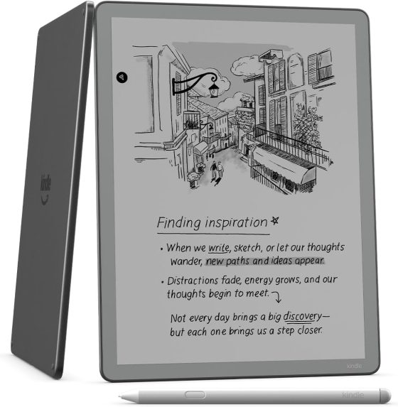
Every morning I check the product page for the new Kindle Scribe without a frontlight to see if Amazon has started taking orders for it yet (they still haven’t), and every time I can’t help but notice how unbelievably bad Amazon made the screen look in all the pictures.
Take the picture at the top of this page for example. There’s no way the screen looks that dark under normal lighting in real life. Are they trying to make it look bad on purpose so people will buy the more expensive frontlit model instead?
E Ink screens don’t have backlights like LCD screens, but almost all ereaders and eNotes that use E Ink screens have frontlights these days except for a few. The screen does look darker when not using the frontlight, but they don’t look that dark under normal lighting. The pictures make it look more like color E Ink with the frontlight off, which is notorious for its darker appearance (yet Amazon doesn’t show the Colorsoft’s screen looking that dark in any of the pictures).
As a simple test, if you already have a Kindle or other ebook reader, turn the frontlight off and judge for yourself. Does the screen really look that dark and gray under normal lighting?
It’s even worse on Amazon’s website when they have the non-frontlit model pictured next to the frontlit version and the Kindle Scribe Colorsoft. The screen looks way worse on the non-frontlit Scribe.
The funny thing is the non-frontlit model probably has the best looking screen in real life without the added frontlight layer (provided the ambient lighting is strong). I reviewed the Boox Go 10.3 in 2024 and it didn’t have a frontlight either and the screen looked absolutely fantastic. The text looked extra sharp and dark without the light layer clouding things up. Yeah, the screen looked darker in low lighting without a frontlight, like real paper, but under good light it looked better than frontlit models.
I think Amazon is really undervaluing the non-frontlit Kindle Scribe in the product pictures. Granted, it still hasn’t been released yet so nobody really knows what the screen looks like, but unless Amazon went back to using E Ink Vizplex screens from two decades ago I don’t think those pictures are very accurate at all.


Probably someone in marketing said “We need to darken the image so that people don’t assume it has a frontlight.” So they took the same image and darkened it. Just the Scribe, though, because I think the styluses are the same color.
That is odd. The only ereader I have where I really use the frontlight on a regular basis is a color one. The rest are fine unless I’m reading in bed and I need to turn off the lamp because my husband is sleeping.
Although I don’t really use it anymore, but sometimes I turn on my Kobo Touch which doesn’t have a frontlight. It’s always interesting to see, that how sharp the screen is compared to other ereaders. Like the contrast is not that good, but the letters feel “closer” to the eyes.
When I purchased the Tolino Vision 6 on Amazon, the product image showed it in landscape mode and distorted. I had to read the product description carefully to verify that it was indeed a new Tolino Vision 6 e-reader and not something else, especially since it had an incredible price of €89.19. I don’t know why they showed such a distorted image (you can still find some on Amazon with the usual image and a price of €200), but the product was fine.