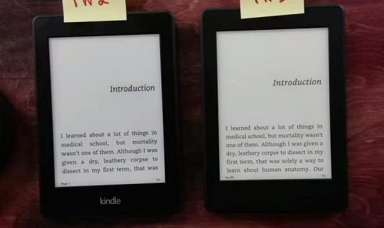
Amazon announced a new upgraded Kindle Paperwhite the other day that will be released at the end of this month. It’s basically the exact same as the old Kindle Paperwhite but it adds a higher resolution 300 ppi E Ink screen to help make text appear sharper and clearer.
Len Edgerly from The Kindle Chronicles has already uploaded a YouTube video that compares the new Kindle Paperwhite 3 with the 2nd generation Paperwhite as well as the Kindle Voyage.
I’ll be uploading detailed reviews and some comparisons between the new Paperwhite, the Kindle Voyage, and Kobo Aura HD in a couple of weeks, so stay tuned for those.
But I don’t have a Paperwhite 2 anymore (there’s no point with the Voyage on hand), so it’s good to see Len doing a comparison between the two.
Unfortunately the frontlights aren’t compared at all in the video, but you can see the difference in text with the upgraded 300 ppi display, and a slight difference in background color.
Len shows us how to tell the difference between the Kindle Paperwhite 3 and the 2nd gen model, so if you happen to see one in stores or used and you want to know what model it is this is how to tell:
Determining the Paperwhite’s Generation
1. The Kindle Paperwhite 1 has a “Kindle” logo on the back.
2. Both the Paperwhite 2 and 3 say “Amazon” on the back.
3. The 2nd gen Paperwhite has a lighter “Kindle” logo on the front and a darker “Amazon” logo on the back.
4. The “Kindle” logo on the front of the 3rd gen Paperwhite is blacked out and blends in with the bezel, and the “Amazon” logo on the back is indented with no added black color like on the 2nd gen model.
Is the New Kindle Paperwhite 3 for You?
Subscribe to The eBook Reader Blog to keep updated on reviews, comparisons, and tutorials for the new Kindle Paperwhite 3.


I wish that he would have used the same formatting for all three devices: font, justified text, etc.
The new screen looks nice. The screen does not have as much contrast as on the voyage or the PW2. I know a lot changes when viewed in person but that’s at least my impression. Nice sharp text though.
I think the Glo HD is the better device at that price point. Way more font options and I really like the screen that I have on my device. Much lighter as well. I upgraded from a PW2.
But I do love the ecosystem of Kindles.
The contrast on the PW3 concerns me, or better said lack thereof. It’s definitely inferior to the Voyage and even PW2.
I’m hoping it’s the bookerly font itself and not the actual screen as i’d hate to panick and cancel my pre-order. I do love the sharpness and the tight format on it as mentioned in the video and also the black on black color.
Comparing it to the Voyage however it’s clear the Voyage has a better screen with a whiter backround and much better contrast.
The one thing i miss about my PW2 is the beautiful Onyx cover as I loathe the Oragami style cover and don’t like by knockoff brands. I was thinking this PW3 would replace my Voyage but I can already tell that isn’t going to happen.
Despite the higher ppi on the new Paperwhite, it seems the older version has the better screen. The contrast is better on the older model with solid blacks. The older model also has a whiter backround and the newer model seems grayish. Also, the text on the new model is grey and not black. Don’t see why Amazon would do this.
People are saying the contrast is better on the PW2 than the PW3, but it seems to me that’s just the different fonts being used. “Thicker” letters always seem darker than thinner ones because you’re looking at more black pixels.
@John
I thought the same thing also, different fonts have different contrast but there are multiple sources confirming the new PW3 has much lower contrast, a darker backround which isn’t as white, and a blue screen when fully lit.