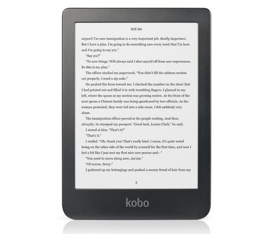
Kobo has been releasing software updates just about every month lately for their line of Kobo ebook readers, and they’ve just released another new update for August 2020.
The new firmware update, version 4.23.15505, is now available for all Kobo models released since 2011 (except the poor ostracized Kobo Mini).
It’s a fairly major update, even though there aren’t any interesting new features. But this update comes with some significant changes to the user interface.
The homescreen and library view now have tabs at the bottom of the screen for Home, My Books, Discover, and More. The main list of menu items at the top left corner is now gone, replaced by a clock.
In the library view there’s now a scroll bar to help navigate through your ebook library, with one long list instead of multiple pages, and there are some other design changes as well.
If you’d like to see the new design of the homescreen and library list before updating, there are some pictures on this post at MobileRead.
You can download the update for each model from the Kobo Firmware Downloads page or you can wait for the update to automatically download and install while syncing, which can sometimes take a few weeks.
Kobo’s release notes:
Easier navigation
Now, you can access and discover more books or go back to the Home screen with one less tap.
Tap More to see everything else like reading activity, settings, and help articles. You can now scroll up and down your list of books.
New
• We’ve added a clock to the upper-left side of your screen
• Check release note information by going to Settings > Device Information > View release notes


Download via wifi, no problems (issues). Nice improvements !
It sucks. New update does not make it easier to read but much harder. This will be my last KOBO. Arnie
Where is icon for font sizing
It’s now on the top bar
@Carl
there was no update in the reading engine, only in the menus.
I spend 99,99% in the book and 0.01% in the menus.
I like Kobo. But I hate people who only collect books …
I don’t know why they said in the release notes that they added a new clock. I thought this to mean that the clock would be displayed in the book you are reading like on Kindles but my three updated Kobos do not show this. So what was the big deal about the clock?
I like it, it greatly reduces the number of taps and menus to do something. Amazon should take note.
Arnie, what are you on about!? They changed the overall UI they didn’t touch the reading experience. Did you even try it?
I’m new to this but I successfully did my kobo touch now I need to do the kobo Clara. Do I just plug the ereader into my computer, log into kobo and follow instructions? The older kobo had stopped working so I reset it and did the update. The Clara is working well and seems to be a totally different ereader.
Thanks!
You have to do that for the Touch with its terrible wifi, but not the Clara. Just connect to wifi and sync it. The device will take care of the rest.
I do not like the sensitivity of the scroll bar. Too hard of a tap and you’ve jumped from page 1 to page 7 with no indication of what page you’re currently on. Could possibly miss looking at books in between. I prefer to older version
I agree. New update horrible.
I have the same problems with the scroll bar. The old system was much better!
Yes, I have the same problem, with the scroll bar.
Nothing negative except for the new scroll bar. It can be quite annoying when scrolling through book lists. If you don’t touch it just right, you’ll go from page 1 to page 7. You can easily miss books in between
to turn pages you still can wiping instead of using the scroll bar
Is it possible to select specific page by typing page number?
Tap the arrow keys in the scroll bar
I like the new update. Still always better than the Kindle advertising experience on their e-readers.
Don’t want to shell out $20 to remove them when I could buy books.
And this doesn’t affect the Kobo reading experience at all. I have the Kobo Libra H20.
For Kobo Aura:
The Home Page Clock is a welcome addition, and the Library scrolling is much more convenient than trying to guess which page you want.
Menu bar is just a cosmetic change, no great shakes.
Thankfully, the beta features are still there, especially Sudoku.
I do not like the scroll bar. It is way too easy to jump too far ahead …. I have over 900 books and I hate that scrollbar
Seems like a few of us dislike the scroll bar. I think I’ll contact Kobo and let them know. Perhaps they’ll go back to the forward/backward arrows. 🙂 A person’s reading experience should be pleasant and relaxing.
THANK YOU , THANK YOU , THANK YOU!!!… I just received a new installation ( Aug 18) on my Kobo Clara.
Arrows have been added to the scroll bar for easier navigation. So, everyone who had problems with this scroll bar with the previous update ( too sensitive and possible skipping of books in between) can now scroll easily with added up and down arrows. !!!