Ever since Amazon started changing the user interface on Kindle ereaders, one of the biggest complaints from Kindle users has been the removal of the old list view from the library.
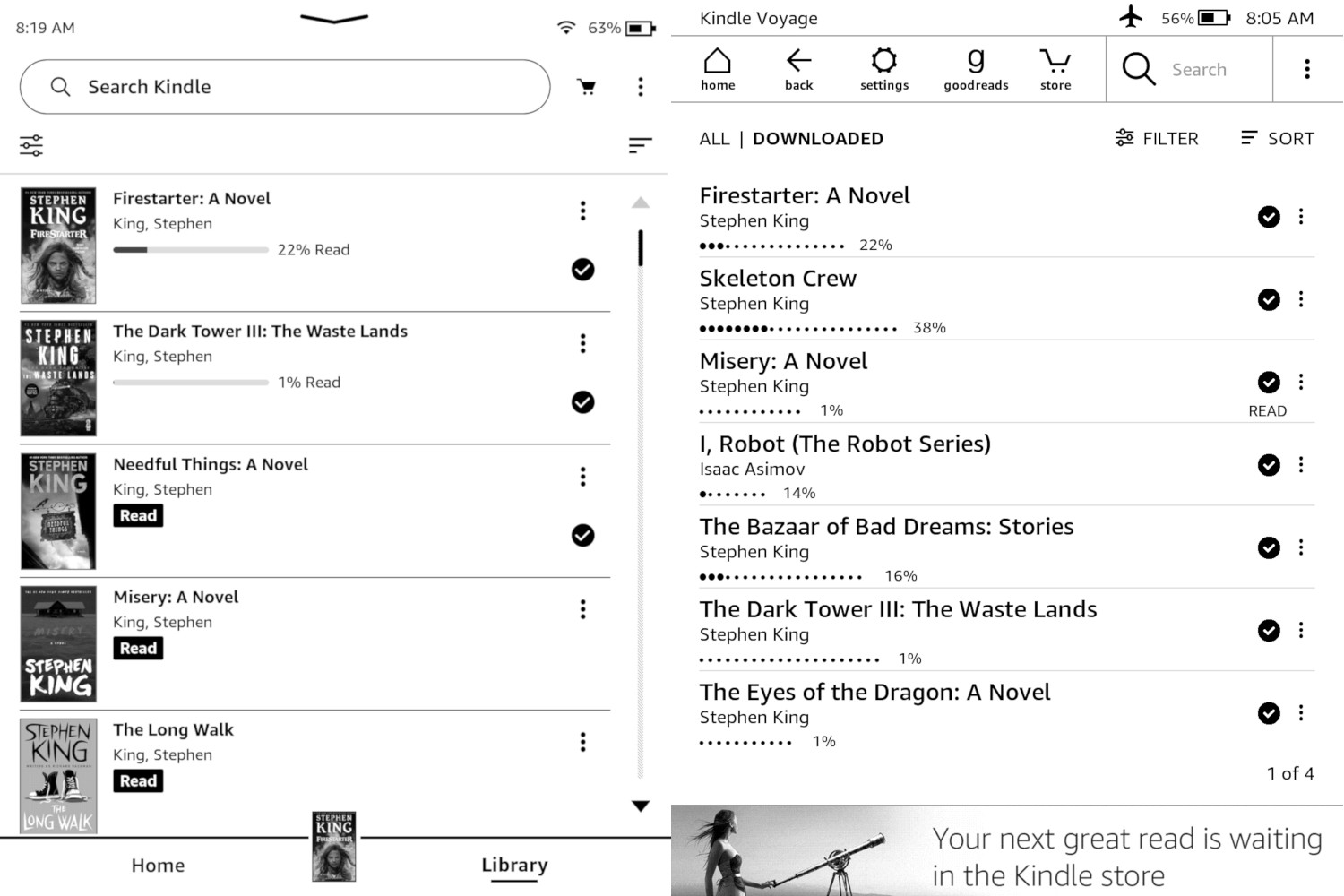
The new interface still has the option to use list view, but they reformatted it to show book covers now, whereas the old list view just showed a list of book titles with the author below and no covers.
The new list view only shows four titles at once on 6-inch Kindles, and five on the larger Paperwhite 5 and Kindle Oasis. With old list view you could see at least seven titles at once on 6-inch Kindles (and that’s with an ad-supported Kindle; I’m guessing the non-ad versions show eight).
I’ve seen a lot of complaints about the new layout, but I actually like the new list view format (but I also like the old layout without covers too).
I kind of have a different take. Ever since the new interface came out, I can no longer stand grid view where it only shows covers. I don’t like how some covers are different sizes, and how ugly the generic collections and personal document covers look. Frankly, it’s an eyesore, and the lack of consistency is annoying.
With list view it’s easier to focus more on the titles of the books than the covers, but I don’t know why they had to make the text so small—there’s tons of wasted blank space with the new list view.
I never used the old list view much, but lately I have my old Kindle Voyage set to list view because of my growing dislike of cover view, and I’ve started to really like it. It’s cleaner and easier to read than cover view, and when it comes to a device designed for reading it makes a lot of sense to have an easily-readable list view.
I can see why people have grown attached to list view and favor it over cover view, especially for long-time Kindle users that have been using list view for over a decade. It seems silly to suddenly remove it.
I don’t see why they can’t just offer both a list view with covers and a more condensed list view without covers on the new user interface.
The Kindle Voyage is the latest model to still support the old list view (because they stopped updating it), and it was released in 2014 so that doesn’t give people who want the old list view back very many options since they’d have to get a Voyage or something even older. Hopefully at some point Amazon will bring back the old list view without covers for those that prefer it.
What do you think? Do you like the new list view layout on Kindles or do you like cover view better? Or is the old list view your preferred choice?
I like the new list view. It is very similar to Kobo’s.
I prefer the old list view because the font is larger and more are displayed on each screen. The images in your example you see primarily just the author’s name and the images are not well displayed. of course that is just one example.
I could adjust to the new view if the font is larger.
No problem with it here. I rather like it.
I haven’t had issue with the interface at all, and I am running the latest firmware on my Oasis 2. The list view is not dissimilar to what I see on my Kobo, so it has that going for it.
But my lack of difficulty with the new UI may be because I don’t fuss a lot with things like collections. I don’t keep tons of ebooks on my readers, I just load a batch, read, load another batch. OK, the batch loading is more my Kobo, but with Kindle, it’s similar, although I’m usually using the Amazon store, rather than sourcing books from my computer via DropBox or USB cable. I’ll download and read a few freebies or Kindle exclusives, then remove them from the device, download more.
I like to read and so I don’t FUSS much with devices, I simply READ on them.
My UI beefs tend to be things that slow me down when it comes to lighting or font or layout adjustments, because my eyes are old and sensitive, so those are things I adjust frequently. Kobo is easier and faster for those, but the Kindle UI is certainly serviceable.
I found the old list view very ugly and didn’t want to use it. The new interface actualy made me come back to Kindle after couple of years. I also agree with the list view, it looks messy with each book having different height of thumbnail, so I don’t use it.
*grid view, it looks messy
I seldom use the list view, they are both okay for my usage
Biggest complaint with the new list view is that you can no longer tell kindle to go to authors/titles starting with “Thi,” instead you have to hit the scroll bar multiple times, overshooting and undershooting until you get close enough to scroll a page at a time. If this isn’t correct then please tell me where to find the old “go to” feature that used to be in the bottom right corner associated with the page numbers.
Otherwise, I prefer list over gird since I like to see the series info on a book.
I don’t often use List View. I usually keep it in “Library” view. I like that because it automatically groups books by series and attaches the number where that book falls in a series. I often read series, and was always going to Amazon to see which book was next. I borrow from the public library, and so I’m not always able to get the books in a series right away, so they didn’t “list” next to others in the series. Now they do and I love it.
I miss the old list view, where you also could se the lenght of the book.
Yes, list view used to have eight lines on an ad-free Kindle, but that was cut to seven when the Filter line was added at the top. I regret letting my Voyage get that update.
I prefer the old interface for everything.
I always liked the old list view with the dots representing how long a book is. I keep lots of books on my Kindle and prefer more titles per page.
With the new UI there are lots of Amazon purchased book that don’t have their cover. I hate that look and now can’t avoid it even with List view.
The old back button is still very much missed.
List view always – need to be able to actually read book title.
I do miss visual representation of book length from the old list view.
And they could have made font bigger in the new list view, true.
That said, I prefer the new list view because text-wise it’s less visually busy compared to the old one.
Also – scrolling is a life-saver because now I can get to the end of the list without needing to click through 50 pages one by one.
I think there needs to be an option to make it smaller. I liked the list because I could see more titles, this is less than the grid view. They could easily make a smaller thumbnail an option.
hello,
Nathan you are spot on with wanting AMZ to allow the option for a list view with covers and one that only has titles.
i use list view exclusively, its clean, functional and uncluttered.
thumbnails are a pain in the patootie!
cheers!
I hate it. I like the old one without the thumbnails. If I wanted thumbnail view, I would choose that option. Instead there’s now less books visible per screen, and you can’t opt out of it or change the font size/ dimensions of the menu page to allow for more books to be listed.
Is there a way of undoing the update that did away with the old list view? The thumbnails are not useful (they are too small to read easily); it is slow to go through a lot of books, I regret logging in to Amazon earlier today; I found this site trying to find out how to get a list without the unhelpful pictures.
There’s no way to go back to the old layout (unless your Kindle was jailbroken before 5.14.3).
The thing about list view is that it’s suitable for people who prefer WORDS over PICTURES. Which obviously enough has to be a considerable portion of people who have a Kindle.
And on a 10th edition kindle there seems to be no way at all of having a list view on the Home screen, just muddy low resolution often unreadable images. FFS!
We now have 5 kindles from the first one to the 10th and 11th versions. Your user interface has become much less useful.
Miss the list view showing the title, author, and book length and how much we have read. The covers are pretty much useless in black/white, and just take up useful screen space. Give us an update where the list view has options for book covers and reading status. We want to get back to the older list view. Give us the option.
Also, Arthritis hands do not play well with touch screens. You get very low scores on the user interface on the 10th and 11th versions.