
The Pocketbook Era Lite that I ordered from Amazon arrived yesterday, and I’ve been trying to get things setup how I like, and so far I’m pretty impressed with the device (the screen looks nice and clear), but there’s one thing that’s simply unacceptable for an E Ink device.
The included font types are terrible. No matter what font type I select, the text looks too light and spindly compared to what I’m used to on other ereaders—they aren’t doing the E Ink screen any justice at all. It doesn’t even look like any of the fonts were optimized for E Ink.
It wouldn’t be a problem if Pocketbook’s ebook app offered boldness adjustment like most other brands, but with the stock software you can only choose between regular, italic, and bold (some font types only have regular), and the bold setting is way too thick and blocky to be useful.
That’s one of the reasons why some people elect to install KOReader on Pocketbook devices since KOReader offers a lot more settings than the stock software. But I want to stick with the default software for a while for review purposes, and the only way that’s going to happen is with a better font choice.
The Fix – Install ChareInk7 Font
Luckily Pocketbooks support installing custom fonts. You wouldn’t know that from reading the included manual because they don’t mention it anywhere, and I forgot how to do it so I had to reference the article above, but once you figure out how to access the hidden system folder it’s easy to add more font types to the Era Lite.
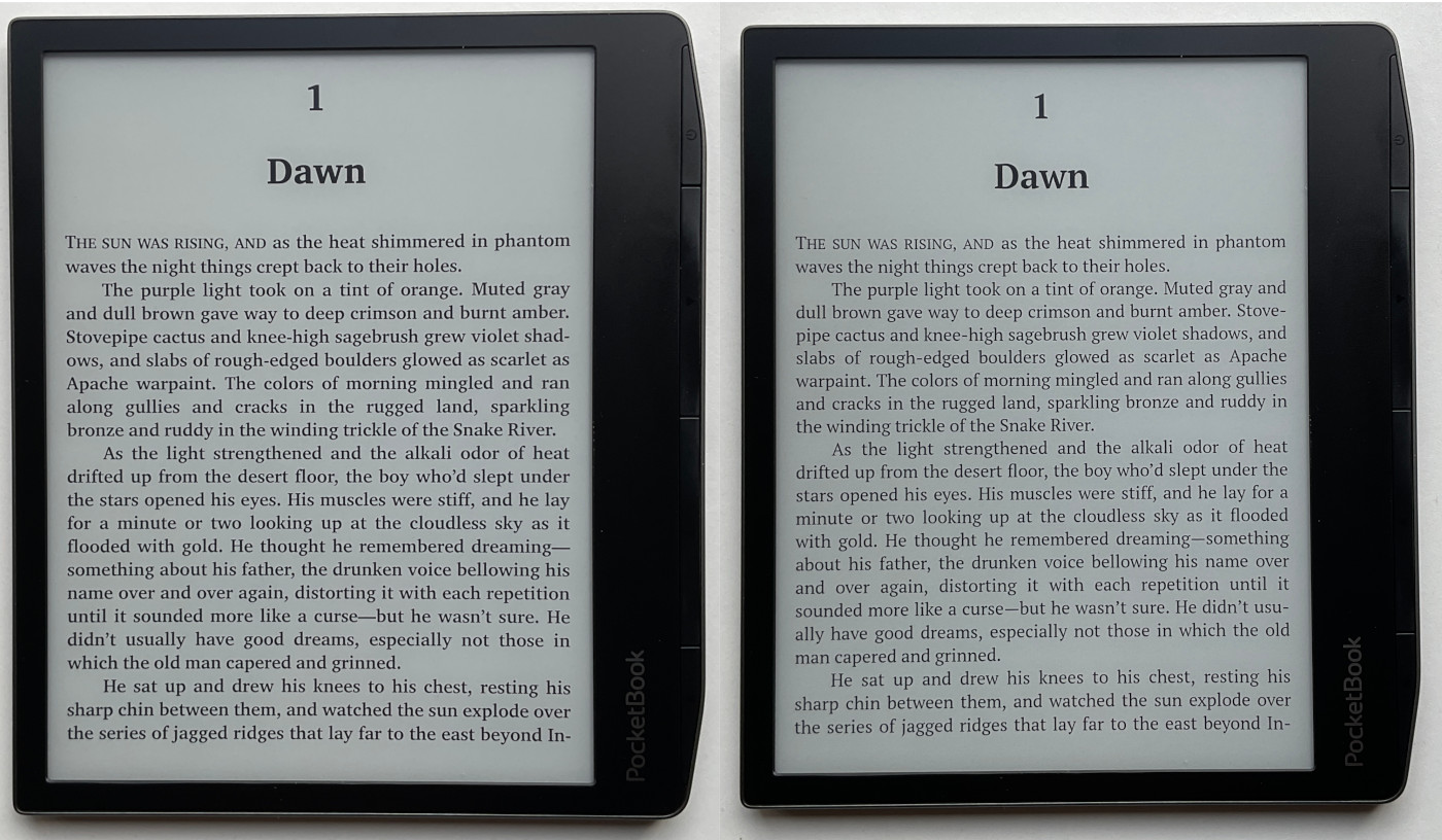
For Pocketbooks, since they don’t have a boldness slider like Kindles and Kobos, I’d recommend the ChareInk7SPW font because it has added weight (it’s the last one on the list). It’s kind of hard to tell from the picture, but it’s a big improvement in person (ChareInk on the left, default on the right). I think it looks a lot better than any of the included fonts.
Of course you can add your own favorite font types as well, and you can use a font editor to increase the weight if it doesn’t look dark enough.
Thanks for this. I received my PocketBook Era Lite a few days ago and have been generally happy with it. The UI is pretty slow, even for an e-reader, but when moving through books (such as turning pages) it is fast enough so I don’t really notice this issue too often.
Been mostly reading manga on it for the time being, so I haven’t had to deal with the available fonts at this point, but I’ll go ahead and grab this one here to add it to the library for when I do move over to standard e-books.
The choice of fonts is a matter of personal preference. That font hurts my eyes. In fact, on my Kobo or Kindle e-readers (or in KOReader), I don’t use the font weight adjustment feature. I’m used to the original fonts. PocketBook’s default PT Serif font looks similar to Georgia or Charis Sil, on which the version you’re publishing is based. I find the current Carta 1200 or 1300 screens good enough that there’s no need to make these types of fonts bolder. But as I said, it’s a matter of personal preference. Years ago, the fonts I used on my e-readers all had their weight adjusted. Now I can’t stand them like that.