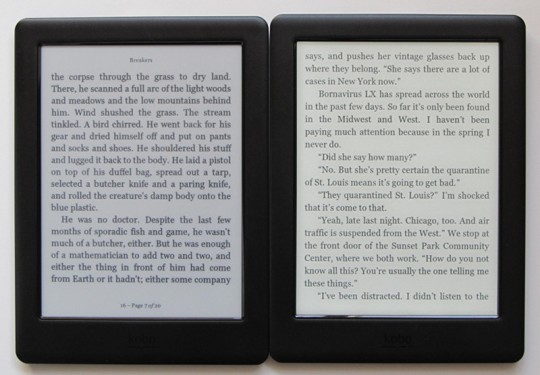
Last week I posted a review of the Kobo Touch 2.0, Kobo’s latest entry-level dedicated ebook reader.
My biggest complaint with the device is the screen. It lacks a frontlight and it uses an old low resolution E Ink screen from 4 years ago.
I’m working on a comparison between the Kobo Touch 2.0 and the Kobo Glo HD. The screen difference between the two is shocking.
The Kobo Glo HD uses the latest screen tech from E Ink, a Carta screen with 300 pixels per inch. By comparison the Touch only has 167 pixels per inch, and it uses an older Pearl screen with a darker background color and less overall contrast.
It’s surprising just how much better text looks on the Glo HD’s screen. Text appears jagged and rough and fuzzy on the Touch, like a picture that’s not quite in focus. On the Glo HD text is super crisp and clear and much more pleasant to read.
The Kobo Touch 2.0 isn’t the only device to use that screen either. The entry-level Kindle Touch uses the same exact low resolution screen.
These 6-inch 800 x 600 E Ink screens were fine 4 years ago when they were first introduced, but why are they still in circulation when E Ink makes newer, better screens?
It makes no sense to keep inferior screens on the market when there are superior alternatives. E Ink has got to be the only technology company that can get away with selling 4 year old screens on “new” devices.
You can’t say that cost is the reason because 212 ppi ereaders like the Kobo Aura and Nook GlowLight only sell for about $10 more than these 167 ppi ereaders, and those add frontlights as well.
It’s time to retire these old low resolution screens, E Ink. They’ve got to go. What’s the point of developing new screens if you’re just going to keep using old ones?


Hello there,
I just wanted to say that I totally agree with you about low-res screens. E-reader manufacturers seem to be missing the boat with a huge market out there.
My mother is 95 and suffers from Glaucoma (amongst other things) but she does enjoy reading. She used to read large print books but they became too heavy for her to hold so, over the last few years, I’ve purchased the original Kindle, a Nook and now a Kobo HD. There are still problems:
1.The 6 inch screen doesn’t cope very well with large font sizes
2.Turning pages is not as easy as you may think – leave a finger on the screen for a fraction too long and you’ve missed a chunk of the story.
3.There are other minor irritants but she can live with those.
There must be literally millions with poor eyesight who could benefit from e-readers if only manufacturers would produce a device that is easy to use for those who are elderly, infirm or have poor sight.
A start would be a larger screen – say 8″, with specially developed high res fonts suited to large sizes. Add an easy way to turn pages whilst being able to lock off menu & other settings (voice control?). I’ve considered a tablet as a replacement but there is the problem of the device needing to be charged more often and it doesn’t solve the control problems.
Thanks for your blog, I’ve been reading for quite some time now and I’m always looking for that elusive device that can handle my requirements.
Perhaps e-Ink is not still manufacturing the 800 x 600 screens. Perhaps they are just clearing out remaining inventory. I still like my Nook Simple Touch, though through rooting and some tweaks discovered by the folks at XDA, I have better contrast than stock and with AlReader, more font choices as well as font weights. I haven’t seen any of the newer higher resolution screens in person so I am still happy with the Nook.
I am hoping to be able to snag one of the open android e-readers when the price comes down.
It’s still price to some extent. What E-Ink needs to do is lower their price on their higher res screens, and then the 800×600 e-readers will disappear.
I have an older 800×600 e-reader, and it’s fine. No way I’m going to pay ~100+ dollars to upgrade — just for a higher res screen. I’ll upgrade when my e-reader dies — although at this rate — that might be another 8-10 years. 🙂
IMHO, it’s actually the contrast rather than pixel density or (even) frontlight uniformity that has the biggest impact on readability.
I’ve both a KPW1 — jailbroken with KoReader installed — and a KV. The KPW is far and away my preferred device; mostly because I can adjust the gamma (contrast). I can also adjust the margins, justification, fonts, and type size much more completely, of course, but it’s the gamma that makes the most difference.
Pixel density? Sure the KV is better on that measure but the contribution to viewing ease is negligible. It’s simply not that important.