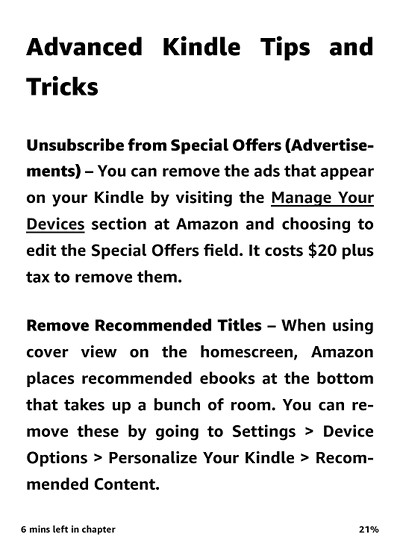
A couple weeks ago Amazon updated the software on Kindle ereaders for the sole purpose of adding the option to use a new bold font called Amazon Ember Bold.
Lots of people have been calling for bolder fonts on Kindles for years so it was nice (and surprising) to see Amazon finally add the option.
Now that people have gotten a chance to try out the new font, an obvious question arises: Do you like the new Amazon Ember Bold font choice?
I’ve heard some complaints that it’s actually too bold.
Others don’t like the fact that there is no bold serif font option.
Personally I prefer serif fonts myself so it’s kind of hard to adjust to a sans-serif font when you’re used to a serif font.
Why give nine different font type choices but then limit bold to only one?
I hope Amazon decides to at least add a bold version of Bookerly at some point in the near future.
The best thing would be to add a boldness slider so that customers could fine tune the fonts however they want, like Kobo does with their ereaders, but I just don’t see Amazon ever going that far.
I’m glad they finally listened to customers and added a bold font choice so it’s hard to complain about it too much but there’s no reason for them to stop at just one. 😀
The new font was added to the second generation Kindle Paperwhite through all the current models.
If you haven’t gotten the update yet you can download and install it from the Kindle software updates page at Amazon.


I am enjoying the new bold font. I too have been waiting for that addition to the kindle. I do wish they had given a bold option to the bookerly font. That is the font I preferred to use. I’m hoping they do it soon.
I wouldn’t hold out too much hope for more boldness in fonts from Amazon. Of course I’m just guessing but my guess is they did this in response to Teleread and David Rothman’s complaint that the lack of a bold font made the Kindle less accessible to people with vision issues. Accessibility has been an issue for Amazon and it’s taken special legislation to allow them to ignore it. And that legislation has to be renewed from time to time and I think this was Amazon’s way of avoiding problems.
My guess is that Amazon sees bold fonts as a non-issue and they provided just one to try to avoid accessibility issues.
As for liking Ember Bold, I do like it. I think I still prefer Bookerly. I also like fonts with serifs and Ember Bold is bolder than I would have chosen. I do find it very readable but I’m fine with Bookerly although I wish it was a little bolder.
I’ve been reading with both to give Ember Bold a fair chance and I have to say that I think it’s a good font; easily readable. My guess is that I’ll stick with Bookerly in the long run but I haven’t really decided that yet.
Barry
I’m okay with the new bold font. I prefer bold san serif fonts and wouldn’t mind if Amazon added a few more 🙂
I don’t like it, it’s way too bold to the point where it hurts the eyes. I had previously tried it by embedding only the bold and bold italic options through Calibre on both Ember and Bookerly which is what this essentially is. No go for me. Funny how Bookerly looks amazing on Kobo’s but horrible on Kindle’s; just way too thin. What we need is medium weight font options on Kindle’s. Better yet give us the option to adjust our own wait and justification! That makes perfect sense which is probably why it won’t happen.
I’m happy with Helvetica on my PW3 so I haven’t bothered to update manually, but I’m wondering why the auto update is taking so long to show up – I charged it for a few hours again yesterday and still not there…
They’ve been taking forever lately, it seems. I never got the previous update and that was several weeks ago so I decided to manually update to try the new font.
Finally got the update today 14Feb – thought I’d post as a benchmark for future update timeliness.
I didn’t like the font that well at first but it’s growing on me…