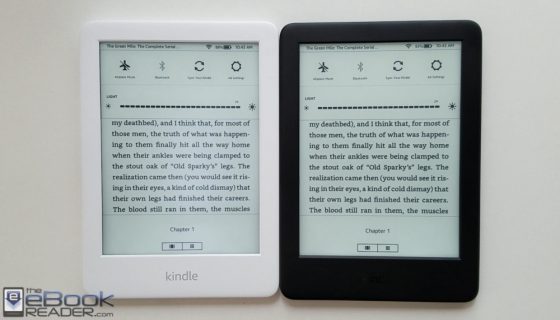
Like the previous entry-level Kindle, the new 2019 Kindle comes in both black and white versions. The Paperwhite used to have a white option as well, but now they only offer black on the new model with a flush screen.
I wasn’t sure which color to choose when I first ordered the new Kindle so I got both colors to see which one I like better after using them both. I’ve never done a color comparison before with the same model, but there are a couple of key differences between the two.
First, there’s an optical illusion that makes text appear a bit darker when surrounded by a black frame, and that does appear to be true in this case.
However, adding a frontlight to the equation has some benefits with the white frame because the light kind of blends in with the frame and gives it more of a papery look overall.
But with the frontlight off, there’s an optical illusion that makes the background color on the white Kindle look noticeably darker. It’s an odd thing because even side-by-side with the black Kindle there appears to be an obvious difference with the color of the screen, but really the only difference is the color of the frame.
Another thing I notice is there are subtle brighter spots along the bottom of the screen where the LEDs are located, but they are more visible on the white Kindle, whereas I can barely see them on the black Kindle. But this is probably more of a variance with the individual frontlights than having anything to do with the color of the Kindle.
There’s also a difference with the Kindle logo located on the front of the device below the screen. The white Kindle has a silver logo that stands out more than the glossy black logo on the black Kindle.
Another difference with the white Kindle is you can see a black border at the edge of the screen all the way around. On the black Kindle you don’t notice it because it blends in with the frame.
Here’s a quick video showing both the black and white Kindles up close to help get a better idea of which color to choose. So far I’ve been liking the black one better. The frontlight is really good on it; the brighter spots at the bottom of the screen catch my eye more on the white one. The white one seems to stay cleaner, though; you don’t see smudges and spots of dust on it like the black frame, and I like how the light blends in with the white. Both have their own subtle advantages.


As you said, front lights vary between units. The white one seems to get brighter but the black one has a less harsh and evener glow. I prefer the black one.
The background colour might not be an optical illusion. The plastic film of the white one could’ve come out of a different production batch than the black one.
Overall, the black one is the better one to keep.
I prefer Black, too. Another color can be distractive, and some colors on material has a bad changes, example: White become some yellow, in some months and use.
Once you go black you never go back.
Dude..
I have a white Kobo (pink on the back) and love it. It’s about 6 years old and hasn’t yellowed at all.
Black is the new black. I live in a dusty environment where nothing white stays white for long.
One thing I’ve noticed it that dust specs are a lot more visible on the black frame, and easily catch the eye, whereas they’re virtually invisible on the white frame.
I actually don’t know: could you please reply for me? Thanks