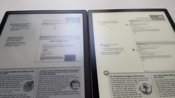
With the release of the new Onyx Boox Note Pro, I was eager to see how the screen compares to the original Note that was released last year. I don’t know if Onyx is going to continue selling the original Note but it’s interesting to see how they compare nonetheless.
Both have the same 10.3-inch E Ink Mobius Carta display, but they added a flush glass screen to the Note Pro, along with a frontlight.
The Note Pro also has twice as much storage space and RAM with 64GB and 4GB, but otherwise the two Note models are the same, and both run identical software.
I was surprised to see the black ink is a little darker on the Note Pro despite the glass screen compared to the original Note with the standard screen protector on. The difference is fairly obvious.
It would be interesting to see how they compare without the screen protector on but I don’t want to take it off because they aren’t selling them anymore, and if you’re going to use the original Note it needs a screen protector on to avoid scratching the screen.
With the glass screen you don’t need to worry about scratches so a screen protector isn’t necessary.
The glass has another benefit too. It helps make the Note Pro feel a lot more sturdy and solid than the original Note.
The downside with the glass screen is it does add some more weight. At 390 grams, the Note Pro is about 50 grams heavier than the original Note.
The original Note has more of a papery feel with the texture on the screen protector that adds a bit of resistance and scratchiness when writing, and the screen itself has some give that feels more natural when pressing down.
The glass on the Note Pro has more of a solid, slick feel when writing, but you get used to it after awhile and it doesn’t make the process of writing any more difficult. Onyx’s new stylus tips have a slightly grainy feel that adds some texture on the glass screen when writing.
The biggest difference between the two models is the frontlight. The Note Pro adds a frontlight with dual temperature control. Even in a well-lit room the light helps make the background appear lighter and the text stand out more. Having a frontlight is an even bigger advantage in low lighting conditions.
Overall performance is similar on both Note models, but with the extra RAM the Note Pro does load apps and books faster when switching between them.
Conclusion
I was skeptical about the glass screen at first and I thought I might end up keeping the original Note instead since I’ve always liked it, but after using the Note Pro and seeing it in person it clearly is the superior model. The glass screen makes the build quality feel stronger and the contrast is surprisingly better with the glass screen than it is with a screen protector on the original Note. Plus the frontlight makes a huge difference in overall readability, and the slight boost in performance with 4GB of RAM is a nice bonus as well.
Too bad the Note Pro is so darn expensive because it really is a nice device. At the most recent price of $449, the original Note seems like a bargain. But it started at $549 so maybe in a year the Note Pro will be down from it’s current $599 price.

