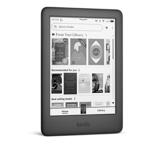
Ever since Amazon started rolling out the new user interface on Kindle ereaders, there’s been a lot of complaints from users about the changes. Some people really hate the new layout, and how Amazon removed some of the features they’ve been using for many years, like list view without covers.
But on the other side of the coin, it seems like Amazon is really proud of their new user interface. Something I’ve never seen them do after an update before, they’ve gone through and changed the pictures on Kindle product pages to show the new user interface.
They even updated the page for the 3-year old entry-level Kindle to add a picture showing the new homescreen and to boast about the new “reimagined reading experience”. They did the same with the 2.5-year old Kindle Oasis.
By contrast, I remember with the previous generation Kindle Paperwhite they had a screenshot of the old font selection menu that had been replaced soon after release, and that picture is still up on that page today—they never did change it after the update.
Amazon also has a page on their website dedicated to touting the features of the new update (and yet they still haven’t added any new help articles to explain the changes or to help troubleshoot new problems introduced with the update).
It’s funny how they’ve gone through and changed pictures from years ago, and how they’re going out of their way to brag about the new update. I noticed they even changed some minor thumbnails here and there to show the new homescreen. Someone at Amazon must really think highly of the new layout, but it seems like many long-time Kindle users aren’t so fond of the changes.


At least someone is paying attentions to their web page. I have seen the web page in Mexico with incorrect information when it comes to the features offered by the new PW. Things as mixing up the features between the signature edition and the Oasis like claiming that the PW 5 signature has turn page buttons. Maybe they will fix their information along with the screen shots?
They probably have a new unpaid intern trying to impress.
Its an e-reader… Open it select a book read it.
This is sound advice.
No it is open it, get their “home screen” select library (which doesn’t work well with voice view on, their horrible TTS), then select a book, if you have it set to “downloaded”, you will be able to read.
If you try searching for the book, you no longer can see whether a book is downloaded before pressing enter. I loved that my book would pop up and I could select it from the search drop down, but now… if it isn’t actually downloaded and you are out and about (no wifi) you will have to search again, or press enter, then get a list that has a symbol that is a check mark that tells you it is downloaded (on device). OMG, let me choose to ONLY see what I have on my device and DON’T ask me if I want to attempt to connect!
I hated their home screen before and set my Kindle to list view on “HOME” button press.. so yea, open the Kindle and select a book and read. Now it is a whole process and a waste of time. You cannot choose to have list view as default, no home button rather one button that changes and usually drops you into their environment. I gave my Kobo Libra to my sister so, even though I have an Oasis, I just ordered a Kobo Forma. Easier to get library books and my “home screen” is a list of my books ON THE DEVICE.
It SHOULD be an ereader, I bought it that way, but it is now an ad delivery system that took my list view away and tries to sell me the “next in the series”, Umm…. I can get that info myself and decide for myself, just be an ereader, that is what I bought it for, not to be some Amazon book store. I get a lot of my books from Overdrive and the library and send it to Amazon then download it. I will probably get the next from the library, NOT Amazon. Who owns this reader, well it is not me because I would put the freaking OS that I bought it with back on. It worked like I wanted it to work.
Going to find a new eReader. Can’t stand the fact that the downloaded collections can not be shown in list form as in the previous version. Goodbye kindle!
If you Filter by Collection rather than Sort by Collection, the inside of your Collections can be in list view
You know you can ‘refine list’, right?
Of course they’re proud. Do they dare not to be? Do they care about users? Nope, they’re a megacorp. Should have stopped at cover when asleep.
Seeing Goodreads is a thing I miss. The new Discover section they just slapped on is useless to me and takes half the screen.
Your “Is this why Amazon is changing the Kindle’s User Interface?” post from the 28th I think explains why Amazon’s so proud of it and has done things like update their pages on the older Kindle models. They’re transitioning away from a Java based UI to React Native.
IMO it’s not about this specific UI update, it’s about Amazon trying to “sell” the move from Java to React Native.