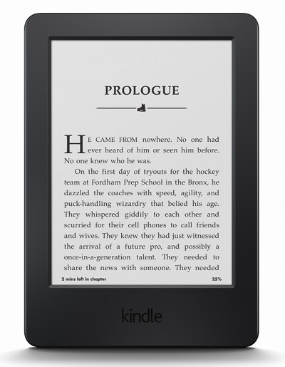
Amazon’s latest entry-level, basic, 7th generation, $79—whatever you want to call it—Kindle was released today. Amazon refers to the new device simply as “Kindle”. After all these years the word is so common it could be used in a number of different contexts, so that doesn’t help give the device much of an identity. Quite frankly I don’t know what to call it either….
Anyway, the “new” Kindle has been largely overshadowed by Amazon’s new premium ebook reader, the Kindle Voyage, with its fancy pressure sensitive page-turn sensors and 300 DPI screen.
The entry-level Kindle doesn’t have any of that. It doesn’t have a frontlight or the newer E Ink Carta screen either, and it doesn’t bring anything new to Kindle ebook readers that we haven’t seen before, but it does have a low entry-level price of $79, and it adds a touchscreen that the previous basic Kindle lacked.
I posted earlier about how the new Kindle is basically a downgraded Kindle Touch from three years ago. Now that I’ve got it in my hands, that is indeed very much the case. In fact it’s pretty much the exact same device in a different shell and without audio support, but with newer and better software.
As someone who has been reviewing Kindle ebook readers since 2009, it’s hard not to be a little disappointed with the new $79 Kindle.
Right out of the box my initial impressions were not positive. The overall design is a step in a different direction from previous Kindles. It’s much thicker and blockier than the previous non-touch Kindle. It’s not nearly as refined as the Paperwhite. Honestly, it feels like a child’s toy. It’s a big slab of plastic. Even compared to the Kindle Touch from 3 years ago, it’s a step down in the design department.
I know that Amazon is trying to shave costs to hit the $79 price point, but that doesn’t necessarily make it a good buy. Personally, I think the Kindle Paperwhite provides a better overall value with the frontlight, upgraded screen, and much nicer design. It’s priced $40 higher than the basic Kindle but sometimes it goes down to $99 like it is at Staples this week.
On the positive side, at least the new Kindle feels solid; there’s no creakiness from the plastic when handling. And aside from the lack of physical appeal, the software is pretty much identical to what’s on the Kindle Paperwhite, so there are lots of features and the reading experience is excellent.
The screen looks good. It has the exact same screen as the last non-touch Kindle and Kindle Touch, so everything looks pretty much exactly the same between them, although the software differs slightly so layout and text rendering isn’t identical. The Kindle Paperwhite also renders text slightly differently with its higher resolution screen. Font sizes are a little smaller, so more text appears on the screen even with the same exact font size, type and ebook—it all makes it very hard to compare.
I’ll post some pictures tomorrow, along with some comparison reviews and video walkthroughs. Subscribe to The eBook Reader Blog to keep updated! The fastest way to get updates on video reviews is to subscribe on YouTube or Google+ because the videos get posted there before I write the articles here.


That are pretty much all of us previous kindle Touch user are expecting. Nothing new, nothing amazing. The design is really disappointing even by viewing the photos.
Feels cheap & chunky, huh? I guess I’ll return it for the paperwhite. Thanks for the review!