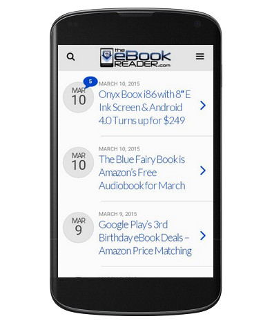
Yesterday an email showed up in my inbox from Google Webmaster Tools saying that The eBook Reader Blog was not a mobile-friendly website and that 100% of the pages had critical mobile usability errors.
This website is turning six years old in a few months, and I’ve never setup a mobile-friendly version of this site because of my personal dislike of them, mostly from being forced to use them with tablets when they aren’t really needed.
But the times they are a changin’. Smartphones are more popular than ever. Lots of people use them to browse the web.
So many, in fact, that Google is making some big changes that will significantly affect the future of internet browsing from smartphones.
At the end of February, Google announced that search results are going to start taking into account how mobile-friendly a website is or not:
Starting April 21, we will be expanding our use of mobile-friendliness as a ranking signal. This change will affect mobile searches in all languages worldwide and will have a significant impact in our search results. Consequently, users will find it easier to get relevant, high quality search results that are optimized for their devices.
Google is basically telling websites owners flat out that they better go mobile or they’re going to get penalized.
So I’ve spent the past couple days trying to figure out a mobile-friendly solution for The eBook Reader Blog.
After some research and trial and error, I decided the least technical option would be to use a WordPress plugin call WPtouch. There’s a free version and a paid version (for now I’m using the free version but might upgrade to Pro later).
WPtouch is designed to create a separate mobile theme that automatically displays on mobile devices.
What’s great about that is this site remains the same for all desktop computers and most tablets, but devices like iPhones and Android smartphones get directed to the mobile-friendly theme, where you can still choose to switch over to the desktop site if you want.
From most devices there is no way to even view the mobile theme. The theme will only be active when any of the following user-agents or user-agent combinations are matched:
iPhone, iPod & Mobile, Android & Mobile, Opera & Mini/7, BB & Mobile Safari, BlackBerry & Mobile Safari, IEMobile/10 & Touch, IEMobile/11 & Touch, Firefox & Mobile, IEMobile/7.0, IEMobile/9.0, webOS
I tested the new mobile theme using the Chrome web browser on the Fire HD 6, along with the developers tool that simulates a bunch of different mobile devices using the desktop Chrome browser. Everything seems to be working well, but please let me know if you encounter any problems using the new mobile theme.
How to Use Our Mobile Theme
For smartphone users, WPtouch is a popular plugin that you’re probably already familiar with from other websites. The layout is pretty standard.
Tap this website’s logo at the top of the screen to go to the main blog homescreen that list the latest articles.
Use the menu button icon on the upper right to bring up a list of popular categories.
Tap the search icon to use Google Custom Search across all the articles on this blog.
Not Everything is Mobile Friendly
This website started out as a static HTML site before I realized the topic would be much better suited for a blog-style format. I still use the static site for a few things like longer-format articles, reviews, comparison tables, lists, etc. But I’ve decided not to update any of the static pages to show a mobile version.
Most of the pages are older and outdated anyway, and it’s just not worth the technical undertaking to create an entirely separate mobile-friendly page that’s only going to load for less than 10% of visitors. I briefly tried to make something work, but there is simply way too much code work involved.
Moving forward, I’m going to use the blog format to post all articles and reviews so it’s not going to make much difference anyway, but for all you smartphone users out there you still may encounter one of the non-mobile friendly pages occasionally.


Awesome. I likey!
It displays fine on my NTG using Opera Mini, but tapping on any links for some reason doesn’t take me to the link. 😕
That’s weird. My Nook Touch has an old version of Opera Mobile and links work fine but it doesn’t display the mobile site. It must be something with that version of Opera Mini. Is it an older version? The supported user agent options mention Opera Mini version 7.
I got the same notice from Google and will checkout WPtouch for my website, Thanks 🙂