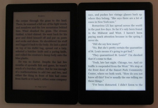
Ever since I got a Kobo Touch 2.0 to review, it has really made me question the evolution of ebook readers. It’s amazing how an electronic gadget in a world of constantly evolving technology can remain virtually unchanged for over 4 years.
Somehow this is par for the course when it comes to dedicated E Ink ebook readers. Even when superior devices exist with better screens and built-in frontlights, companies continue to put out products using outdated technology.
The crazy thing is the price difference isn’t great enough to warrant such sacrifices in quality.
The Kobo Touch 2.0 is the perfect example of this. At $89.99, it’s only $9.01 less than the Kobo Aura, which has a frontlight, a higher resolution screen, a memory card slot, and a nicer overall design.
In short, there isn’t one single reason to choose the Kobo Touch over the Kobo Aura. I don’t have an Aura anymore to do a direct comparison but I do have a Glo HD to compare.
The Kobo Glo HD sells for $129. With 300 pixels per inch, it has the highest resolution screen of any Kobo ebook reader, so text is super sharp and easy to read. And unlike the Touch 2.0, it has a frontlight to illuminate the screen, which helps add contrast in addition to lighting the screen.
I talked about it in the previous post about how I think low resolution E Ink screens should be discontinued, so I won’t rehash all that again here.
Needless to say, I don’t understand why devices like the Kobo Touch 2.0 and $79 Kindle exist in this day and age when devices with better higher resolution screens and frontlights are available for only $10-$40 more.
Below is a quick video comparison between the Kobo Glo HD and Kobo Touch 2.0, showing the difference between the high and low resolution E Ink screens, along with a frontlight verses no frontlight comparison.
Check the individual Kobo Glo HD and Kobo Touch 2.0 reviews for more detailed information about each. The software is identical between them, and so is the hardware except for the screen.
