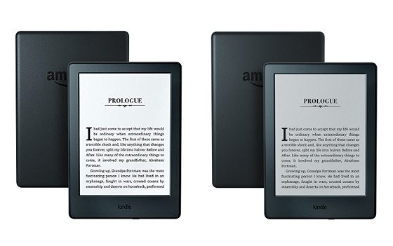
I was over at Amazon this morning trying to figure out something to write about when I noticed that the pictures seemed somehow different for the new Kindle than I remembered them being the last time I looked.
After some investigating, it turns out that Amazon has indeed gone through and changed most of the pictures for the new entry-level Kindle on the description page to make the screen look darker.
The picture at the top of this post is just one example of many.
They also added a note directly below the bullet point description that says, “Planning on reading in low-light settings?”, which points out the other Kindle models have built-in lights.
The new pictures are a lot more accurate. That’s actually what the Kindle’s screen looks like with the old screen tech that it uses with no frontlight. In fact the low resolution, dark gray screen is the #1 complaint on my Kindle review.
Amazon is probably trying to minimize the number of negative reviews at this point. There are a number of complaints about the screen. Currently the new Kindle has a 3.8 star rating, with over 20% of reviews just one or two stars.
Personally I think it’s time for Amazon and Kobo to ditch non-frontlit ereaders altogether but that’s probably not going to happen anytime soon. Unless you’re reading in bright sunlight, frontlit screens are far superior and a lot more enjoyable to read books on, and it’s not like you’re required to have the light on if you don’t want it on.


Good catch. It’s more than past time for them to put realistic pictures of that device on their site.
I love my unlighted Kobo Mini, mostly in the summer with the longer daylight hours. It’s a special case, though. I wouldn’t buy a 6″ unlighted reader.
There was something to be said about the non front lit screens…especially the non touchscreen versions…
The text/graphics sensed to be on top of the screen (like a sticker), rather than a layer below it.
I disagree, with Amazon or Kobo ditching the entry-level e-reader – non front-lit e-readers are great devices, with genuine use cases e.g. children, bulk orders by schools, those sensitive to lights (any light), a travel e-reader that your throw in a purse or bag etc. Also, these e-readers are even more affordable when they go on sale or if you purchase a refurbished unit.
I near always keep the front-light of my Paperwhite off but still use the Paperwhite due to its 300ppi and E-Ink Carta (it is not just the front-light). The only issue is if the resolution on these entry e-readers could be bumped to the first generation and second generation Paperwhite.
My Kindle 5th generation (Black Version) has a vastly superior screen than this new version. The screen is whiter and the contrast is much better. The fonts look inky pitch black whereas the new version looks faded gray and washed out aside from the darker screen. I also had this problem with the 2014 version. They don’t make them like they used to thats for sure.
Agreed, Rick.
Very happy with the Kobo Aura H2O. Even with the light off, the fonts are crisp with excellent contrast. Of course it’s not an entry level reader. But to your point, the old non-front light readers were excellent. Especially the Sony ones.