Last September when Kobo released the Kobo Aura One it was the first ebook reader to come with a 7.8-inch 300 ppi E Ink screen, and it was also the first ereader to offer a frontlight with adjustable light temperature.
Kobo calls it a Comfortlight Pro, and it’s also available on the new 2nd gen Kobo Aura H2O that was released last month.
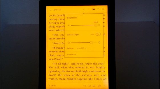
The frontlight can be set to automatically adjust the color of the light based on the time of day, from a cool blue tone during daylight hours to a warm orange hue at night.
Or you can turn off the auto setting and manually adjust the color temperature yourself.
Currently the two Kobos are the only E Ink ereaders to offer frontlights with an adjustable color tone.
Other companies will likely follow suit in time—Onyx already had a new device on display at a trade show recently that had the same kind of frontlight.
With all other frontlit ereaders you’re stuck with whatever color they give you, which can vary from cool blue in tone to a warmish yellow (sometimes on the same screen, unfortunately).
It’s pretty cool to be able to adjust the color to suit your personal preference with the Comfortlight Pro. Some people prefer to read with a warmer background color and others like a lighter background.
At the far end of the Comfortlight Pro’s spectrum the light color takes on an orangish hue, as blue light is filtered out. At the middle settings the color is more subtle, and at the far left there’s no orange color at all, only a cool blue.
The orange color is a lot different on the two Kobo ereaders that I have, however. The orange tone is darker and redder on the Aura One, but frontlights differ so much it’s hard to say if they’re that way or not.
I got the Kobo Aura One when it first came out about 9 months ago; maybe they’ve refined the color temperature since releasing the 2nd gen H2O last month. Either way the orange color looks better on the H2O than the Aura One because it’s not as drastic and the contrast of the text is better at the far right of the frontlight color dial. Here’s a video for a closer look…


My KA1 is fairly recent and the color looks like yours. What I find useful is varying the tone from warmish to coolish and back for longer reading sessions. I never use the heavily orange color.
In any event, there are a lot of reasons to get a Kobo vs Kindle and this is one of them.
Off topic, perhaps, but I was thinking that Amazon might finally be catching up to Kobo with respect to typographical choices in the latest update with margin justifications but … nope. Changing margin styles is not available for sideloaded books. Maybe the Calibre conversion is interfering with it but I have no trouble changing that style with Kobo and converted, sideloaded books.
Any changes to Kindle formatting moving forward will likely be for ebooks with enhanced formatting only, KFX format, so that’s why it isn’t available on sideloaded books. You’d have to convert the books to KFX.
Thanks for this video Nathan. The colour of the light of the H2O looks a lot better than the colour of the light of the Aura One. You said that the text looks better on the H2O with the light on, so maybe this could be a reason to buy the H2O? When I read your review of the H2O I thougt that the quality of the screen was really bad, but now I doubt again…
It only looks better at the far right of the orange scale, otherwise the Aura One’s screen looks clearer. The H2O’s screen looks fine on its own, quite good actually, but it’s just that the One’s screen looks noticeably clearer when they are right next to each other.
ok, thanks for this clarification!
On my Aura One, the color of the Comfort light seems in some way connected with the brightness. When I go all the way to the right, my Aura One looks closer to the H2O from the video. But I never go above 5% on brightness. To test, I ran the brightness up to 100% and got that dark orange/red color shown in the video. Perhaps Kobo recognized this and make the color of the comfort light less dependent on the brightness setting on the H2O.
I just went through fourth exchange and seem to finally have a decent front light on my Aura One. This is a newer model and the comfort light seems Orange. I see it’s more in line with the Aura H2O tone.
https://imgur.com/a/Qtt5v
My Aura H20 2nd edition was ordered today. Just for the Comfort light; I hope it turns out to be a good investment. It is replacing my Glo HD.
Is it effective? In other words, is the orange light affecting sleep?
There’s zero proof either way.