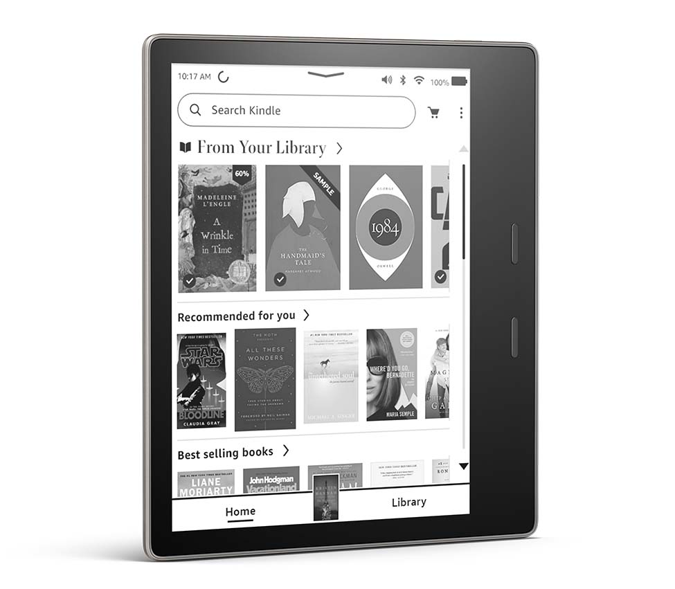
There’s been a lot of talk lately about Amazon changing the user interface on Kindles to add a new homescreen, a revamped library view, new menus and new functionality.
I came across a post on reddit that gives a good possible reason for the changes, one that makes sense on multiple levels, and the poster even gives directions on how to revert to the old user interface, but unfortunately that’s only possible on jailbroken Kindles. But apparently it’s really easy to change back to the old UI if you do have a jailbroken Kindle.
People keep asking why Amazon is changing the Kindle’s user interface so much. Why change something that has been working fine for many years?
According to the post on reddit, which was made by someone that knows the ins and outs of Kindle software and works on Kindle jailbreaking methods, Amazon is transitioning away from their previous Java based UI to a new one that’s based on React Native. Presumably this is being done to make it easier for software developers to use their skills to continue to develop the Kindle platform further and more efficiently.
The new UI on Kindles is a lot like the UI on the Kindle apps for iOS and Android, so it does indeed seem like Amazon is going for a more unified approach. From a software development standpoint that makes a lot of sense.
It’s also worth noting that more changes are likely coming to Kindles in the near future, as there are apparently more references to additional UI changes in the code for the 5.14.2 update.
I think Amazon’s biggest mistake with the new user interface is pushing it onto older Kindles that people have been using with the old interface for as long as 7 years. People got used to the old interface and now they’re being forced to use the new one without any warning or explanation. I can see why that’s ticking a lot of people off. Amazon really should have just updated the current models and left the old ones alone.
via: reddit
The ideal would be to allow user to choose between the old and new interface while keeping the new system updates that enhance performance and security.
I’m a long time Kindle user. I bought the Kindle 2, Kindle 3 (keyboard), Kindle Paperwhite 2nd and 3rd gen, Kindle Voyage, Kindle Oasis. When the back light came out, I bought a Nook Glow at first, I had an original Nook ereader before Kindle, so tried it out and it was OK but the Paperwhite blew it away. I also bough a Kobo Libra recently for my sister overseas and thought that it was just as good as my Oasis. I used it for the first couple of months. Overdrive support, as a library digital user, was really nice with Kobo. Still I stayed with my Oasis but there was an update last year, I didn’t really like, and then this one that I actually hate, hate. I’ve tried to get used to it but just cannot.
There are several issues I have with this new OS,… that they got rid of the back button, I miss it greatly, that the home button is now a shared button that sometimes (rarely) puts you in “list view” and sometimes in their “home screen” Amazon selling suggestion environment, just frustrating. I had my Kindle set to list view for home button but you no longer have that option. Tapping on the top of screen brings a modified menu but then you have to swipe down or tap the down arrow to get to settings. I liked having all my menu and how it worked. Now in the list view or home screen there is a big “SEARCH” button that takes one book listing away from list view. At one time, the list view had 8 books listed per page without ads, then it went to 7 with an update and now it is 5 books per page, why? Well because the search bar takes one book and the cover view even in list view takes the other. Only 5 books! takes flipping through your books a lot longer and more tedious. Voice view, which I will switch to if my hands are busy, has the worst screen reader they could get. Google voice reader is much better and it is not all that good. And it is very hard to turn on and off even with the new on/off with the pull down, that is when it senses your BT. Kindle Keyboard’s TTS is so much better and it is from 10 years ago.
I haven’t update any of my older Kindles and will side load, so that they work as I want them. It takes more time and the whole point was to be able to on occasion, get a book on the fly, like while on vacation. I’ve decided after a couple of months of suffering with my Oasis that I’m buying a Kobo again so that I can have an eReader that is just that, an eReader. That it has Overdrive straight to the reader, so on the fly, without all the hoops, just another plus. I hate the new OS of Kindle, long, long time Kindle buyer and user. I might go back to my Oasis if Amazon ends up fixing all the missing parts but Kobo will be my eReader of choice for the bigger screen times and my Voyage, not updated, will be for my purse. It is a great size.
Whatever it takes for them to finally give us more Font sizes.
I like the new UI and I’m glad they made it available for my old 7th generation Paperwhite. If they’d just fix the”invalid certificate” problem when looking up words and phrases in Wikipedia I’d be completely happy with it
Thanks, Nathan, very helpful information. I too dislike the new, cluttered UI. Fortunately, my Kindle Voyage (perhaps the best Kindle reader ever) still has the old interface, and, hopefully, will not (cannot?) be updated.. One thing I love about KIndles, and it keeps me buying them, is the ease of highlighting and notetaking, instantly uploadable to my computer via email, in an easy-to-read format. Kindles are great research tools, lightweight, portable, and readable in sunlight and and in a darkened room.
The vanished back button that lets you retrace your steps is sorely missed when studying
Indeed. It’s like the developers never read a nonfiction book on a Kindle before. They think we’re only supposed to read in a linear fashion from beginning to end, I guess. What’s really annoying is the back button functionality still exists in the help section of the Kindle’s settings menu, so it’s still there, but they won’t let us use it while reading.
Lou Sevens here- I do like being able to scroll for the books but it’s not as smooth as say the app on the phone or perhaps computer (even though the e ink is better)
My 10th generation Kindle forced the new upgrade on me last week. For me the killer is that there is evidently no way to show books other than with the book cover. For me the resolution on the Kindle simply isn’t up to the job. I prefer a view showing the author and title.
If this continues, I’m going to simply dump my 3 old ones, and shift over to one of my Kobo’s.
Sheesh!
Comments like this confuse me. There’s still a list view option, but it just shows small covers now in addition to the text. It’s literally the exact same thing Kobo’s do with their list view in the library, including the vertical scrolling.
Unfortunately, there is no list view option when you use Collections. There is no way to make items in Collections show up as a list. If you have fifty books in a collection, it’s a pain. It’s part of the overall society transition from reading words to looking at pictures.
It is possible to view collections in list view. The new list view. See here: How Collections Work After Latest Kindle Update.
Sorry. I am already using collections in list view, following these instructions:
“If you want to view your collections in list format you have to use one of the other settings, and then choose “Collections” from the filtering menu that’s accessible from the top left of the Library (this option does not appear with the default setting).”
Unfortunately, this option does not show a real “list.” It populates the screen with made-up blank icons that just take up room. All my collections would fit on one page (instead of four pages) if it truly was a list without icons. As it is, it will only show five collections per page…with a whole lot of wasted space.
This “update” is a giant mess. The comments on here prove it. It shows complete disregard and disrespect for the paying customers. An option should be added to nix all book pictures and icons.
I talked to someone at Amazon about this. They actually had the nerve to suggest that I buy a Kindle Fire to read the books I have already purchased.
I HATE the new format! Each and every morning I read a series of daily meditative books…a couple of them won’t even open! I have been doing this ritual for over 13 years and I can’t begin to tell you how disheartening this is for me! I may have to discard my kindle and look for another option.
I know I’m late to the story but my wife bought a new Paperwhite and the new interface is terrible. She is getting use to it but one big feature used and I do on my old Paerwhite is being able to jump to a specific page in the list of books. We both tend to have a lot of books on our Kindles and sometimes just to randomly jump into the list and pick a book on the page.
Just today I noticed they also changed their online interface to make listing your library and see what has been read or on devices and how many now requires two mouse clicks per book title where you use to require none. They also went to a less compact list so now it only list 4 books per page, makes it hard to fine things. At least let us customize the look.
To sum up it looks like Amazon is screwing up all their interfaces, Don’t these their developers use their own product. It is pretty but harder to use.