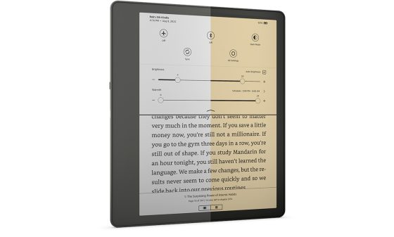
After reviewing the Onyx Tab Ultra C last month, I got used to using the gesture-based navigation on it and it’s so much smoother and more intuitive than the interface on Kindles.
Every time I go back to using a Kindle it feels like going back in time ten years. Just about every action requires a series of multiple taps to get anything accomplished, and there are a number of inconsistencies with the user interface that makes things unnecessarily confusing.
If you’re reading in landscape mode on a Kindle, navigating the interface is even more cumbersome because every time you go back to the homescreen or library or the main settings menu the interface reverts back to portrait mode because only the reading interface supports landscape.
One thing I really like about the gesture-based navigation on the Tab Ultra is the ability to go back to the homescreen by swiping up from the bottom of the screen, and you can also swipe from the left side to go back. You can do things like adjust the frontlight level by swiping up and down the side of the screen, or open a list of recent apps to easy jump back and forth between notes and books, and you can set other actions to gestures as well.
Swiping is simply a lot faster and easier than tapping the screen and hunting for back buttons and different menu icons. It’s also nice not having to open a menu to adjust the frontlight level, and not having the menu cover most of the screen so you can’t see what the actual text looks like while adjusting the light level.
Jumping around between multiple documents and notebooks on the Kindle Scribe is an especially clunky process. It could really benefit from some navigation upgrades. I didn’t realize just how clunky the UI was until using the Tab Ultra.
Kindles have a lot of good things going for them, but when it comes to navigating the interface some improvements need to be made. I have no idea how people manage to navigate large libraries on Kindles.


Actually, I have a huge library. In this aspect, I actually Prefer Kindle over Kobo etc. Once all your books are indexed, just go to the search bar and begin typing the title. Although both Kobo and Kindle will find a book by title, Kindle will search trough the entirety of your library for keyword/s.
Setting up collections is a bit of a pain and needs improvement…sub libraries etc.
The Kindle team must have a mandate to keep things simple and not customizable.
Indeed, using search is a must—it’s the best way to find stuff.
Front light gestures aside, the features you mention are available on Ultra C because it’s an android device.
Boox are android tablets with e-ink. These are productivity devices, not simple e-readers.
I can only speak for Boox Leaf2, Kindle PW5, Kobo Libra2 and Pocketbook Era (neat device, excellent screen btw), but non-androids do not have the same functionality.
– None of the non-android readers have system-wide gestures for navigation. Even side swipe for light only works in reading mode.
– Screen turn in Boox changes orientation for the WHOLE SYSTEM. While in non-android e-readers no part of system outside the book is available in landscape – you pointed this out for Kindle, but this is true of Kobo and PB too.
– Only Pocketbook has process manager, allowing to switch between system apps. No other non-android e-reader has it.
Basically, for all that nifty stuff you like so much on Ultra C you’d need to stick with android devices. Possibly with Boox specifically, since it has all the things you like.
Personally, I don’t consider library management terrible on Kindle. I prefer it.
True, it was a pain to setup collections for purchased books but now I have a system that works. I add more collections as needed. I also have collections specifically for sideloaded books. Also – search.
You’re forgetting one somewhat new gesture on Kobos that Kindles could really benefit from, swiping down from the top of the screen to access a list of recently-opened files, including notebooks. And Kindles have supported swiping up from the bottom of the screen to access the multi-page view for a long time so it’s not like only Android devices are capable of such features.