Color E Ink has been around for several years now, but it’s just starting to gain more attention and popularity since Amazon and Kobo started selling ereaders with color E Ink screens last year.
Color E Ink is a divisive technology. Some people really like it, and others hate it. For those new to E Ink screens, I think it’s easier to overlook the drawbacks of color E Ink if you don’t have a regular black and white E Ink screen to compare it with, but it’s harder for people that are already used to the look of regular E Ink screens.
One thing that’s interesting about Amazon’s approach is they admit, in an indirect sort of way, that color E Ink offers an inferior reading experience when it comes to black and white text.
Most people probably skim right over it, but on the product pages for every color Kindle, including the page for the new Kindle Scribe Colorsoft, Amazon has a variation of the following statement in the FAQ section:
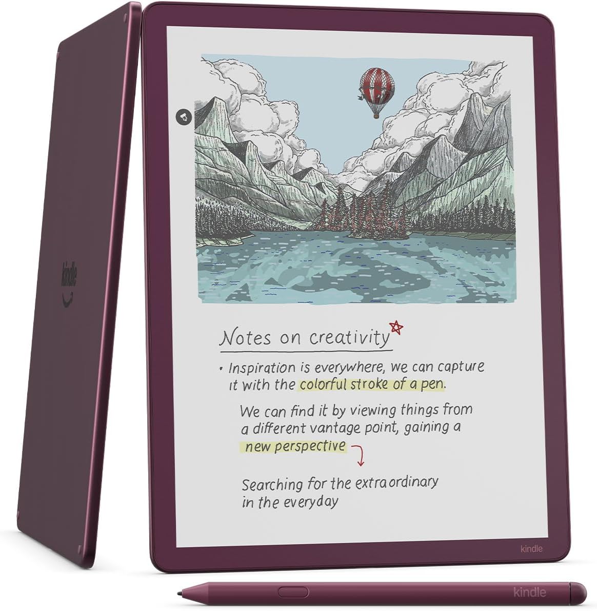
1. How is the reading experience different on Kindle Scribe Colorsoft than on Kindle Scribe?
The Colorsoft display is distinct from the Paperwhite display. The Kindle Scribe Colorsoft is designed to provide a high-quality reading and writing experience in both color and black and white. You may notice that the texture or brightness of the display looks different than the Kindle Scribe display. That’s because of the color filter layer that creates the easy on the eyes color reading experience on Kindle Scribe Colorsoft. If you are looking for a slightly crisper black and white reading experience, you may want to check out Kindle Scribe.
Note that last sentence in particular. On the Kindle Colorsoft page the wording is slightly different, but Amazon is saying the same thing:
If you are looking for a slightly crisper black and white reading experience, you may want to check out Kindle Paperwhite, which has the fastest page turns and highest contrast ratio of any 2024 Kindle device.
That statement says it all.
Other companies that sell color ereaders and eNotes tend to avoid admitting that color screens have any kind of deficiencies compared to black and white screens. A lot of companies use terms like “soft” and “soothing” when describing color E Ink, and they dance around the topic a bit, but they don’t usually outright say other BW devices offer better contrast and a better black and white reading experience.
Amazon is known for using a lot of underhanded marketing tactics, so it is a little surprising to see them of all companies adding an obvious acknowledgement like that to the product pages of color Kindles. Maybe they’re hoping it’ll cut down on customer returns.
I agree with Amazon’s text as a whole. We can emphasise the final part (which you highlight) or the initial and central part. Emphasise the black and white text or emphasise the colour. The controversy you refer to stems from this different perspective. Some focus on black and white, while others focus on colour.
Personally, I have always believed that the only way to understand colour e-readers is precisely through the word “colour”. Monochrome e-readers may have fabulous contrast and unbeatable sharpness, but they have no colour. And those who buy a colour e-reader do so for the colour, something they will never get from a monochrome e-reader, no matter how excellent its screen may be. The main feature that defines a colour e-reader is not its lower contrast or sharpness, but its colour. And whenever we talk about a colour e-reader, we leave what constitutes its raison d’être in the background. A colour e-reader does not compete with the black and white text of a monochrome reader, but rather provides the colour that is missing.
I don’t think Amazon is thinking about returns. I remember a statement that caught my attention from a PocketBook representative in a German forum: the return rate for monochrome and colour e-readers is similar (in fact, PocketBook is the only brand that offers e-readers of both types in all sizes). From a “monochrome” mindset, it is inconceivable that colour e-readers will not end up being returned. Why would anyone keep an e-reader that is inferior in contrast and sharpness? The answer is obvious: for the colour. Until we understand this, our differences will be irreconcilable.
“(in fact, PocketBook is the only brand that offers e-readers of both types in all sizes)”
Actually, Onyx also offers bw and colour screen options from the same sizes. Currently, kobo is the only one, who doesn’t offer any 7 inch bw model anymore.
Onyx Boox does not currently have a 6″ colour e-reader, nor does it have an 8″ monochrome model (and I believe the 8″ colour Tab Mini C has also been discontinued). It may not take too long for them to incorporate these models, but they do not have a parallel line like PocketBook. They alternate between monochrome and colour models as they see fit.
Oh you’re right, onyx doesn’t have those. But at least they released the same 7inch model with both screens. And they probably see the gappy model lines of kindles and kobo devices so hopefully something will happen soon.
It’s been saying that on the colorsoft page for a long time now. Weirdly I like my colorsoft more now, I like it more in dark mode too. Depends on time of day and lighting
There’s a use case for colour e-ink, but it isn’t book reading. Of course for coloured content it’s better.
A lot of people on reddit buy colour ereaders to read novels and other bw books.
Just think about it, how much time do you actually spend reading a 500-page book, and how long do you even look at the colour cover? I’d assume you don’t stare at the book cover for hours.
Kobo seems to be the only one giving more attention to Kaleido 3 screens, probably because a colour display looks more attractive to the mainstream than black-and-white screens, even if that means a mediocre or below-average reading experience.
Hopefully this is just short-term hype, and it’ll fade away like it never even happened.
If anything, I hope the popularity of color e-readers will encourage more research into improving the technology and one day achieving 300 PPI for black and color, and narrowing the gap between the contrast of b/w and color e-readers.
I wholeheartedly support a market for both b/w and color e-readers. People have their preferences and choosing the highest quality screen and contrast level isn’t everyone’s top priority in choose their particular model.
Gallery 3 could be improved probably, but right now it’s very slow, also has bad contrast, the black is actually dark grey on a light grey background, and with all these, it’s still super expensive.
Instead of improving colour screens, it would be more important to make these displays at least less fragile.
We’ve had e-ink screens for at least 15 years now – and except for the Kobo Forma, which was discontinued long ago – the screen still most likely gets irreparably destroyed from even slight pressure or an accidental drop. Meanwhile, a new screen still costs almost as much as a new ereader… if you can even get your hands on a replacement display and repair kit.
But I guess amazon and kobo are happy if you break your ereader, so you have to buy a new one (If you don’t choose to suffer through the repair steps yourself in the case of a kobo.)
In my particular case, colour is present on every page of my books, as I have the header (title + author) and footer (number of pages + chapter title and remaining pages + time) in colour. I also have the following elements of the text of a novel in colour: chapter titles and subtitles, footnotes, quotations, and other minor elements (initial letters, epigraphs, poems, links, text selection, search results, and TTS…). Underlining is also in colour. And all the external utilities associated with reading (which I use frequently) are also in colour: dictionary, translator, web search, Wikipedia. I keep the base text in black, but all these touches of colour are aesthetically very pleasing to me when reading regularly.
Personally I couldn’t care less about colour e-ink screens. I don’t mind though, I do accept that other people like them.
Although I support the principle of simplicity and the classic unix philosophy: do one thing and do it well.
By that, an ereader should have one purpose – to read books – and it should fulfil that flawlessly. But if they turn ereaders into iphone- or ipad-like devices, they’ll lose their actual purpose. One task can be done perfectly, but trying to do many at once always fails.
@Cellaris
“Monochrome e-readers may have fabulous contrast and unbeatable sharpness”
I have smart phones and tablets with a higher ppi/dpi and thus better sharpness than any e-ink reader. Naturally these phones and tablets can’t be used with their backlight on, whereas e-ink displays can be used with just the light of the environment.
And on topic: I think Amazon is just stating the obvious regarding colour e-ink displays and I wouldn’t use “admit” here. But that may just be semantic and my personal preference.
Maybe after the market is saturated with kaleido 3, will have new refinement of gallery 3 color displays to replace the old technology
And the reason I see the ColorSoft as an expensive useless device for my use. My vision issues leads well for e-ink even better than paper books, and definitely better than phones or tablets. If my vision was better then I still wouldn’t want color e-ink as a normal color screen would be much more vivid.
Like they say : It’s not better, it’s different.
Get over it. ☺️
I don’t take it as they are saying the colorsoft is not as good as the B&W screen, rather just to be slightly different. As a way to warn buyers not to expect the same behavior. People that complain about the colorsoft generally seem to expect more than it is. They are looking for a tablet experience.
We have both here. A Scribe and a Colorsoft 7″. Yes, the Scribe is “clearer”. However, both my wife and my parents and in-laws prefer the color. In part because the cover art helps make the books stand apart from each other, bust mostly because they like that but if texture/grain-e-ness. They say it makes it even more like trading a physical novel. They all read just for enjoyment, and we’re reading a lot of books each year. So even know they don’t need to have color, they opted to buy the colorsoft for that. And they all tried a Paperwhite or scribe before doing the colorsoft.
You will find many others consider that texture/less crisp experience to be a “feature” in their mind. I personally thing it may be related to what stuff one is reading and maybe what one has gotten used to.
Many also like to highlight specific sentences or quotes in books too. I’ll often do that in real books. Having this ability in a ereader would be very useful. I’m still on the fence and haven’t bought a color ereader, yet.
Has anyone else noticed that, at least on Facebook, whenever Amazon posts about the New Kindle Scribe, they don’t allow comments?
I may be “reading” too much into it, but I wonder if that’s so people won’t comment about the prices.