
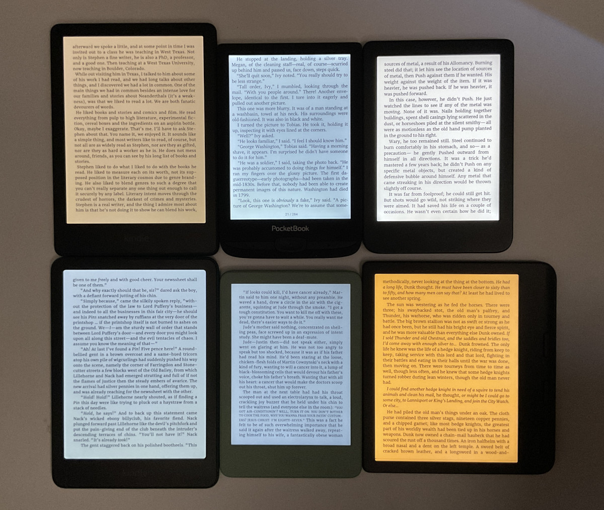
One of the frustrating aspects of ebook readers is the wide variance of colors when it comes to frontlights (they’re still mistakenly called backlights most of the time, but E Ink screens can’t have backlights). Even if you buy two of the exact same models, there’s a good chance their frontlights will look different.
It would make a lot more sense if each ereader had specific color temperatures that companies advertised and adhered to throughout the product lifecycle.
Right now it seems like manufactures just use whatever random LEDs they can get for the cheapest.
As a result, frontlight colors are all over the map. Some have a pinkish hue. Some have an ugly greenish hue that nobody seems to like. Some are far more yellow or orange at the warm setting than others. Some have a harsher blue tone. There’s no standard. There’s no consistency. You never know what you’re going to get from one frontlight to the next, even among the same brands and models.
When you buy lightbulbs, they show a specific color temperature on the label measured in kelvins. Warm color tones are generally in the 3000K range and lower and cool colors are 5000K and over.
How is it that we can get standardized colors for LED lightbulbs that cost $1 each, but ereader companies can’t give us a range of the frontlight color temperature on devices that cost upwards of $700?
It would be great if frontlights were more consistent, and it would be nice if the software could display the light temperature in kelvins. Once you know the color temperatures you prefer, it would be easy to dial things in how you like it.
Specified specs is alway nice, it lets you know what exaclty you’re getting and leaves less space for funny business.
Still I haven’t experienced this much since I’m just a single user and don’t replace my device every year.
That said I don’t think (imho) that this acrticle would fit every device since my note air c has adjustable cold/warm lighting for example?
Yes, but sometimes the lowest setting is too warm, for example.
That’s the whole point. You can get one piece of Note Air C which when you set warm light to zero will have quite white screen. And then another one same device which will have it yellow or even orange at the same settings. That’s unfortunately norm with ereader screens.
I’d like to see red front lights or whatever you call them today. Orange light is nice but it’s not as comfortable as red lights. I have a clip on book light and I found myself using the red setting the most for long periods of reading.
Interesting, I’ve never experimented on those. Now I wish there was such a setting too since I’m never going back to a clip on book light it feels so bothersome.
Its a little clunky and top heavy but for bed reading it’s great. I’ve contemplated cracking open one of the two front light Kindles I have and inserting a sliver of red filter film over the LEDs.
Interestingly, the Kobo Aura One had two versions, one had an orange light and the other had a red light. Personally I’d prefer the orange one, although later Kobo devices only have yellow light..
That’s why I keep my devices always in dark mode. The letters with the different shades of warm coloring are not eye tiring and any shadowing of screen imperfections aren’t as noticeable to me as it is with dark mode turned off.
Doesn’t the Kobo Libre 2 have warm and cool toned lights?
I know, I know, it’s discontinued but I still love mine.
I would consider using a frontlight if I could have one with no blue light at all, and no PWM. Until that happens, I still use a clip-on book light from BlockBlueLight that fits the bill … and leave the frontlight on my GloHD well and truly off!