
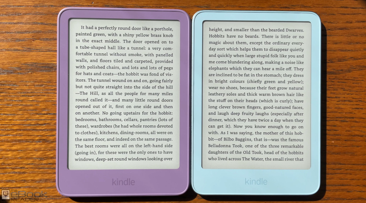
For the first time Amazon has released two distinctly different versions of the basic Kindle. I decided to buy both to see how they compare, and after testing them I’m still not 100% sure which one I like better.
The aluminum version looks classier and it feels like a premium device—it’s very nice for a basic Kindle, the nicest one ever. But the plastic version is noticeably lighter, and for some reason the contrast appears to be a little better on the Ube Kindle than the Alpine Sky aluminum version, even though that shouldn’t be the case since they literally have the exact same screen and front layer—I guess it’s just the E Ink lottery, or manufacturing differences with the front layer. At first I thought maybe it was just an optical illusion, but after further testing I don’t think that’s the case.
The plastic version of the basic Kindle comes in two colors, Ube and Graphite (purple and black), and it sells for $149. The upgraded aluminum version comes in Alpine Sky and Seaglass Green, and it sells for $189. The aluminum versions are ad-free by default, whereas the plastic versions have the option for ads or no ads (ad-free adds $20 to the price).
Another difference, the aluminum versions come with 32GB of storage, whereas the plastic versions come with 16GB.
One thing that Amazon doesn’t seem to specify anywhere, the aluminum version adds magnets to the back that are compatible with Amazon’s new magnetic case. The plastic Kindle does not have those magnets so those cases won’t work (Amazon needs to make that clearer).
The plastic Kindle weighs 140 grams. The aluminum Kindle weighs 162 grams. That’s not a big difference by any means, but when going back and forth between the two it’s hard not to prefer the lighter one. The plastic also has more texture on the back that adds more grip; the aluminum version has some texture too so it’s not super slick, but the metal is colder to the touch than plastic.
Honestly, I’ve never been a fan of the cheap plastic feeling of basic Kindles (and Kobos), so I much prefer the look and feel of the aluminim casing, but if you’re planning on keeping your Kindle in case all the time it’s probably not going to make a big difference either way, unless you want to use a magnetic cover.
The main problem with the new aluminum Kindle is the price. For only $10 more you can get a new Kindle Paperwhite with a bigger screen and a better frontlight. Plus it adds waterproofing and battery life is doubled. But if you want the aluminum Paperwhite with 32GB that adds another $50 to the price. Why does Amazon make choosing a Kindle so confusing?
I definitely prefer the aluminum. But out of these two, the purple is clear winner simply because of the contrast, the difference is absolutely crazy.
It is crazy, to the point where I started questioning if the front layer is somehow different on the aluminum version, but I don’t think it is, and it’s only noticeable under bright lighting; in normal lighting with the frontlight on the screens look identical.
Yeah, I believe it’s the screen lottery you mentioned. Last gen I tried so many Kindles… I finally landed on one good after 8 or 9 returns and literally every single screen was different. I wish E-ink did something about it. But I guess the lack of competition doesn’t exactly motivate them to do better 🙂
I believe the basic Kindle is centered around the 6-inch size, which would be ideal. However, the absence of a warm light completely deters me.
I will patiently wait for the SE to go on sale which will most likely be within a bundle. There’s no reason to purchase the Paperwhite without ads when the SE is available for $30 more.
I though the same thing, but then I saw the reviews and people comparing last gen Basic with the new one. The old one had blueish white light while the new one is much warmer, so I might be perfectly okay with it. Same thing is on my Viwoods reader and I never missed warm light for that reason.
Don’t take the early reviews as gospel; it’s a frontlight lottery, after all. The frontlight on my basic Matcha Kindle that I got on release looks exactly the same temperature-wise as both of my 2026 Kindles.
Oh. And I was so hopeful. But so far every single photo in reviews on Amazon.com, UK and DE I’ve seen showed the same warm tone. So I really hope it’s a change and not just luck. But who knows.
I believe the contrast issue is because of the lighter color of the case. The light blue or green as compared to the darker purple or black. I always prefer a dark case Kindle. It allows the screen to look brighter.
Come on Kobo, please give us an aluminium reader, whatever plastic you’re using is really cheap and nasty.
I prefer plastic. I don’t like the cold feel of aluminum (for example, on my MacBook palm rests).
That would be awesome. I hate the cheap plastic feeling of most ereaders. I absolutely loved my Oasis 3 and used it caseless all the time. Kobo really needs to step up their game now. But I don’t think they will. If they introduce another generation I believe it’s gonna be all plastic and all color e-ink.
Or at least a nicer plastic!
Definitely prefer comfy to hold plastic since I don’t use covers. And I like boring black for the contrast.