
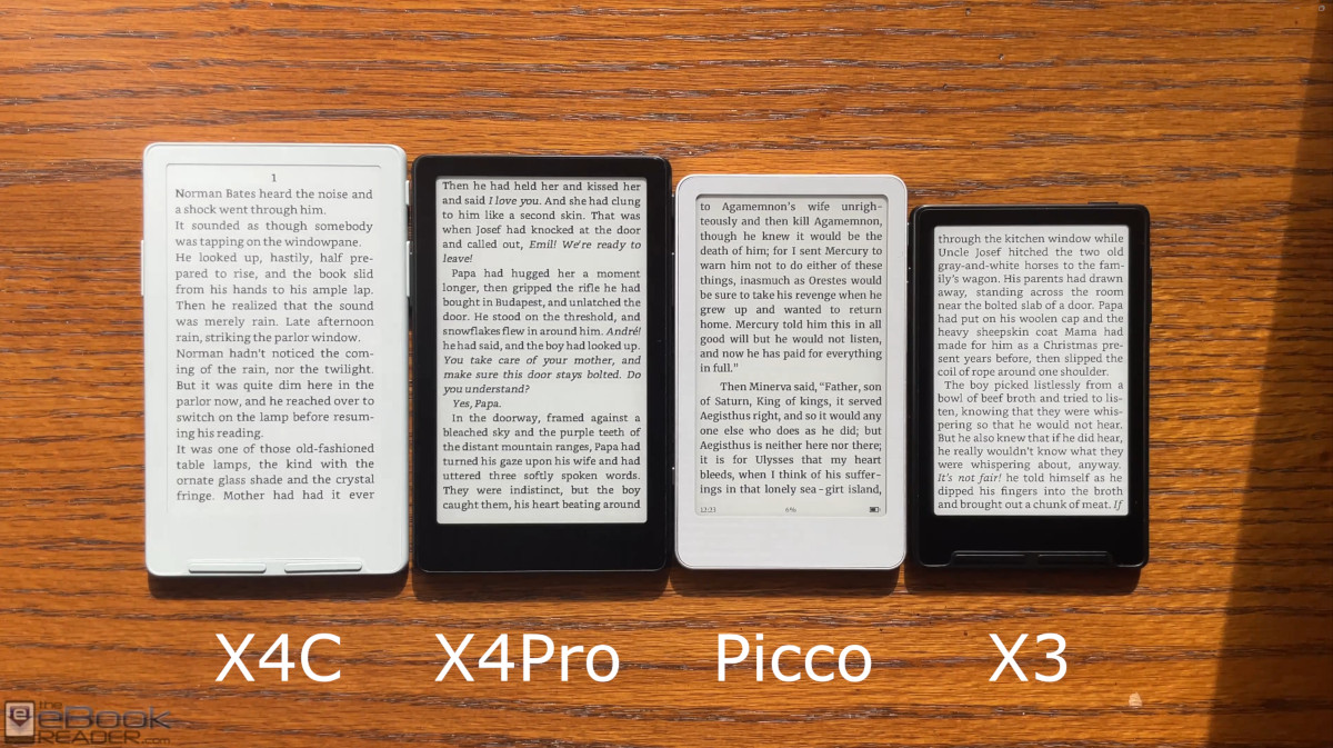
Last week I uploaded a video comparison between the Boox Picco and the Xteink X4 Pro, X4 Classic and X3, and I thought I’d write down some thoughts comparing the four mini ereaders.
I’ve had the Boox Picco for a couple weeks now, but since the stock software sucks I haven’t wanted to use it, and I don’t want to install CrossPoint yet because then I’d just basically be reviewing CrossPoint for the 3rd time, so I’ve been waiting for Onyx to update the software, and they finally did today so I’ll upload a review showing the new V1.1 software on the Picco soon, but in the meantime here’s a hardware comparison between the Picco and Xteink’s mini ereaders.
Since the Picco’s software is still a major work in progress, and it’s way behind Xteink’s ereaders functionally, the video only focuses on the hardware aspects of these devices, the size, the frontlight, the build, etc.
When I first got the Boox Picco, I was surprised by how small it is, particularly how narrow it is compared to Xteink’s devices. Since the Picco has a 3.97″ E Ink screen I was expecting it to fall in between the Xteink X3 with its 3.7″ screen and the X4 with a 4.3″ screen, but it’s actually slightly narrower than the X3.
The screen ratio is different on the Picco; it’s longer and narrower than Xteink ereaders, which I wasn’t expecting. And the screen is set farther back behind the flush layer so the text isn’t as close to the surface.
The build quality of the Boox Picco feels pretty nice, though, but it’s like they couldn’t agree on the design so they merged three different designs together. The sides are aluminum, but the back is plastic with a weird two-tone color scheme that doesn’t match the front. The front bezel is darker than the mist gray of Xteink’s ereaders so it doesn’t quite match the background color of the E Ink screen.
Speaking of which, the background color of the screen on the Picco is noticeably darker than all of Xteink’s ereaders, especially the X4 Classic. Something is different about Boox’s flush layer and/or light layer that makes the screen look darker.
On the plus side, the frontlight is more even on the Picco than it is on the X4 Pro, which has subtle brighter spots on the lower part of the screen. The frontlight color is much yellower in tone at the cool end on the Picco, but it looks good on its own.
The Picco is the only one with a USB-C port, and some people consider that a big advantage over Xteink’s with pogo pins (personally I couldn’t care less since they need to be charged so infrequently). Xteink claims they got rid of the USB port to make their devices thinner. The difference is only like half a millimeter; it’s literally not even noticeable. In fact, the X4 Pro is slightly thicker than the Picco so that excuse doesn’t hold up.
Personally, my hands prefer the larger size of the X4 Pro and X4 Classic. The Picco is so narrow that my fingers curl around the screen, and it just isn’t as comfortable for me to hold—it’s the same story with the X3. But if you have small hands you might find the smaller size more manageable (my hands are way larger than average). The side buttons also have a nicer feel on the Xteinks; the buttons are extra firm on the Picco and require more pressure to press.
The X4 Classic is my favorite model of the bunch because it has the best contrast without the added frontlight and touchscreen layers, and the mist gray color matches the background color of the E Ink screen almost perfectly. The contrast difference is striking and instantly noticeable in person, even you don’t have them all side-by-side. The downside with the X4 Classic is it feels slightly cheaper than the other models with the plastic sides—the original X4 and X3 feel nicer.
Leave a Reply