There’s a new software update available for Kindle ereaders. The new firmware version is 5.8.2.
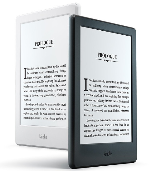
It applies to the current lineup of Kindles, including the Kindle Oasis, Kindle Voyage, the Paperwhite 3 and the new entry-level Kindle (8th gen).
The update is also available for the Kindle Paperwhite 2 and the previous entry-level Kindle Touch (the 7th gen model).
The 5.8.2 update is releatively minor. It adds one new feature and includes the usual ambiguous “performance improvements”.
Here’s the note for the update:
Improved Tables Experience: Reading and navigating tables inside your books has been improved with optimized rows and column spacing, a pagination indicator to preserve context for multi-page tables, and a new pop-up table viewer with zoom and pan capabilities so you can interact with large tables at any font size.
Like usual you can wait for the update to automatically download and install on its own (as long as you have wireless connected and turned on).
Or you can download the update now and manually install it yourself.
The directions and download links can be found on the official Kindle software updates pages at Amazon for each individual model.


Still waiting for the update that makes the Bookerly font bolder. Oh well here’s to the new Kobo Aura One…
Helvetica seems much bolder to my nearsighted eyes than Bookerly – maybe because of the font size I use, 5 usually with smallest margins and spacing…
Yes, I pretty much use Helvetica because it’s the boldest.
Yes indeed Helvetica is much bolder then Bookerly, actually it’s the boldest font available in the Kindle line-up. I personally cannot read a novel in any sans font which is why I wish the Bookerly font was much bolder. I also try and imbed my own fonts in side-loaded books but the problem with the Kindle is that the size options are terrible and I can never seem to get it just right along with the line spacing. Just another problem with the limited options available on the Kindle. Of course this is personal preference but I can assure you I’m not the only one that thinks this way.
No argument here. I can’t explain why but I’ve always preferred sans fonts and always use Arial if available. If that wasn’t the case I suspect I’d be considerably less satisfied with my 2015 PW.
Now that most models are 300 dpi it seems to me that we’re overdue for at least some basic font weight options?