The Kobo Glo HD is the second ebook reader behind the Kindle Voyage to use E Ink’s highest resolution 300 pixel-per-inch Carta screen, and the Glo HD comes at a much lower price.
I wanted to put together this comparison review showing the Kobo Glo HD’s screen up close to show how it compares to the more expensive Kindle Voyage and Kobo Aura H2O, and the old school Kobo Touch with an 800 x 600 resolution screen.
This review focuses on text clarity only, not how the frontlights compare. I’ll show frontlights with each individual review and comparison.
In short, the frontlight on the Glo HD is the whitest of the bunch, with just a hint of blue. The Aura H2O is yellower in tone, and the Voyage is pinkish orange by comparison.
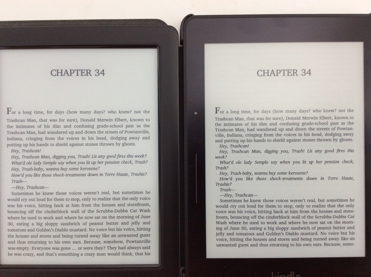
I loaded the same the book (Stephen King’s The Stand) on all four devices, with the same font, Charis SIL ModifiedLarger, embedded in the book using Calibre.
Higher resolution screens are best compared with small font sizes since that’s where you can see the most difference. So I’m using the smallest font size on the Voyage, with the comparable size on Kobo’s devices. Kobo’s software offers a lot more font sizes overall, and there are several smaller than what the Kindle offers.
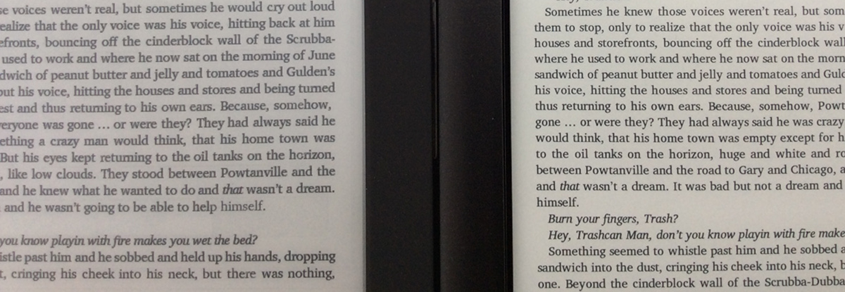
When comparing with the Kindle Voyage, I can’t see any difference at all. Fonts are rendered ever so slightly differently, but sharpness, contrast, text darkness, and clarity all appear the same to the naked eye. The Glo HD’s screen background looks a little lighter in tone, the Voyage’s background is a touch creamier, but text looks virtually identical.
The picture at the top of this article shows the Glo HD (left) and Voyage (right) at the Voyage’s smallest font size. My camera doesn’t focus on small text well over the span of two displays, so it’s about impossible to show in pictures (any perceived difference is more light and camera related than any actual difference). I uploaded a video in 1080p that shows things a little more clearly (see below).
Comparing the Kobo Glo HD with the Kobo Touch shows the difference a lot more. The Glo HD has almost double the pixels at 300 ppi; the Touch has 167 ppi. Here’s a picture with both at the lowest font size (click for larger):
I don’t have any 212 ppi ereaders to compare with anymore but if you really want to see the difference check out my Kindle Voyage vs Kindle Paperwhite video comparison review.
When comparing the Glo HD’s screen with the Kobo Aura H2O, I can’t see much of a difference in text clarity at all; the text on Glo HD is maybe a touch darker. There’s only a difference of 35 ppi. There is, however, a big difference in the tone of the frontlights between the two devices. I’ll show that in the direct comparison review tomorrow.
I’ll be posting several more reviews and videos of the Kobo Glo HD this week. Check back or subscribe to The eBook Reader Blog to keep updated. For those wondering why I’m reviewing the Glo HD after I said I wouldn’t, it’s explained on this post in the update.
Update: Here’s the link to the full Kindle Voyage vs Kobo Glo HD Comparison Review.
IT would sure be handy to know which is which in the photos! “Left” and “right” are useful words in captions.
I didn’t think it needed to be stated twice, especially with the top half of the Kindle logo present. 🙂 The photos are immaterial anyway as it’s nearly impossible to capture what the screens look like in person. The 1080p video does a better job of showing things clearly but even it’s not completely accurate.
You mean like a brand name on a sticky label on each one? That’s too techie!!
Thanks for the comparison. The H2O and Voyage looked especially good to my eyes at least.