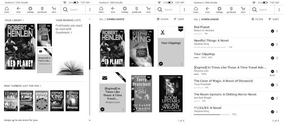
One unique aspect with Kindle ebook readers is the fact that there are three different homescreen views to choose from (shown above), but most Kindle users probably stick with the default option because it’s not very obvious there are alternatives.
One thing I’ve always disliked about Kindles is how everything is buried behind multiple levels of settings menus, and you’re never quite sure which section holds the setting you’re trying to find.
Just to turn on and off the default homescreen it’s literally a 5-step process.
Go to Settings > Device Options > Advanced Options > Home & Library > Home Screen View.
The default scrollable Kindle homescreen shows three recently-read titles, along with your Goodreads Reading Lists—if you don’t use Goodreads it’s just wasted space. Then below that there’s recommended titles, and when you scroll down or use the page buttons on models that have them there’s more recommended titles, including Prime and Kindle Unlimited ebook if you have an active subscription, and sometimes, if you’re lucky, there will be something different like Reading Stats.
If you continue to scroll down or hit the page forward button, the default homescreen will go to the Library View, where you can view 6 books with covers and use different sorting and filtering options.
If you turn off the Home Screen View setting mentioned above, you can bypass the scrollable homescreen and go directly to the Library View whenever you hit the Home button or back out of a book or menu.
You can also change from a Grid layout (cover view) to a List layout, which will show 6-8 books (depending on the model and if it has Special Offers or not) at once without covers.
Older Kindles used to use list view before cover view came along, and they kept it as an option for those that prefer list view, although most people probably use cover view at this point.
Which of the three layouts is your preferred homescreen setup on your Kindle?


Library view with covers. I’m very glad they don’t make you use the default Homescreen.
Me too, especially since I don’t use Goodreads.
I use the first option. I don’t care for any of the features (store recommendations, etc.), but because I usually read more than one book at a time, I like how easily I can switch between my three most recently opened books.
I prefer LIBRARY VIEW WITH
BOOK’S COVER. And I’d would like very much a KINDLE with 10’3 inch screen for PDF format and manga.
r/choosingbeggars
The third screen above (the list), sorted by Collection.
I use the option two from above.
Same here. The list screen.
List view. On a 6″ screen especially, information density is king.
I use the list view. I’ve had a Kindle since they first came out and I like being able to see the books I’m reading at first glance. I think the other views are basically ads for books.
I prefer the “original” list view of my Collections. My downloaded Collections fit on one screen, although it shouldn’t really matter how many pages of Collections I have on the Kindle, my current book(s) are in my NIghtstand collection.
I prefer the middle option. I immediately get rid of anything that offers content. Cover tiles catch my interest more than list titles.
Thanks for reminding me of the options. I get bored easily and like to change things around. And on that note, I appreciate each of those options, because sometimes I just want to find something old quickly, other times need something shiny and/or new.
List View with Collections. All my books are put in Collections by genre. Unread books aren’t in a collection yet, so they’re in the top-level list. Easy-peasy.
I prefer the list view. It shows how far I’ve read in the book I am currently reading.
List view. I don’t need to see the covers of *my* books, they’re already in my library. And when I’m looking for a recently added book, it’s by name, or author, not cover. The other views are not helpful for me at all.
This. Exactly how I feel. I want to see as many of my downloaded titles in one spot. If I need recommendations, I then go to the store.
I like the list view which allows me to see all the unread books at once. The other two lists are annoying.
List view used to show eight books, but it maxes out at seven since they added the Filter line. Annoying, since I use list view.
It’s surprising how many prefer list view. I didn’t know it was still so popular.
I *will* say this: If I’m in a reading slump and can’t decide what to read, switching to 0ne of the cover views will sometimes rekindle (ha!) my interest.
Not TOO surprising. I’d call list view an enthusiast feature that sacrifices some gloss and shine for additional functionality. And your audience is mostly enthusiasts. It is exactly the people I’d expect to use list view.
In a survey of all Kindle owners, I suspect list view would see much lower usage. I’d wager most Kindle users use the default home screen simply because it is the default.
List View, since it’s my only option. Still using a Kindle 3 …
Add another list view user
List view is what I always use. It’s more informative, even showing how ‘long’ a book is. It shows more books per screen.
I keep it on list view. I’d forgotten there was a library list with cover view.
I want built in Latin dictionary