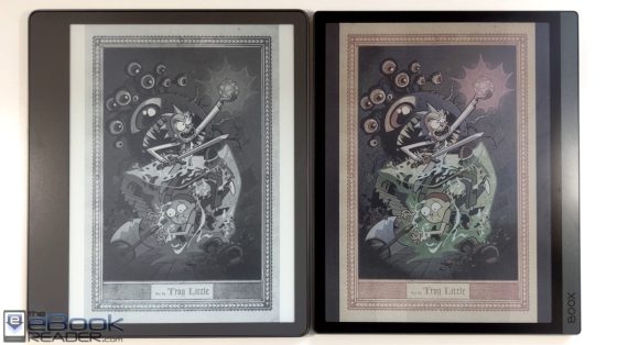
Onyx recently released the new Boox Tab Ultra C with a 10.3″ color E Ink screen, and the first thing I wanted to do after buying one was compare the new Kaleido 3 screen to a regular E Ink screen, along with the previous generation Kaleido Plus screen.
Right out of the box I was surprised by how good the screen looked on the Tab Ultra C. I’ve been pretty critical of E Ink’s color screens ever since they first came out, but things have improved quite a bit since the beginning.
With these new Kaleido 3 screens, this is the first time that I’ve thought maybe color E Ink really does have a chance of making it onto more popular brands like Kindles and Kobos in the near future.
They’ve really done a good job of minimizing the appearance of the color filter layer. With the previous Kaleido screens, the filter layer was clearly visible to the naked eye, which created kind of a screen door effect, like a subtle grid that you can see over the screen. With the Kaleido 3 screen that’s on the Tab Ultra C, it’s hard to see any filter layer at all, so the screen looks much smoother and clearer overall.
There’s still a fair amount of ghosting at times, and it’s more obvious with a color screen, and it varies between apps since they aren’t designed for E Ink screens. When viewing comics with the built-in app, there really isn’t much ghosting at all, but with the Kindle app you notice it quite a bit. There are some app optimization settings to help improve that, but I haven’t figured out the magic combination yet.
Either way, comics look way better on the Tab Ultra C’s screen than on a regular black and white E Ink screen, and it’s nice to have colors for book covers and other things too, like highlights and notes.
Colors are kind of washed out and dull compared to LCD screens, and that’s to be expected considering it’s E Ink, but to me the color quality is fine for the most part. Plus these new Kaleido 3 screens have improved color resolution, up to 150 ppi from 100 ppi on the older screens.
When it comes to reading regular text, color E Ink screens have a darker background color than black and white E Ink screens, but without the screen door effect, text actually looks quite good on the Tab Ultra’s screen, everything is nice and clear and sharp. Usually I’m critical about the appearance of text on color E Ink screens, but my first impression was I thought the text looked totally fine on the Tab Ultra C.
However, when you directly compare the screen side-by-side with a regular E Ink screen, like the one on the Kindle Scribe, there’s a big difference in terms of overall appearance. The off-white background color is much lighter on black and white E Ink screens. Color screens are darker overall, and benefit more from having the frontlight cranked up pretty high. Without the frontlight turned on the screen looks too dark unless you’re outside on a bright day.
I still think regular black and white E Ink screens are better if you’re going to be primarily reading ebooks and other text-based content, but there’s no denying how much better comics and other color content looks on the Tab Ultra C’s color E Ink screen, and they’ve improved the grid layer enough that regular text looks pretty good now too.


I am optimistic, now, that Kobo will put out a color ten inch device at 300 dpi(black/white) within a year…possibly late this fall. If the screen is as good as Onyx, I will buy.
Color E ink looks to be ready for prime time.
Thanks for quick comparison.
¿When can we expect to see a large-screen Gallery 3. ereader?
Who knows. The refresh rate is still too slow.
Color E-ink tech is getting there, but i’m still waiting for next generation though.
Kaleido just isn’t there yet. The color is still too washed out to be anything but a distraction. Also it is incredibly slow. Slower than the average b&w e-ink display. Wait a few years for the Gallery display is improved.
Kaleido is a black and white screen so it can’t be slower; it just has a passive color filter over the top. It might look slower next to the Scribe, but that comes down to differences with Android and using an app that isn’t designed for E Ink.