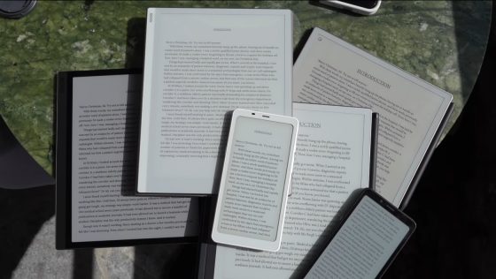
Last week the Remarkable Paper Pro was released. It’s the first eNote to use E Ink’s Gallery 3 screen with actual colored micropixels instead of an RGB color filter layer like E Ink’s Kaleido screens.
Color quality is better on Gallery 3 screens, but it looks like they still can’t match regular E Ink screens when it comes to displaying basic black text. Color E Ink always comes with some drawbacks, and it looks like that’s still the case with these new Gallery screens as well.
Some YouTube videos are starting to crop up that compare the screen on the new Remarkable tablet with other types of E Ink screens. The video below compares it to the Boox Go 10.3 with a regular 300ppi E Ink screen and the Boox Tab Ultra C with a Kaleido 3 screen, among other devices, and the Go 10.3 clearly has the better screen when it comes to displaying regular black and white text.
I knew there was something fishy about these new Gallery displays. They definitely seem like a step up from Kaleido screens, but they’re more expensive and there are still some drawbacks compared to regular E Ink screens. For instance, the “white” background is darker, but not as dark as Kaleido screens. Close up the text looks more jagged and rough for some reason, even compared to the Remarkable 2 with a 227ppi screen.
I think part of the problem is the fact that Gallery screens don’t have black micropixels like regular E Ink screens. They use a four-particle ink system with cyan, magenta, yellow, and white colors. So black is a mix of colors. There’s also the fact the Remarkable Paper Pro only has 229ppi vs the Boox with 300ppi so text is inherently clearer on the Boox Go 10.3. It would be interesting to see how the Gallery screen would look with 300ppi.
When it comes to color quality, the Gallery 3 screens are indeed superior to Kaleido screens, but they still don’t look as good as cheap LCD screens, and the screen refresh is kind of jerky and slow. Color looks impressive for E Ink, though, but I’m not sure if these screens are going to be a good option when it comes to just reading regular ebooks and PDFs without color.


I am quite worried that it’s going to be years until the colour screens catch up with b&w screens for displaying b&w content (i.e., books!), and in the meantime there will be no new quality b&w readers released.
I’m still hoping for a new Sage with better battery life, but perhaps I should just get a Sage while it’s still available….
It seems like that’s happening already and I don’t like it either. Like how Kobo discontinued the Libra 2 and only offers the Libra Colour as a replacement now. It’s kind of like how 6″ ereaders were replaced with larger screens. Now everybody just releases cheap basic 6″ models instead of nicer premium 6″ models.
I’m using PowerCover with my Sage and I’m happy. It’s not much bigger and also good for stylus.
I’m hearing/seeing this on the Remarkable subreddit and also on YouTube. People are saying the screen is dimmer than expected, more flashing than expected, blacks dark blue instead of black, Lots of mixed feelings, which is, no doubt, partly connected to the price point of new tech. Remarkable has taken a fair risk in developing this, so I do hope it succeeds for them, thus spurring other companies to work on the tech.
Color still appears to be a trade-off for e-ink note-taking devices as much as for basic e-ink readers.
I think for shoppers, it’s going to come down to whether they truly NEED color. Or, if wallets are full to brimming, whether they just plain WANT it badly enough.
I’m falling in the camp where I simply don’t need color on my readers that badly. But I do kind of want it. Not this year though. I think if I cave and get a color e-ink device, it won’t be until next year. Early adoption is not my style. I got my Pocketbook Era and have been so happy with that BW device in addition to my Kobo Sage, that color e-ink desire has mostly faded away.
Looking at the image posted on Reddit, it seems that RMPP doesn’t have dithering in the images, so my guess is there’s no font antialiasing as well. I’m not sure if it’s oversight or limitation — hopefully, we’ll see other Gallery 3 based devices in an year.
I don’t understand the crave for text crispiness. I read many books in my old Sony Prs-T1 and had not any difficulty. Yes, it can be annoying to go from more to less, but if you appreciate some color to show graphics or photography in order to comprehend better the text, isn’t it worth the trade-off?
No
It really depends on if the color capability is more important to you than the resolution.
For me, personally, sharp text is more important than color, as my primary use is reading text. Hence, I am happy with grayscale-only on my e-reader until the color situation improves.
I do recognize this is not where everyone’s decision point is, and that the color displays are already at a point where others find it to be worth the loss of resolution.
And to be clear, I’m glad that color displays are finally available, and seem to be improving rapidly. It is an exciting step, and I’m looking forward to the day where the tradeoffs are on the other side of my decision point.
I hope Amazon will not go with Gallery 3 screen. It flickers at every page turn! Horrible. But the colours are beautiful. That said, I only read novels, so I would prefer a 1300 Carta like the Scribe for a new Paperwhite.