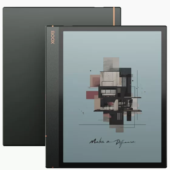
Now that Kobo is releasing new ereaders with color E Ink screens, people are asking questions about color E Ink and want to know more about it.
E Ink’s color “Kaleido” screen technology has been around for several years, but it’s gone through three generations now and devices that use the latest Kaleido 3 screens just started coming out last year.
If you’re wondering how color E Ink screens compare to regular black and white E Ink screens, see my Kaleido 3 screen comparison review from last year between the Onyx Tab Ultra C and the Kindle Scribe. It shows a larger screen than what Kobo is offering, but it’s the same screen technology with the same resolution of 300 ppi for black and white and 150 ppi for color.
I’ll post some reviews and comparison of Kobo’s new color ereaders after they get released. In the meantime, here are some things to consider when it comes to color E Ink screens in general.
Color E Ink – Things to Know
1. Color Quality: Color E Ink supports 4096 colors, which might sound like a lot but it’s actually far lower than a typical LCD screen. Colors tend to look softer and more subdued with E Ink, and color accuracy isn’t great, especially with certain colors, and it has more of a printed newspaper look.
But like regular E Ink screens, they have low power requirements and show less glare under bright light, and they can even be easily read in direct sunlight, unlike LCD screens.
2. Darker Screen: The main drawback with color E Ink screens is they look darker than regular B&W screens because of a color filter layer that is applied over the top of the screen, which makes the contrast appear lower. Kaleido color screens are really just regular black and white E Ink Carta screens with a fancy passive filter over the top (that’s why color resolution is lower than black and white resolution).
However, when using a frontlight the issue of a darker screen is largely mitigated. But if you’re the type of person that likes to read without a frontlight then it will be harder to look past this.
Color E Ink screens also have a little bit of a grainy appearance to them because of that added color filter layer. It’s less noticeable than it used to be, but it’s still there on Kaleido 3 screens if you look closely.
3. Ghosting: Afterimage effects are more noticeable on color E Ink screens, where you can see a faint impression of the previous page. Color content may require more full page refreshes and flashes to look clear. It really just comes down to how well-optimized the software is; some early color ereaders had a lot of ghosting issues.
Onyx offers different refresh settings on their color ereaders and eNotes to help minimize ghosting under different circumstances, but it can still be an issue at times.
4. Performance: As stated above, Kaleido screens and regular black and white screens are the same so the overall performance isn’t any different between them. Color E Ink really isn’t suitable for things like videos or games, although some people use Onyx’s devices for that to some extent (Onyx’s devices with BSR are specially-designed for faster and smoother refreshing and scrolling, like on the Note Air3 C).
5. Battery Life: People are always asking how color affects battery life, but in theory it doesn’t affect it at all since Kaleido screens are exactly the same as B&W screens. However, color content tends to require more page refreshing than basic text, and you usually have the frontlight turned up higher because of the darker screen, so in practice it probably does require using a little more battery power.


Good article, Nathan. Thank you so much for the explanation. I am looking forward to seeing the actual device.
Ditto what Patricia said. Thanks, Nathan!
How suitable are these color screens really for comic books and graphic novels? Is it still going to be a better experience reading digital comics on an iPad?
They might provide a better reading experience outside in bright light, but an iPad is always going to have the edge in color quality and overall performance.
I typically use Clara HD at night time in bed at anywhere from 2%-5% brightness. Anything higher than that and I find it too bright. If these color screens require higher brightness to look good will the screen be too bright for my night time reading? Or would it look roughly the same brightness wise even if I’m running it closer to 10%-15%?
They should still be fine for night reading but that’s something I’ll have to test.
That is exactly how it works on my color Pocketbook. The color screen has a dark tint, so at 15% it looks as bright as the same screen without color at around 5%. I haven’t tested the exact difference, but it is sort of like you are using it while wearing sunglasses. I also love a dim screen at night. The color screens allow more fine tuning to make it perfectly comfortable in a dark room, and I like it more than I expected. But I still keep going back to my old Kindle Voyage, because the screen and font rendering look better to me.