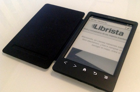
The folks over on Librista.es, a Spanish-language blog, have somehow managed to get their hands on the new Sony PRS-T3 ahead of launch, which is expected to come as early as tomorrow.
There really aren’t any new details about the reader that we haven’t already seen in the earlier leaked documents, but there is a nifty video (see below) that gives a closer look at the software and the integrated cover.
Yeah, you read that right. This year’s Sony Reader comes with a cover already built into the device. As it shows toward the end of the video review, the front cover is attached to the back panel of the PRS-T3.
And as earlier leaks revealed, there also a lighted cover available. Sony decided not to use a frontlight on the PRS-T3. They decided to offer a built-in lighted cover instead. That’s a daring choice when all the other companies are going with frontlights, but it appears that Sony refuses to budge on that after the failed PRS-700 with built-in LED side lighting.
The attached cover accessory on the PRS-T3 is somewhat reminiscent of the Sony PRS-900 from a few years ago. It also came with a cover built in as part of the exterior frame, but it had the option to peal off the front cover flap if you didn’t want to use it; the PRS-T3 doesn’t appear to have that option because you have to take off the entire back to remove it, which is also the way to get to the microSD card slot.
The software appears about 90% the same as the PRS-T2 from last year, which was 90% the same as the PRS-T1 before it. But Sony went in a different direction with design with this newer model. It has the same buttons below the screen, but they’ve done away with the flared look and made it more rectangular and book-like. I think it looks nice; I can’t wait to get my hands on one to review as soon as they become available.
While the lack of a frontlight is disappointing on the PRS-T3, it still has a solid amount of features and offers things other ereaders don’t, such as writing notes on-screen and integrating with OverDrive for downloading library ebooks directly.
One thing I look forward to doing is comparing Sony’s PRS-T3 with the Kindle Paperwhite and Kobo Glo and new Kobo Aura to see how the screen compares. The PRS-T3 is the only one of the bunch to have an HD 1024 x 758 E Ink screen without a layer over the top, be it a capacitive touchscreen or light layer, which tend to degrade contrast slightly. The PRS-T3 doesn’t have a frontlight or capacitive screen so it just might have the best contrast of the bunch, or the difference might not be noticeable at all.


I clicked on the video and it says it is private 🙁
Me too. Lame…
Yeah they probably got in trouble for posting it early and had to take it down.
Looks like it’s gone down. I went to librista and the changed completely the post… Maybe Sony a$ked them to $hut up 🙂
Interesting…. Something definitely happened. It’ll probably be back tomorrow after Sony makes the official announcement.
Even so.. disappointed. Had an PRS-505, upgraded happily to PRS-T1 and have waited for something from Sony that would give me a reason to upgrade. Doesn’t seem to happen this year either.
On the other hand I picked up a Kobo Mini cheaply this summer and I love it for it’s extreme portability, just slip it into my shorts pocket and sometimes I’ll even forget it’s there.