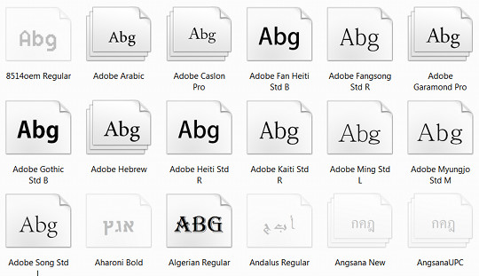
One of the great benefits of reading ebooks over paper books is the amount of control you have over the most important part of a book: the text.
You can adjust how small or large it is, and depending on the reading device or app you use, you can often change font type, font weight, text alignment, spacing—and with tools like Calibre you can pretty much format an ebook any way you want if you’re determined to do so.
One of the most important aspects of customizing your reading experience is font choice. Most ebook readers and apps these days offer several font choices, or at least an option for serif or sans-serif.
Sometimes you can take it a step farther by adding more fonts to an ebook reader in a few simple steps, as is the case with adding custom fonts to the Kindle Paperwhite and Kindle Touch, the basic Kindle and older Kindles, the Sony PRS-T1 and T2, and the Kobo ereaders.
Once you have that kind of freedom to choose whatever fonts you can get your hands on, it’s fun to test different styles to see which ones look the best. Most computers come with a plethora of font choices on board that you can use (just type “fonts” into the search bar), and you can always find tons of free and paid fonts online from sites like Google Fonts.
When dealing with E Ink ebook readers I find that it’s often best to use thicker fonts for better contrast. I’ve experimented with a variety of different styles to try and find the best font, but my favorite changes all the time, and I’m always looking to try new ones.
Recently I came across a discussion at Mobileread about which font people like to use on the Kindle Paperwhite. I happened to come across a really nice font on postcount #700 that a member named JSWolf put together. It’s a modified version of Charis SIL that looks great on the Kindle Paperwhite’s E Ink screen. It’s thick. It’s clean. And it’s unobtrusive. It’s my new favorite font…for now.
So how about you? What is your favorite ebook font?


I am using the Charis SIL modified font that you mentioned on my Paperwhite and my Kindle Touch, and I have fallen in love with it. I have a slightly different version of Charis SIL on my Sony T1.
I prefer slab serif fonts. My current favorite on my Nook ST is Amasis.
I downloaded the font Nathan mentioned and plan on giving it a try.
This question exposes both a weakness of the NST and a strength, depending on your perspective. You can’t add fonts on a NST. Unless you root it. After rooting, you can add fonts but you have to rename the new fonts to match one of the original fonts. I will install the new font and call it Malabar so it will become the default font for the NST’s built in reader. I currently have Malabar linked to Amasis thus making Amasis the default font.
Not very original, but my favourite is Georgia and I format my books for it using Calibre 🙂
“Liberation Serif” or “Linux Libertine”
I prefer Serif fonts for reading: on eink, Georgia–on LCD, Garamond, Bookman or Century Schoolbook in that order.
I prefer San serif fonts on my ereading device. I wish Segoe is a very nice font and wish it was more available.
Verdana W1G on Sony PRS-T1
BTW, how can i set cool reader to use the original formatting of the book?
Thanks
Apparently you cannot add fonts to the Kobo Mini, as I’ve tried but no go.
Definitely either Century Gothic (my favorite), Roboto normal, or Brawler.
Amasis
For me, the most readable font by far.
Without any competition.
Only with Amasis I see words and not letters.
A very distant second – Charis SIL.
I like small letters for better readability (to better see words and phrases at a glance), but still in the range of real printed books, just at the beginning of that range.
Who likes to enjoy the beauty of large letters, I’m sure there are prettier fonts.
At the moment it is Amasis for me. I use it on my Kobo Aura HD. I feel it is the best font I have seen on an ereader lately.
Strong, very readable when using smaller font sizes.
I intended to add more fonts to my Aura, but I think I won’t have to. Amasis it is.
I use Verdana on a 6″ 758×1024 display which I set to override the fonts embedded in the books. I will try some fonts recommended here, though, since I curiously searched to find what people thing is the best font for e-readers.
I’ve always used common fonts because they’ve been recommended and went with serif fonts like Times, Georgia and Garamond. Lately been reading more on my android phone with back lighting and found my eyes prefer sans serif fonts like Calibri, Vendana and Lucida.