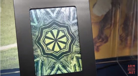
New color epaper screens called ClearInk (actually CLEARink but I can’t stand writing it that way) were being shown off at SID DisplayWeek in Los Angeles.
In fact the screens won best in show so maybe they’re something that might actually materialize into viable products (unlike all the other low-power color displays that get demoed at trade shows and then never amount to anything, like Liquavista).
ClearInk is similar to E Ink in that it is a low-power technology that uses electrophoretic ink to rearrange particles on the display.
The screens don’t use much power because there is no light source; they rely on ambient lighting instead, and are sunlight readable, unlike LCD screens.
ClearInk has a couple advantages over E Ink, like the fact that it supports color and it’s fast enough to play video at 30 frames per second. Apparently support for video is a big selling point.
Color E Ink bombed when they tried to release ereaders with it a few years ago because the colors were just too washed out and the contrast was too poor—now you never hear anything about color E Ink anymore (not for ereaders, anyway). Hopefully ClearInk can produce better results.
The company has a couple of customers lined up already and they plan to target the education market with ereaders for schools, along with wearables, mobile devices, and more.
ClearInk trial manufacturing starts in June and July, with mass production starting later this year. The first devices are expected to get released next year. The first wave of screens will reportedly support 4096 colors, and they plan to improve on that in the future.


WOW! This is amazing… and plays video too :O
The screen itself covers very little of the surface real estate. Wonder if this is because it is a prototype or if production screens will also require this? Other that that – not terribly impressed by the color clarity, but it is better than no colors at all. Focus on the video version might indicate higher prices and thus not a good ebook reader candidate, but time will tell. I will sit on the fence and see what happens this time around as well.
Found some nice e-ink fonts over at mobilread, check out the constantia font in particular. Click where it says Kindle Fonts click “show” it will take you to a link, click on it. Download the package, modify the Constantia font name which will show up as “serif” change the four fonts as follows….Serif to serif.ttf then serif-talic to serifi.ttf then serif-bold to serifb.ttf then finally serif-bolditalic to serifz.ttf this will configurate all fonts accordingly in calibre and in your Kobo font folder. Let me know what you think of Constantia, i think it’s a great font with a touch of added weight it’s on par with Bookerly or very close. Let me know what you think…
ooops forgot the link, here it is…https://www.mobileread.com/forums/showthread.php?t=204363
I tried it on the new H2O and it is a nice font. I miss the advanced weight options on sideloaded fonts though.
I agree with the CEO that the best target market is the school/education market. As long as the kids can see videos from Khan Academy or other similar sites, and the device support basic colors (4096 colors is more than enough as far as I think) and paired with respectable hardware in today’s terms (4GB RAM with 1.2+GHz quad-core CPU – and not 512MB RAM with 800MHz single-core CPU), it would be great. Note that education market uses tablets for email, google docs, browsing and some design, apart from reading. This is the reason why I think the current e-readers are failing to increase their market share.