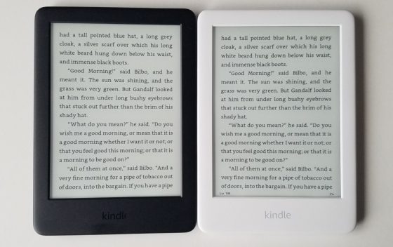
Today was the official release date for the new entry-level Kindle for 2019.
Amazon basically took the previous entry-level Kindle and added a frontlight and changed the design slightly. It still has 4GB of storage space and comes with WiFi and Bluetooth for Audible audiobooks and the VoiceView accessibility feature.
The new model has the same low resolution 167 ppi screen as the previous model, but apparently they upgraded to a higher contrast Carta screen.
The Kindle Paperwhite and Kindle Oasis both have 300 ppi E Ink screens so that’s the biggest difference between the new Kindle and the other Kindle models.
Compared to the previous entry-level Kindle, the screen on the new Kindle looks a lot better with the frontlight. Seriously, it’s a huge difference. Unless you’re reading outside in direct sunlight the frontlight is a big advantage for overall readability.
The text does have a slightly fuzzy appearance with the lower resolution screen but the text is still perfectly readable. I give these older 800 x 600 screens a hard time but the truth is they’re perfectly adequate for reading ebooks. The screen looks better than I expected, actually.
I think the addition of a frontlight is the important thing; if they would have simply bumped the resolution up and not added a frontlight it would have been a pointless upgrade. And the frontlight itself looks pretty good. It looks fairly even for the most part but there are some brighter spots along the bottom where the frontlights are located, similar to the Paperwhite 3.
I also like the new design. The corners are more rounded and that makes it seem a bit smaller overall, and the device feels comfortable in-hand (I just wish it had page buttons like entry-level Kindles used to have).
I bought both a white and black version because I wanted to see how they compare. I like how the frontlight blends in with the white frame, but the there’s an optical illusion that makes text appear slightly darker with a black frame.
I’ll post a video soon showing the new 2019 Kindle in action, and I plan to get a review posted by the end of next week.


Is there any noticeable difference in text appearance in comparison to the previous generation’s E-Ink Pearl screen? It might be a good idea to compare the previous generation to the current one to see if E-Ink Carta really makes a difference.
With the frontlight off there’s really not enough difference to say one looks better than the other. The background colors are just a little different.
Is there really that much of an improvement having a light? I’ve never had a front light so don’t know if it really makes a difference in daily use. I tend not to read in dark rooms so is it just for reading at night?
Having a frontlight makes a big difference, even with regular lighting it makes the background appear lighter and it helps make the text stand out more. About the only time it makes no difference is in direct sunlight.