Yesterday Kobo officially unveiled their latest ebook reader, the Kobo Nia, and while there isn’t a single thing “new” about it other than the name, it does have a very unusual cover.
In fact the cover is the most interesting thing about the Kobo Nia, and at $19.99 it’s actually reasonably priced for a change.
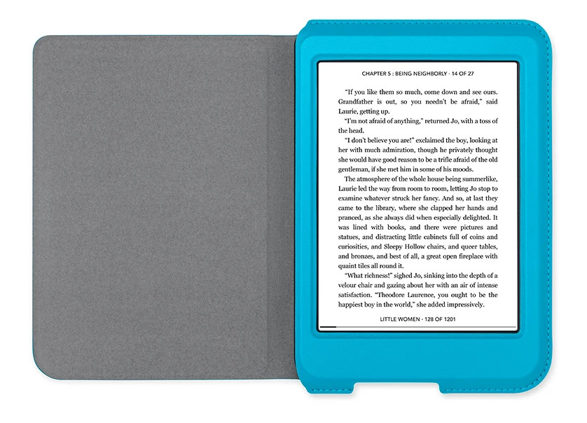
The weird thing about Kobo’s official Kobo Nia sleepcover is the fact that it encases the entire front bezel of the device, which is especially odd considering the Nia has an indented screen.
I’ve seen cases that partially cover the bezel before but I’ve never seen one quite like this.
Personally I think it looks goofy and I never liked cases that cover the bezel, but to each their own. I like the Clara HD cover better because it’s narrow, lightweight, and it doubles as a stand.
With that much extra material going over the front it’s certainly going to add to the overall weight and thickness of the device, but Kobo does not specify the weight of their covers.
The Kobo Nia cover is available in three colors—Aqua, Lemon, and Black—and it’s made out of artificial leather. It has the automatic wake/sleep feature when opening and closing the cover.
I can’t help but wonder if the Kobo Nia was initially supposed to be a model marketed towards children like the Kindle Kids Edition that Amazon sells. With the bright colors and unusual design of the cover, it does have a kids feel to it.
What do you think of the new Kobo Nia sleepcover?
I’ve never known an official cover to cover the bezel, I had only seen it on on third party covers.
In general, I find Kobo covers are either garish in their bright primaries or are black. They are not as good at more subtle colors like Kindle and Nook are. I’m literally looking at the only exceptions right now. I have the gray Libra cover and the purple Forma cover and they look very nice.
These overly bright colors are in particular problematic in this case because they wrap over the bezel. It is distracting if you’re trying to read and will also emphasize the murky grayness of the eink screen.
The design also looks ridiculous. Those sewn edges really add to the size and bulk. You can tell from other photos that the cover does NOT fold flat behind it, making it harder to read with the cover on. And I’m sure as you said it will probably add a great deal of weight as well.
I miss what the Kobo covers used to be. I don’t like the portfolio design of the Clara cover, and I don’t need the origami covers of the Libra or Forma. I like the simple design that Kobo used for years before the current gen.
I will say that this cover can enter the hall of infamy of bad official covers along with the first wave of Oasis 2 covers (didn’t cover the back completely and easily fell off), the Kindle 7 covers (didn’t close properly), and the Kindle 4 covers (too easily damaged). For context my gold standard is the PW4 leather covers.
I think it depends on what you want your cover to do. If you want it to always cover your device, yes, it will add weight and be somewhat clunky, and there’s no good way around it.
The problem is that devices keep getting thinner and lighter – and more fragile. At some point, if you move the device around a lot you want to protect it by *adding* weight in the form of a bulky cover. If you are careful with the uncovered device and use it in one location most of the time, or read for extended periods of time where you remove the device from it’s cover, that works. If you move the device around a lot and travel with it, you’re sort of stuck having to add cushioning to it to protect it from damage.
Nothing you’ve said is true.
1. A cover doesn’t have to be clunky and heavy. Most covers are shell covers and don’t add that much to size or weight.
2. Devices DON’T keep getting thinner and lighter. The Paperwhite lineup has had almost the exact same dimensions and weight for the entire run. And the 6 inch ereader hasn’t dramatically changed in dimensions and weight ever since the keyboard was dropped many years ago.
3. Ereaders are not getting more fragile. They’re becoming less fragile. The Forma is a tank with the Mobius and plastic design, it is so good at taking a beating that it probably doesn’t even need a cover. The all plastic designs of the Kindle basic, PW and all of the Kobo models are very robust. Covers are really there to stop cosmetic damage like scratches.
4. I find your post reductive. We’re not talking about the uses of covers in general but how genuinely awful this one particular design is. A well designed cover can complement the ereader, make it easier to grip, allow you to open right where you were reading without pushing any buttons and look good doing it. If you think that all covers look bad and are just a necessary evil then you really are missing the point of the criticism of the Nia cover. Not all covers are equal.
looking at the advertising/promo photo and the color scheme of the covers, my impression is, Kobo is aiming this reader at the pre-teen – teen, female market .
My bright pink Clara cover disagrees with you. You give Kobo too much credit. They are just bad at designing aesthetically pleasing covers. Also no need to be sexist. Boys would also gravitate to bright blue and yellow covers.
You would think they would have a cut out for the logo, even if it isn’t as good as the original one.
I must admit I prefer having a bulkier cover for my readers and tablets. I have a Fintie for my Clara that partially cover the bezel and have a stand that has a card slot, and a strap to hand hold it. Library design cover like the decal I bought for my Sony. It is heavier than the lightweight covers, but it’s not building bicep weight, I mean it is still lighter than a medium size book.
I had a thin lightweight one for my Kobo Touch and didn’t like it. The protection was weak and the feel wasn’t great. When I bought the Glo I got an after market wraparound cover that was a copy of the Kobo one, but a lot better quality and cheaper.
What I am saying is if you don’t have a problem with the bezel, and I don’t as it gives extra protection to the screen, then extra protection to the bezel should be okay as well. as long as the case closes properly.