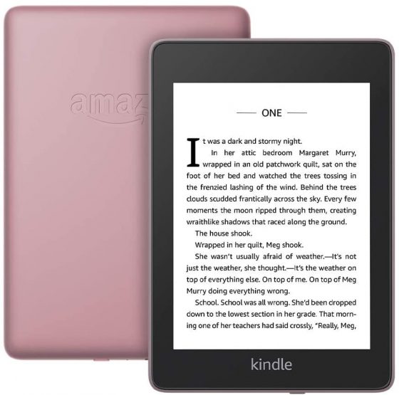
There’s been a lot of talk lately about the user interface changes that Amazon has started rolling out to Kindles via a new software update.
Naturally when things suddenly change after years of being a certain way, it can cause frustration for some users, especially when the changes aren’t adequately explained, as was the case with the latest software update.
If you don’t like some of the changes or find something on your Kindle that doesn’t function properly, there is a quick and easy way to provide feedback to Amazon about your issue, and you can do so directly from your Kindle device.
On your Kindle go to Settings > Help & User Guides > Contact Us > Give Feedback. (On my Kindle with older software, it’s labeled Contact Us instead of Help & User Guides).
This opens up a page that shows your name and email address, with a box to enter comments.
On the page it says, “Your feedback is important and helps us improve our products. While we cannot reply to all feedback, all comments are taken into consideration.”
It’s funny how one of the biggest complaints with the new update is the removal of the back button from the menu bar, but it turns out the Contact Us and Help sections are the one place in the interface that still has a dedicated back button. If enough people suggest they bring it back to other parts of the interface then maybe it’ll come back in a future update.


When will the Kindle voyage get this 5.13.7 update?
Do you guys remember the Kindle update, where the bold font option was removed and the grayscale value for the background and font itself, we’re made nearly identical?
I owned a Kindle Voyage back then, paid a small fortune for it but absolutely loved that device. Bought an old leather cover for it and carried it everywhere with me, reading whenever I needed to find some quiet from the rat race of our urban cities. The font I loved had a deep black gradient and using it, the words on my screen seemed to float, so crisp and clear, a joy to my eyes and I would read effortlessly for hours and hours…
I remembering updating, thinking must be some new security settings and optimization that’s important; when my Kindle Voyage restarted with the new settings my favourite font was gone and I could barely make out the new gray font weight on the gray background of my screen. I couldn’t believe what I was seeing!
I wondered if the software team behind the update we’re readers themselves, and if they personally used a Kindle and felt as passionate as I did about it? I wondered who thought a gray font on a gray background was a good design choice for reading? Who thought taking away user “options and choices” was good value for the customer?
Seems to me that if clothing designers could update their products the same way these software user designers do; my favourite jeans one day would have three pant legs, next update have a zipper, next update have buttons, next update be white, next update be black, next update be back to two pant legs… at some point you simply lose connection and the jeans get thrown out.
As Nathan points out in this article, user feedback is critical to letting Amazon know what we think of these software user interface updates, whether we like them and why, and if we don’t like them, why.
But I wonder if anyone in the Amazon Kindle team is listening or cares?!
Lou sevens here- I don’t think they seem to have an interest in developing the product.
I would like a 8 or 10 inch reader with the ability to scroll through my library like I can do on the app- I am up to around 600 books.
I agree that it seems the developers are not interested in user comments. My own complaint is that selecting “remove download” no longer removed the book cover from the kindle. Now read items clutter the lists. If I didn’t have almost 200 unread titles I would look for a kindle alternative.
When I try to use the send feedback option, after sending, it just says there was a problem and kicks me back to settings.
Thanks for this! Complaint about missing “back” button sent.
Btw, there is a new swipe up from the bottom thing which does some of what the old back button did. I don’t care for it, but there is some new functionality for navigating back and forth. In my tests on Oasis, this widget only supports 3 previous location, unfortunately.
A cool feature that would be really useful would be to have an option to highlight words you don’t know. Then have a tab where the reader can view all those words as flash cards.
That feature already exists in the form of the vocabulary builder.
I don’t think anyone that worked on the new UI is visually challenged. Formerly I could look at my library and see the percentage of the book that had been read. Now, that information isn’t about 1 point type in the corner of an image of the book which itself is difficult to read. This used to be so good for those of us with poor vision, now they have made it unusable.
I don’t know about anyone else but I would like the library to be but back so I can access from any of the tabs like before… This change is not an improvement to me but the opposite