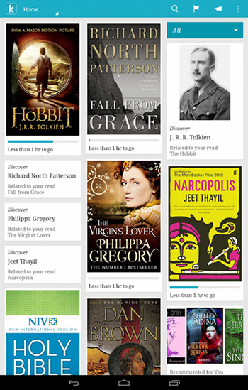
I’m testing the Icarus Illumina HD ereader to review, and I installed the Kobo app to see how well it works, and was surprised to find that it’s basically an entirely new app from the Kobo app I just tested a few weeks ago while reviewing the Onyx Boox T68.
I checked the description page over at Google Play and it turns out the Kobo Android app was just updated last week. Kobo hasn’t done much to promote it yet, but it’s a significant improvement over the older version of the app. I was just complaining about how crummy and outdated it was during the Boox T68 review, and now they’ve gone and improved it quite a lot. There are still some things that need to be added and improved, but this new update is a good start.
The first thing I noticed about the app is the homescreen now uses a tile style layout similar to what Kobo uses on their ereaders. Switching over to library view shows a lot more titles on the screen at once, with a layout that is similar to the older version of the app.
Upon switching to library view, I was pleased to see that my Kobo ebooks weren’t automatically downloading all at once like the old version of the app. Now you just tap on the titles you want to download; it’s much better that way. There’s also the option to create collections—not sure if that was on the older version of the app.
The new app loads a lot faster. There are several new settings options. More font sizes. Making onscreen selections works much better now. There are new multicolored highlighting options, and the dictionary popup adds the option to search on Wikipedia and Google—a handy feature, that. Kobo’s Beyond the Book feature has been enabled, and so has public notes. They’ve added “immersive full-screen mode” on supported Android 4.4 KitKat devices (not sure what that means).
There are number of other new features as well; I didn’t use the old app enough to notice all of them, and Kobo hardly explains any of the changes at all on their changelog, but it’s been a complete overhaul, that’s for sure.
One thing the Kobo app really needs is more layout options; it’s still majorly lacking in that regard. You can only choose between a serif or sans serif font, and publisher default. There are no line spacing or margin adjustment settings, and the default margins are huge.
All in all, the app works really well on the Illumina HD with the E Ink screen. The app now has the option to turn off animated page turns so the text remains relatively smooth when paging forward. I’ll post a separate review showing it in action on the Illumina HD.

