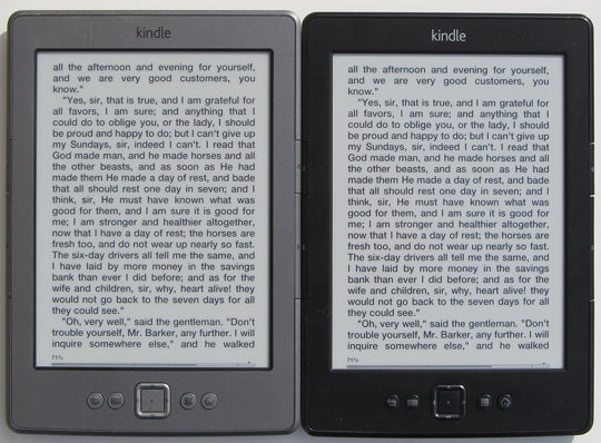
The latest $69 basic Kindle. Surprising, eh? The cheapest ebook reader on the market is the one with the darkest and boldest fonts. It’s not even a close contest, either. It wins hands-down.
You’d think that the Kindle Paperwhite with its higher resolution screen would be better. But it’s not. Fonts are thinner and sharper on the Kindle Paperwhite; they aren’t nearly as dark and bold as the basic Kindle.
Even Kobo’s ereaders with their advanced font weight settings can’t beat the $69 basic Kindle. The Kobo Glo comes very close and in fact has bolder fonts with the Caecilia font weight setting maxed out, but the text looks more rough and fuzzy on the Kobo, whereas the Kindle’s text is more refined and tuned for the E Ink screen, and it looks a little more inky black.
I know what you are thinking. What about the basic Kindle from last year? It’s the exact same as this year’s basic Kindle.
That’s a valid point, and you’d think the fonts would look exactly the same. But they don’t. For starters, this year’s basic Kindle is black instead of grey. That alone makes the newer Kindle appear to have darker fonts; it’s a well-known fact that black ereaders make text appear darker, even if it’s just an optical illusion.
But that’s not all. Side-by-side the newer basic Kindle appears to have slightly darker fonts. That’s not an optical illusion. The same can be said when comparing it to previous generation Kindles as well. The font just appear slightly darker on the newer basic Kindle. Maybe it’s just because it is a newer screen; it’s hard to say for certain.
At any rate, if you’re looking to get an ebook reader with the darkest, boldest fonts, the $69 basic Kindle is the one to get. It only has three font choices to choose from, but they are very thick and dark, especially the sans serif font. Other than Kobo’s ereaders nothing else even comes close.


For me, the contrast is more important than darkness
I don’t prefer basic kindle. because the white paper is gray , not white.
Paperwhite has a lot more contrast .
Hi Nathan, could you please tell us how the above mentioned screens are compared to the Nook Touch and Nook Glow? I read from some users who replied to comment on this blog that the NST seems to have a slightly better font and sharper screen display when compared to the Paperwhite. Do you find it so too?
The regular Nook Touch does have some nice fonts, but they still don’t come anywhere near the darkness of the newer $69 Kindle. However, the text is darker and bolder than on the Paperwhite with the light all the way down. Frontlit ereaders all have slightly lighter, greyer text because of the light layer over the screen. The Paperwhite suffers from this the least, but it’s still noticeable when next to a non-frontlit ereader, and the GlowLight Nook suffers from it the most—the text is more grey than black.
Thanks Nathan. That’s very helpful. I’m still waiting for a frontlit ereader that would at least hold a candle to the regular NST in this area.
I also have a question. With the “darkest, boldest” font, can you tell the difference between standard and bold text in a document? On my NST when using the Caecilia font, you can’t tell the difference between “standard” and “bold” text, making certain types of books, especially side loaded books (because they are not specifically formatted for the Nook) less effective if they use bold to highlight some text. I fixed this issue on my rooted NST by linking the CaeciliaBold and CaeciliaBoldItalic fonts to another font. Does the Kindle have this same problem?
The Kindles don’t usually have any problem with bold and italic text like some ereaders.
Far as I know, this Basic Kindle screen have been improved! The reason I know that it’s ’cause when I saw my nephew’s basic black Kindle and compared to my 2011 grphite one, I talk to amazon costumer support. It’s really the best in fonts. It really has a darker font than my Kobo Glo
In agreement here. Everytime I look at my basic Kindle, I wish I could use that font on my Paperwhite — it’s clearly superior. At the end of the day, I still choose the Paperwhite because of the light since all of my reading is indoors. What good is a superior font if you have to sit directly under a lamp to appreciate it? I know, you have to do that with a real book and my answer is that I don’t have to do that anymore with a Paperwhite. 🙂
Hi Nathan, I think I have read too many reviews and am now totally confused as to which e reader to purchase. My first instinct is obviously the Paperwhite but comments on the Touch seem to me that “new and improved” is not always best. That said does it seem impractical to purchase a device with last years technology. Just want an e reader for “reading”, not particularly bothered about reading at night, so is the standard Kindle more of an option? I have an iPad for any other requirement but reading on this is not practical!
Help!!!!!!!!
I need an instruction booklet for augen the book
You’ll probably have a hard time finding one since Augen went out of business a couple years ago, and I’m not sure there ever was one to begin with. Checking out my review of the Augen might help, especially the video.