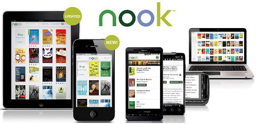
Barnes and Noble released a new Nook app for iPhone today and upgraded the iPad app. They also updated the PC app to carry the new Nook brand instead of the older eReader brand. I tested the new Nook for PC app and compared it to the old eReader app and the results were not good. B&N seems to have rushed this new Nook app because it is a complete mess. More on that later. But first, the iPhone app.
Nook for iPhone
With the Nook for iPhone app, US and Canadian residents can shop and download ebooks from Barnes and Noble’s online ebook store. The app has a decent feature-set, including adding notes and highlights, setting line spacing, changing font style, colors, and sizes, syncing with other Nook apps, and it can even lend ebooks for 14 days like the Nook.
There is also a dictionary, a setting to retain the publisher’s original setting to view the ebook exactly as the publisher and author intended, portrait and landscape viewing modes, bookmarks, and the ability to download, read, and delete free samples from within the application itself.
According to the press release, Barnes & Noble designed the Nook for iPhone app to optimize ebook cover art and text on the new iPhone 4’s Retina display, and it also works well on earlier iPhone and iPod touch models.
Nook for iPad
The updated iPad app brings a few new features like being able to rate your books and sort by favorites. B&N also added a new user guide and beginners tutorial to demonstrate the features of the Nook for iPad app.
Nook for PC
When I saw that Barnes and Noble had updated their PC app to have the Nook brand name, I assumed it would still be the exact same app as before. But unfortunately, it is not.
Strangely, opening the old app and clicking on the check for updates button yields no updates; you have to download the new app from B&N. The new Nook app is a separate program entirely and doesn’t affect the old eReader app in any way; both can be open at the same time.
The problem with the new Nook for PC app is that they’ve removed many of the features. You can no longer adjust font type, line spacing, justification, or change the background color, text color, etc. Worse, the app forces you to read in two column view with a giant margin in between the columns. Switching to full screen mode adds three columns with huge margins in between. What were they thinking? I don’t expect this to last long before they update it.


Quick question. I can open my epub library book on Adobe Digital Editions, then plug my Nook into the computer and transfer the file onto the Nook. Is it not possible to transfer the file to Nook for PC? Isn’t this essentially the same thing, opening an epub book on Nook software?
Yeah. I seem to remember trying library ebooks on several other desktop apps and they wouldn’t work either. It’s probably some rule Adobe has so that you have to use Adobe Digital Editions.
I have the Nook for PC and enjoy it. I downloaded it around September 4, 2010 and it doesn’t seem to have those buggy problems you mentioned, so maybe they were fixed.