My Kindle Paperwhite 2 arrived yesterday so I’ve had a few hours to analyze the new screen and frontlight.
The first thing that jumps out about the new Paperwhite is that from the outside it is pretty much an exact replica of last year’s Paperwhite. The only noticeable difference is the new one says “Amazon” on the back instead of “Kindle”.
The first thing I was eager to check out on the new Paperwhite was the frontlight. My first gen Paperwhite had a very blotchy frontlight and funky discolorations that proved to be distracting while reading.
I’m happy to report that the frontlight on the 2nd gen Kindle Paperwhite is much improved. The lighting is a lot more even and there aren’t any weird discolorations. There’s still a touch of brighter light in certain areas, and a hint of shadows at the bottom of the screen, but that’s the nature of LED frontlights.
Overall I’d say that the new Paperwhite has the most even frontlight of any ebook reader I’ve reviewed yet. It narrowly beats out the Kobo Glo, which has just a little bit more shadowing. The Kobo Glo was my previous top choice for an even frontlight, as my Kobo Aura HD and Kobo Aura both have a frontlight with yellow hues at the top of the screen (frontlights seem to vary a lot from unit to unit, so it’s hard to gauge overall expectations, these are just personal observations).
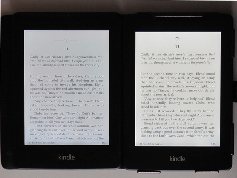
I’ve found that it’s very hard to take a picture that shows the blotchiness of the 1st Kindle Paperwhite’s screen, so I took the picture from the top of this post and added a color filter to it. It’s a bit extreme but it shows the pattern of the discolorations well. You can see how much more even the coloration is on the new Paperwhite’s screen. There are a few subtle shadows at the bottom of the screen, but overall it’s much more even than before, and it’s more yellow in tone (click pictures for bigger images).

The difference between the two frontlights is readily apparent, but one thing that isn’t very apparent at all is the difference in the screen tech. The old Paperwhite uses an E Ink Pearl screen, whereas the new Paperwhite is the first ebook reader to use E Ink’s new screen tech called Carta.
When comparing the two Kindle’s side-by-side with the frontlights turned all the way down (you can’t turn them off fully), you can just barely tell the new Paperwhite has a slightly whiter screen background. Text doesn’t appear any darker to my eyes. The difference between Carta and Pearl appears to be even less than the difference between Pearl and Vizplex.
On a side note, I am not at all a fan of the default partial refresh setting to reduce the frequency of full page refresh. It makes it so that there is way more ghosting, which is an effect where you can see faint text from previous pages behind the dark text of the current page. I thought at first maybe it was an issue with E Ink’s new “regal waveform technology” that is designed to prolong partial refresh much longer than before, but I’ve noticed that for some reason the ghosting is way more prevalent on the new Kindle’s screen than on the Kobo Aura, which is also using the new partial refresh settings. Luckily there’s an option in settings to turn partial refresh off. Personally I much prefer a millisecond of black flash than rough text with faded out text behind it.
So to wrap things up on this initial review (I’ll post a full review after more use), I definitely think the frontlight is a big improvement, but as far as everything else is concerned this doesn’t feel like much of an upgrade at all. The device has the exact same design as last year, and pretty much all the software features are the same. There are couple of new features, which I’ll go over in the main review, but nothing to really set it apart from last year’s Paperwhite, which will likely get the new features in a software update anyway. This is what the Kindle Paperwhite should have been in the first place, so it’s pretty hard to get excited by such an incremental improvement.
Thanks for the review. It looked and read just like you said: an incremental improvement and to me it’s not worth upgrading if I was interested in upgrading which I’m not. It’s like a rat race to see who can get a new device to market for the holidays and god forbid if they have to wait a year to get the technology just right.
Yeah if you’ve got a 1st gen with a frontlight that you’re happy with (they vary widely), then I don’t see any reason at all to upgrade, really. The faster processor makes things a little zipper on the 2nd gen, but it’s not a big difference, a millisecond here and there.
I read a lot of non-fiction, so the new way it handles footnotes makes an upgrade a no-brainer for me.
The new footnote feature is excellent. I read a lot of B&N Classics, and it was always a pain to have to switch back and forth between pages when you click on a footnote. Now a little popup box comes up with only the footnote, instead of the whole footnotes page.
The page scan feature is really quite pointless though. The vocab builder is cool (who doesn’t like vocab flash cards), but I don’t like that they have taken Time to Read off the main page display and replaced it with a percentage. You also can’t switch between the chapter and book times anymore, and you have to tap to bring up the menu to see it.
The biggest disappointment by far is the total lack of difference between Pearl and Carta displays. Aside from the PW2 display being a very tiny touch lighter, text looks the same or worse. No change in the sharpness of the font at all. In fact, I think text looks bolder and more crisp on the original Paperwhite.
I’ve owned every Kindle ever released, and this is by far the most disappointing upgrade. The faster processing speed and some new features are nice, but I’m noticing a lot more glitches when selecting items or going through the menu. Hopefully a software update will fix this.
I found last night that there is an option to switch the location out with Time to Read, but you still can no longer just tap on the displayed time to get it to change between chapter and book times.
I never understood why companies get you used to doing things one way and then suddenly change how it works for no good reason. (Incidentally I’m noticing that a lot with iOS 7 on the iPad too.)
Darn it, I keep seeing that as the Kindle Paperweight
Just tap In the lower left corner and is will change between location, time left in chapter, and in book.
The first honest review I’ve read (after buying the 2nd gen Paperwhite ofc 🙂 ).
“I’ll post a full review after more use…There are couple of new features, which I’ll go over in the main review..”
Any sign of this?
Kindle Paperwhite 2 Review