Review Date: November 2013 – Review unit purchased from B&N.com
Overview
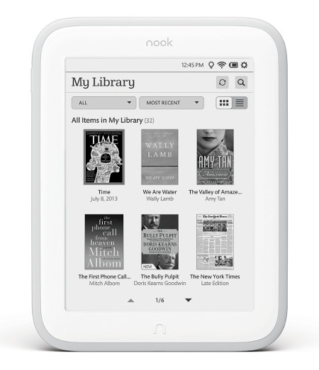
The Nook GlowLight is Barnes and Nobles fourth generation E Ink ebook reader, and is the belated followup to the Nook Simple Touch with GlowLight from early last year. B&N has dropped the “Simple Touch” designation and is calling the new device simply “Nook GlowLight”.
The Nook GlowLight brings a much-improved frontlight and a higher resolution screen to the mix, but at the expense of some of the features that made the previous Nook Touch ereaders desirable over the competition. Are the improvements enough to offset the disappointments? Let’s find out…
Hardware
When it comes to hardware, the biggest buzz about the new Nook GlowLight is what B&N removed instead of what they added. The previous Nooks had page-turn buttons and microSD card slots. The new Nook has neither. And while the amount of storage space has doubled from 2GB to 4GB, with 2.5GB usable, only 500MB of that is available for sideloaded non-B&N ebooks. That’s enough for roughly 500-700 ebooks so it’s not a huge deal, but for those with large ebook libraries it is. I don’t see the purpose in B&N choosing to partition the internal storage when other brands like Kindle and Kobo allow you to use the space for whatever you want.
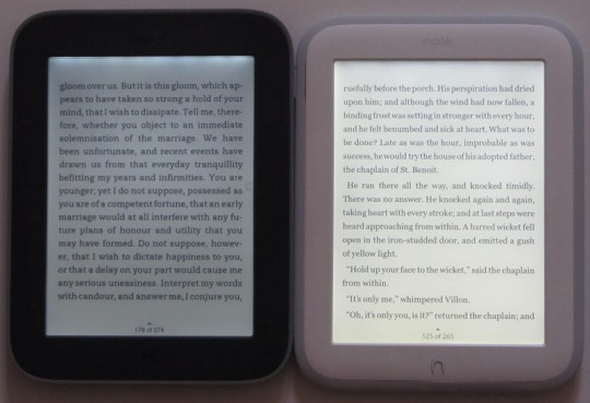
In terms of hardware upgrades, the Nook GlowLight has one main thing going for it: the screen. It has a much better frontlight with more even light distribution than the previous Nook Glow. It also has a higher resolution 1024 x 758 screen that has increased text clarity quite a lot, and now text is noticeably darker instead of grayish. Here’s a pic comparing the two:
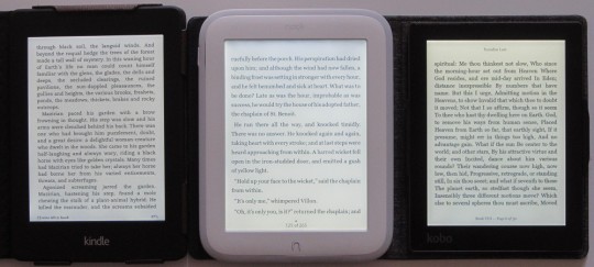
In terms of the frontlight, the new Nook GlowLight stands up pretty well to the Kindle Paperwhite 2, which has the best screen and frontlight in my opinion. The Nook’s lighting isn’t quite as uniform as the Kindle’s. There’s a little bit more shadowing visible on the Nook and there’s some subtle yellowing toward the bottom of the screen. But overall the Nook’s screen has a similar whiteness to the background of the Kindle. The frontlight is a little brighter and bluer in tone on the Nook, and unlike the Kindle the light can be turned off completely. Compared to the Kobo Aura, the Nook’s screen looks better to me because it is less yellow and more white, and text appears sharper and clearer. Here’s a picture of all three together:
One other hardware upgrade is the processor. The Nook GlowLight has an 800MHz process, up from 600 MHz, which is still less than the Kindle Paperwhite and Kobo Glo, Aura, and Aura HD, all of which have 1Ghz processors. I can’t say the speed difference is noticeable one way or the other, however. The Nook Touch at 600MHz can turn pages faster than any of them—no joke.
The only other hardware detail worth noting is the infrared touchscreen. Most newer ereaders are switching to capacitive touchscreens. Both work well so it’s hardly worth mentioning. But one thing the Nook does lack is any kind of pinch-zooming or multi-touch support.
Design
The Nook GlowLight shares the exact same overall shape and size as its predecessors, but it has a new design and is a lot thinner and lighter, which makes it more comfortable to hold. Gone are the page buttons and contoured back. The power button has been moved from the back of the device to the side. The little “n” button below the screen remains.
I haven’t been hearing much enthusiasm about the white color, but in person it’s not so bad. In fact I like it, and I didn’t think I would. It seems to make the screen appear whiter when the frontlight is on—kind of an optical illusion the opposite of the usual black frame to make text appear darker.
Overall I like the new design more than I thought I would. The device is very light and comfortable to hold one-handed. The one thing I don’t like about the design is the flimsy rubber piece that goes along the edge. You can see gaps between it and the frame of the device, and it comes off easily. I don’t know what its purpose is unless the clip covers that B&N sells slip behind it. Regardless, it doesn’t seem like the kind of thing that could stand up to years of use without deteriorating or coming loose, and the Nook is hideous without it.
Software
The most disappointing thing about the new Nook GlowLight isn’t the removal of the page buttons and microSD card slot, it’s the fact that the Nook software has remained virtually unchanged since the original Nook Touch was released 2 and a half years ago. I don’t recall B&N adding any significant new software features since then. The Kindle and Kobo ereaders have so much more going for them in terms of software features.
About the only noticeable difference in terms of software is they made it so the screen never does a full page refresh when reading. It will still do a full refresh at other times, like when changing pages in the library. Ghosting is apparent at times because of this, but it’s not very bad. Sometimes you’ll notice the faint outline of a picture for a couple of pages after it is gone.
B&N made a few minor cosmetic changes to the homescreen and library, they added a couple of new fonts, and they removed the menu that used to come up when pressing the “n” button (now it takes you to the homescreen) but overall the software is still 95% the same as it was on the Nook Glow and Nook Touch.
The Nook GlowLight has 6 font types and 7 sizes. There are three settings for spacing and margins, plus you can turn on and off publisher defaults. Reading features include adding bookmarks, highlights, and notes. You can share via Facebook, Twitter, and Google. You can search, jump to page, navigate via table of contents, and lookup words in the dictionary. In the library you can create shelves to organize your content. From the homescreen you can select to shop from the Nook store. That’s it. There are no advanced features to speak of. No web browser (although a hidden workaround exists), no annotation export or sync, no reading speed estimator, no vocabulary builder, no X-Ray, no Wikipedia reference, no translations, no landscape mode—none of the extra features found on the Kindles or Kobos.
The Nook GlowLight runs Android 2.1, which means nothing to the average user. From interacting with the device you’d never know it has an Android operating system. The software looks nothing like Android and it is totally closed off so you can’t install apps or anything cool like that. The Nook Touch and Nook Glow were popular with the hacking community—they could be turned into E Ink Android tablets, in fact—but I don’t see that kind of enthusiasm following the Nook GlowLight. Now that the memory card slot has been removed, it makes the process much more difficult, and with the limited amount of internal storage it’s hardly worth the effort anymore. If you want a hacked Nook, my advice would be to get one of the earlier models instead of waiting for this one.
Nook GlowLight Review Conclusion
Pros
- The screen looks great with the higher resolution display and improved frontlight.
- Good choice of crisp and clear fonts.
- The lightweight design and rounded shape makes it very comfortable to hold.
Cons
- The removal of the buttons and memory card slot is hard to get passed.
- Not a good choice for non-B&N ebooks becasue of the limited storage space, and no web access to download non-B&N ebooks—have to sideload everything via USB, including library ebooks.
- Limited amount of software features and no software improvements over previous Nooks.
- Only available in white.
Verdict
The previous Nook ereaders were all about bringing innovation and new features to the forefront of ereaders. The new Nook GlowLight, however, doesn’t do any of that. It offers nothing new whatsoever and feels more like an obligatory release with no real sense of purpose behind it.
There’s no denying the fact that Barnes and Noble made some questionable decisions in regard to the overall design of the new Nook GlowLight. When you set a precedent with a certain amount of features, it’s hard to please customers when you take them away and call it an “upgrade”.
A lot of people will automatically condemn the Nook GlowLight because of this, and that is certainly understandable. I too was disappointed to see the direction that Barnes and Noble chose for the new Nook. It gives the impression that B&N only cares about what they want, and not what customers truly care about. It’s like they haven’t learned a single thing from their past successes and failures.
That being said, once I had the Nook GlowLight in my hands and in use, I was surprised to find that I liked it a lot more than I had initially expected because of the new frontlight and higher resolution screen. I guess that’s one of the benefits of having low expectations, but at the end of the day I don’t think that the screen and frontlight alone are going to be enough for most would-be buyers to overlook all the extra features of what the competition offers.
Price: $119 at Barnes and Noble
Nook GlowLight Specs
- 6" E Ink Pearl display with 16 level grayscale.
- 1024 x 758 pixel resolution (212 dpi).
- Infrared touchscreen.
- Built-in LED frontlight.
- 800 MHz processor.
- Android 2.1 operating system (fully closed).
- 4GB internal memory (2.5GB usable; 2.0GB exclusively for B&N content, 500MB for sideloaded content).
- Wi-Fi 802.11 b/g/n.
- Supported formats: Adobe DRM, ePub, PDF (barely), JPG, GIF, PNG, BMP.
- Battery Life: 3-8 weeks.
- Weight: 6.2 oz – 175 grams.
- Dimensions: 6.5″ x 5.0″ x 0.42″.

Yup… bummer. I had high hopes for this device. Oh well… my old Nook Glowlight will do just fine for a while longer until a good android distro comes to life for the Aura HD.
Here’s what I was talking about. The Glo, Mini, and Aura HD (not the plain Aura, unfortunately) share similar hardware/software features and all have removable micro-sd cards. It working on the Glo (in German, for the time being), so the Aura HD and its sexy HD screen might be able to become a 32gb Android all-purpose reader. Here’s hoping.
http://www.engadget.com/2013/11/04/kobo-glo-android-hack/
I’ll try it with the Glo in a few weeks.
I was greatly looking forward to the new Nook e-reader, and I would have driven straight to the store to buy one. But now, given that B&N has addressed none of my qualms and desires of the last model, I guess I’ll look for an alternative.
has anyone heard anything about Adobe being hacked about a week ago? I forget where I read it but it said usernames and passwords were taken.
I really don’t like the side loading thing. Its too cumbersome.
It was more like a few weeks ago, but yeah. I did a post about how Adobe DRM went from bad to worse. I wish publishers would wake up and realize that Adobe isn’t the answer to protecting ebooks. Far from it, in fact.
After using the Sony T1 and T2 where they have a section for library ebooks through Overdrive to easily browse and download directly to the device, and with Kindles being able to wirelessly send library books to the device, I have to agree that sideloading is a hassle I’d rather not have to deal with, especially when you have to use Adobe’s software.
Your video for some reason doesn’t work. I’m not sure if this is on my end or YouTube’s …
It’s working on my end :).
Yesterday, I’ve tried playing it on all of my home PC’s and my work laptop at work in office. Today is playing only on my work laptop at office, but not at home on any of my home PC’s. Weird…
Anyway, great video (as always) … Wanted to see it before give them money…
I know I can violate the license and move my investment in B&N books to another device, but I don’t know how and don’t want to have to learn.
That said, this looks like the end of my B&N experience. The new Nook is nothing but a straight replacement for my current Glow when the battery won’t take a charge anymore. If sales lag and B&N gets out of the hardware business, I’m in a bind.
Seems like now is the time to untie the know.
Google it, it is just one screw hidden under the power button followed by a pull and it comes into two halves revealing the battery. I’m sure eBay will provide replacements when they start getting old enough.
I bought the new Nook the day it came out. I was expecting to be unimpressed but I liked it and have no complaints since.
Overall I thought your review was excellent pointing out both the pluses and minuses. No, they did not hit a home run but it is a good e-reader with some good points and a definite improvement over the Simple Touch with Glo Light.
I had a thought about that silicone bumper. Since it is easily removable I’m wondering if B&N is thinking of offering different colored bumpers so you can ‘customize’ it a bit.
That’s a good idea, actually, but I don’t think B&N is that smart :). Instead they are offering a weird flap for a cover that has no way to stay attached. So far every review at B&N is only 1 star. They must be pretty awful.