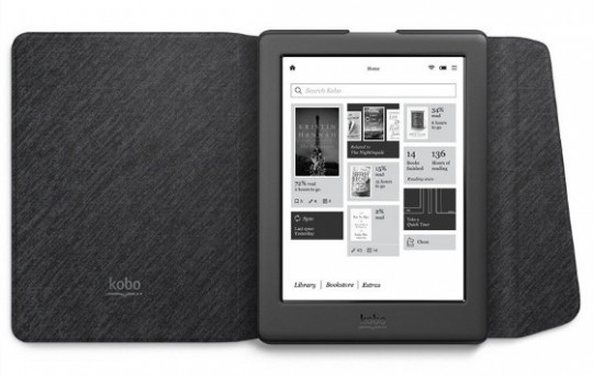
Yesterday Kobo officially announced their latest new ebook reader, the Kobo Glo HD. It’s claim to fame is the fact that it comes with a 300 ppi E Ink Carta display, the latest and greatest screen technology from E Ink.
The Glo HD also features an adjustable frontlight to help illuminate the 6-inch screen, it has 4GB of internal storage space, a 1GHz processor, 2 month battery life, and it’s the first and only Kobo ereader to come with Kobo’s new welcome concierge service.
Not a bad stat sheet for a $129 ereader.
About the only thing it doesn’t have is a memory card slot. And it’s not waterproof. Both are things that the Kobo Aura H2O offers for $50 more.
But if you’d rather get a Kobo Glo HD, it’s now available for pre-order from the Chapters.Indigo website. They also have the official sleepcover up for pre-order for $29, available in black and cream.
Chapters Indigo is based in Canada, but residents of the U.S. can order Kobo’s ereaders from there as well. Kobo is also expected to start taking pre-orders at some point, but it’s still not live yet.
Some folks are wondering about what’s different with the Glo HD from other Kobo devices. To clear things up, it has the same exact processor as other current models, so there’s not going to be any performance boost of any kind. And Kobo’s software is uniform across current devices so the overall reading experience and features are the same regardless of model.
The super-high resolution 300 ppi screen and lack of memory card are the two significant differences, although the Aura H2O has an E Ink Carta screen with 265 ppi—the 35 ppi difference is virtually undetectable (comparison review).
Yesterday a quick first look video showing the new Kobo Glo HD turned up on YouTube. Take a look:


Is there any indication that Kobo will fix the incompatibilities with sideloaded books like the inability to change line spacing you mention in your review of the H2o?
Those things are pretty much what keeps me from getting a Kobo since I plan to use books bought from Google Play books mostly.
I highly doubt it since it’s been a problem for several years. You can use Calibre to remedy the issue. I just loaded in a book on my H2O a couple days ago from Kindle because I was sick of reading it on the Voyage being forced to use spindly fonts, and the awkward spacing between words is just as annoying (Kindles really need to start using hyphens but that’s probably never going to happen either). Anyway, the line spacing was driving me nuts on the H2O so I set line height while doing a conversion with Calibre and it looks much better now. I also used the font embed option to add Charis SIL and it renders much nicer that way than using the same font from the list.