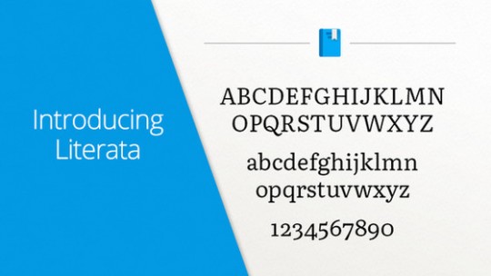
This week Google announced on Twitter that they’ve introduced a new font type called Literata for their Play Books app that was designed specifically for ebooks.
Literata is now the default font for Google Play Books, replacing Droid Serif.
Google claims that their new font is perfect for long reads on all devices, and that it was designed for book lovers.
Google commissioned TypeTogether to create the Literata font. The design team has been working on the new font since April 2014.
The electronic or digital book represents one of the most important challenge designers and developers face today. The technical limitations of devices regarding rendering of type, together with their variety of physical sizes, are only two of the main obstacles eBooks have to tackle. These facts contribute to an unfair yet appropriate comparison with their analog counterpart, where typography plays a leading role. The Play Books project offered an opportunity to approach some of these problems from a new perspective.
The new Literata font family features two weights and matching italics with more than 1100 characters per font with PanEuropean language, full Latin Extended, Polytonic Greek and Cyrillic support.
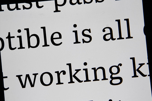
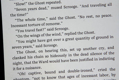
TypeTogether has a bunch of pictures of the Literata typeface up on Flickr.
You can tryout the new font using the latest version of the Google Play Books app for Android.
What do you think of Literata? Is it better than Droid Serif? Can you tell much of a difference?


