Review Date: October 2022 – Review unit purchased from Walmart
Overview
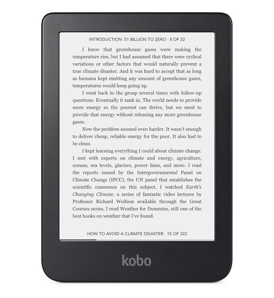
The Kobo Clara 2E was released on September 22nd, 2022. It’s an updated version of the Kobo Clara HD that was originally released in 2018. The new model adds a few hardware upgrades and it also adds support for Kobo’s audiobooks.
The Kobo Clara 2E has a 6-inch E Ink screen with a classic symmetrical design. The Kobo Libra 2 has a larger 7-inch screen with page buttons and there’s the 8-inch Kobo Sage as well. Kobo also offers a 10.3-inch model called the Kobo Elipsa.
The Kobo Clara 2E is the most portable model in the lineup. It sells for $129 USD from retailers including Amazon and Walmart.
Kobo Clara 2E Review
Pros
- Good amount of features for the price—Overdrive support, adjustable frontlight color, waterproof, Dark Mode support, Carta 1200 screen, etc.
- Highly portable design.
Cons
- Basically a rehash of the Kobo Clara HD with a few minor upgrades.
- Basic design with cheap-feeling plastic.
Verdict
The Kobo Clara 2E is highly-portable ereader with a number of nice features for reading ebooks, but the basic design and cheap plastic give it more of a budget feel than other ereaders.
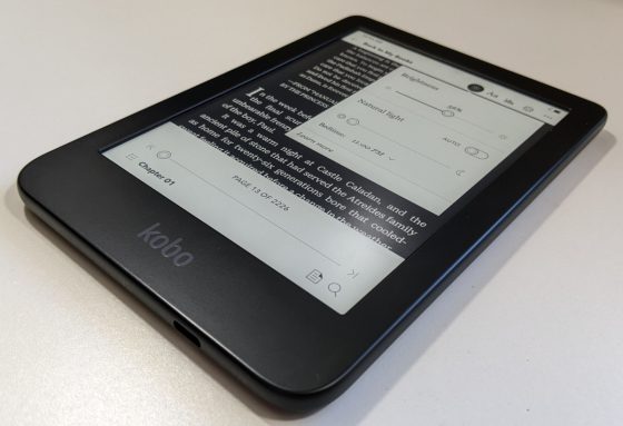
Kobo basically reused the design of the Clara HD, and just changed the position of the power button and switched to a USB-C port. They added more storage space for audiobooks and added waterproofing and support for dual-band WiFi. But otherwise the Kobo Clara 2E is pretty much a clone of the Kobo Clara HD, so it feels like reviewing the same device from 4 years ago. In short, I wish they could’ve elevated the design more.
Personally, I like the Kobo Libra 2 better, except for the fact it’s much wider so the portability factor takes a hit. But the frontlight is a bit nicer and I like having page buttons, and I like how the text looks on the larger screen.
Kobo Clara 2E Video Review
Hardware and Design
As noted in the Kobo Clara 2E vs Clara HD comparison review, the Clara 2E has a few upgrades under the hood:
Kobo Clara 2E Upgrades
- 16GB of storage
- Added Bluetooth for audiobook support
- Waterproof
- Carta 1200 E Ink screen (slightly darker blacks)
- Dual-band WiFi support added
- USB-C port
- Dark Mode officially supported
That’s a good solid list of upgrades for an extra $10 compared to the Clara HD, but when it comes to reading ebooks some folks might not find any of that particularly useful. Having slightly darker text is nice, same with Dark Mode for those that like to use it, but it doesn’t seem like enough improvements were made for those looking to upgrade from the Clara HD.
Unfortunately, Kobo seems more interested in winning over the social media crowd and bragging about how eco-conscious the Kobo Clara 2E is than actually adding any meaningful improvements to the reading experience or upgrading the budget 4-year-old design.
Speaking of which, Kobo must really love the design of the Clara HD because they reused it for the Kobo Nia and now they’re reusing it again for the Kobo Clara 2E. I don’t know why they like it so much; it’s really basic, similar to the entry-level Kindle, and the plastic feels cheap, but at least the device is lightweight and fits into a pocket easily. But at this rate, considering the Clara HD was out for over 4 years before the 2E came along, they’ll likely be using the same basic design for nearly a decade.
It’s surprising they couldn’t come up with any design improvements. Sure, the back is blue now instead of black, and the wavy texture adds a bit more grip, but they could’ve added some texture to the front plastic as well to make it feel a little nicer.
Screen
Like Kobo’s larger models, the Clara 2E uses E Ink’s newer Carta 1200 screen, which still has 300ppi but the black ink is a bit darker so that helps the text stand out a little more. It’s not a huge difference but it is noticeable.
The Clara still has a 6-inch screen, measured diagonally. It has an indented screen so there isn’t an added flush layer over the top like some ereaders have. It doesn’t look quite as nice that way but it helps the text look clearer without an extra layer over the screen.
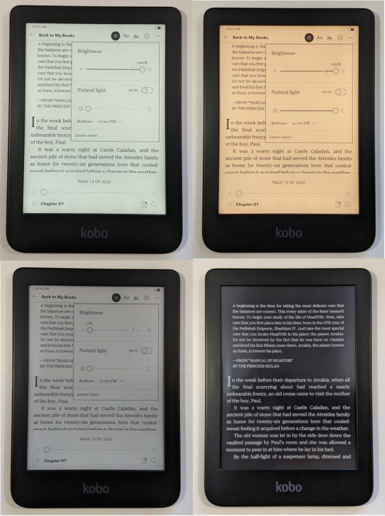
The frontlight on the Clara 2E is pretty much exactly the same as before with the Clara HD. It has adjustable frontlight color so you can customize the color tone, and you can set it to adjust automatically based on the time of day.
Overall the frontlight is good but not great. There are some shadowy areas visible at the bottom of the screen where the LEDs are located, with some areas that are slightly brighter than others, but that’s not uncommon with frontlights on budget models. For some reason the frontlight is more even on the Kobo Libra 2.
Software
All of Kobo’s ereaders run the same software so there isn’t anything “new” about the software on the Clara 2E, but they did bring it up to the same level as the models released last year, so it has Dark Mode support for white text on a black background and they added support for Kobo’s audiobooks.
However, I’ve noticed a few minor things missing from the software that are available on other models, including several games from the beta features list and a few font types are mysteriously missing as well, including Malabar, Caecilia and Gill Sans. Hopefully they’ll bring them back with the next software update.
See the Kobo Software Features Page for a full list of Kobo’s software features.
More Kobo Reviews
Kobo Libra 2 Review
Kobo Elipsa Review
Kobo Software Features List
Kobo Clara 2E Specs
- 6-inch E Ink Carta 1200 screen.
- 1448 x 1072 resolution (300ppi).
- Capacitive touchscreen (2-point).
- Frontlight: ComfortLight Pro with adjustable brightness and color temperature.
- Waterproof – IPX8 rated.
- 1 GHz processor.
- 16GB storage space.
- WiFi 802.11 ac/b/g/n.
- Bluetooth for audiobooks.
- USB-C port.
- Supported formats: EPUB, EPUB3, FlePub, PDF, MOBI, JPEG, GIF, PNG, BMP, TIFF, TXT, HTML, RTF, CBZ, CBR.
- Dimensions: 112.05 x 159.02 x 8.66 mm.
- Weight: 171 grams.
- Sells for $129 USD from Amazon.


I´m starting to think I might wait and get the iteration after the 2E. What do you think it will have on it and when do you think it might come out?
If it’s like the Clara HD there’s a good chance it’ll still be on the market in 2027. It’s an ebook reader. They don’t get upgraded often.
I like the Clara 2E better than the original Clara. I like the feel of the back of the device because it gives a better non-slippery grip. To me it doesn’t feel cheap and definitely feels better than any of the Kindles. I like the ease of getting to dark mode compared to the first Clara. My screen looks as good as the Libra and I find I am reaching to use the Clara 2E more than the Libra. I have no regrets at purchasing the 2E. Everyone has their own opinion and I think Kobo did a great job with the Clara upgrade.
The setting to toggle dark mode belongs on the Brightness panel.. It would be helpful if there was a setting so that the the reader could recognise the light level and turn on dark mode when the room is dark. I am finding myself switching back and forth.
For those who had a kobo clara before and upgraded to 2e but can’t find a cover some covers may fit (but not the standard kobo sleep cover). I took my old cover and burrowed a hole in the back then took a button off a shirt placed in the hole, and covered that with electrical tape. Now I can press the tape over the button and that lines up to press the button on the back. BTW I don’t like the button on the back. It belongs on the top – and better if it was 2 buttons. Sleep and a distinct on – off.
I’ve just returned to the Kobo family after some time with Kindle. My device of choice was the Clara 2e.
So far, I’ve found it amazingly good to use.
The ONLY niggle that I have is that it’s slightly slower to start up than the paperwhite. This in no way affects the reading experience and the Clara 2e easily beats the Paperwhite for overall reading experience and usability.
My favourite feature is the backlight which can be set to any brightness and has a range of colours too!
I plugged my Kobo in to my computer to charge it. It says to eject my kobo before unplugging the USB cable. How do I do that?
Right-click on the Kobo drive and select eject from the list of options. There’s also a button on Windows Explorer.
I do not know how to eject my reader