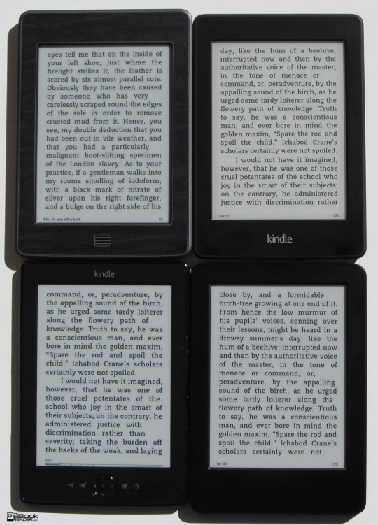
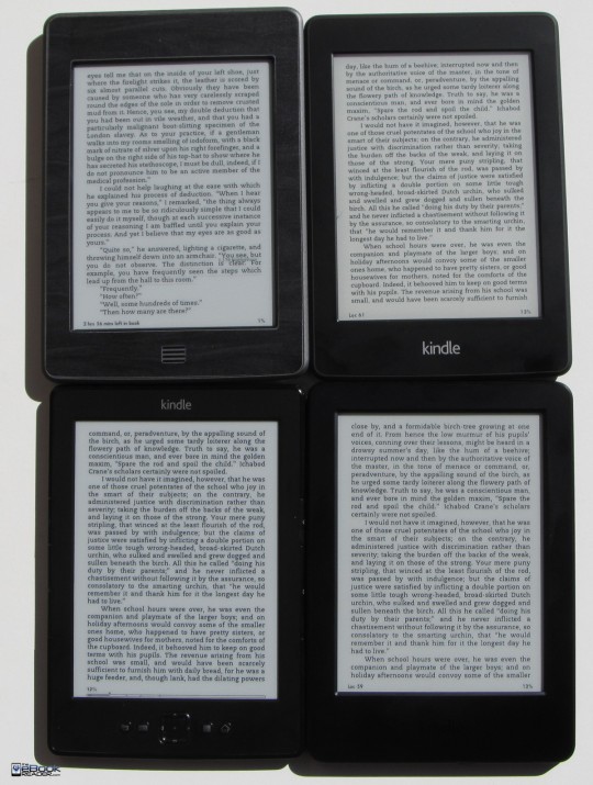
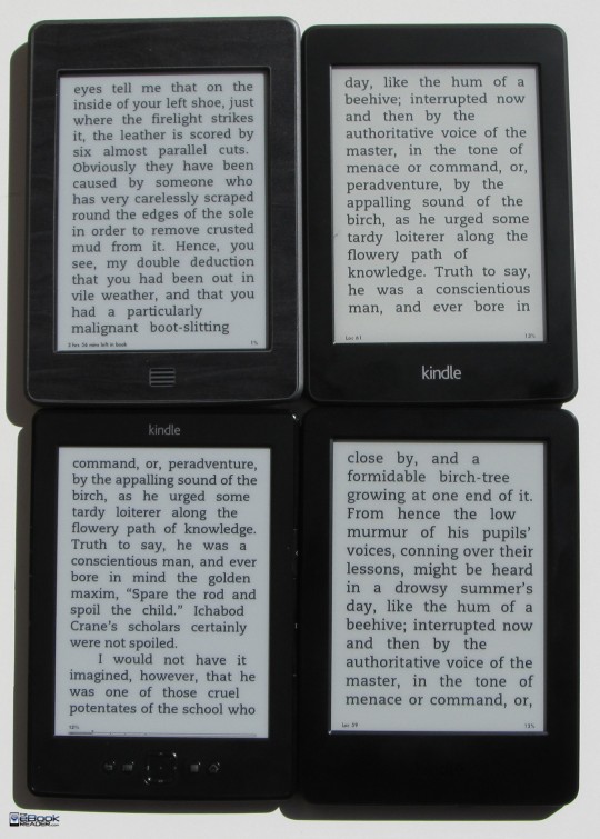
Whenever a new Kindle gets released, everyone wants to know how the screen compares to other models, so I took a few pictures to show the differences. The pictures were taken outside in direct sunlight and the Kindle Paperwhite’s frontlight was turned all the way down.
In all the pictures the top left is the Kindle Touch. The top right is the Kindle Paperwhite. The bottom left is the old basic Kindle and the new Kindle is on the bottom right. Click pictures for larger sizes.
When it comes to Amazon’s latest entry-level Kindle, there really isn’t much to say. As mentioned in my first impressions review, I don’t like the design of the new Kindle very much, but at least there’s not much to complain about with the screen, other than it being old.
It uses the same exact 800 x 600 resolution E Ink Pearl screen as the previous basic Kindle, and it’s even the same as the Kindle Touch from three years ago and the Kindle 3 from four years ago.
The new Kindle doesn’t have a frontlight or one of the newer higher resolution Carta screens like the Kindle Paperwhite or Kindle Voyage.
Given that, the screen on the new Kindle looks pretty much identical to the screen on the basic Kindle and Kindle Touch. Each model renders text slightly differently so text doesn’t look identical between them, even when using the same exact book, font, and settings. In the pictures text appears slightly bolder on the old basic Kindle, but the text is slightly larger too, so that adds to the effect.
Overall there’s not much difference between each screen in the pictures or in person. The main thing that stands out is the Kindle Paperwhite’s Carta screen has a slightly different tone in background color. I compared E Ink Carta vs E Ink Pearl a few years ago, and it’s still the same story today: The overall differences between E Ink’s various screens is very subtle.


Am I mistaking or has the best contrast whith the clearest text, it apears to be so in all pictures?
Sort referring tó the basic Kindle.
The basic Kindle does appear to have the boldest text, but it’s not the clearest. It’s more rough around the edges of the text. The Paperwhite with its higher resolution screen has the clearest text. I wish Amazon would give users the ability to embolden text like many other ereaders, and use sideloaded fonts. That’s my biggest complaint against Kindle—the font choices aren’t very good, they are all too light and spindly. The modified Charis SIL font is ten times better, it’s my favorite font for ereading but of course Amazon won’t let us use it anymore becasue they want to control everything about the Kindle, right down to what fonts we are allowed to use.