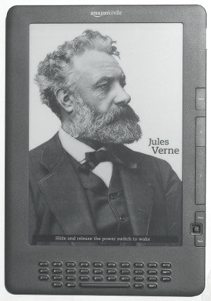
The new Graphite Kindle DX arrived today. And it’s the first ebook reader to feature the new screen technology from E Ink, the leading supplier of epaper screens for most current ereaders.
Update: Several more pictures and a video review have been added to our new Kindle DX PDF review page.
First thing, I’m not a professional photographer—hardly an amateur one—so the pictures don’t do the new Pearl screen and Kindle DX any justice.
I tried doing some comparison photos with a regular Vizplex screen, but they just don’t come out displaying the difference in appearance accurately. I’ll try using a different camera for the main Kindle DX 2 review that I’ll be posting within a week, along with a video review.
The main thing that jumps out about the new Kindle DX and Pearl screen is that the text appears much darker, bolder. Blacks are blacker, and images are more rich and defined—Jules Verne’s jacket, for instance.
The screen background isn’t necessarily a whole lot whiter than the original E Ink screens—they’d probably be too bright in direct sunlight being any whiter—but the difference is definitely noticeable, and especially in lower lighting environments.
The claim that the new Pearl displays have 50% increased contrast over current displays seems a bit much. It’s an improvement for sure, but it isn’t any reason to trade in your old Kindle unless bolder fonts and better contrast are really, really important to you.
If you took someone off the street that didn’t know anything about ebook readers and showed them the Nook, then took it away and showed them the new Kindle DX, the contrast probably wouldn’t be one of the first things they’d notice.
It’s when a Pearl screen and Vizplex screen are side-by-side that you can tell the most difference. And there’s little doubt that all the companies will start using the new Pearl displays in favor of the old ones. It probably won’t be long before Sony and B&N start using them.
Aside from the screen, the graphite Kindle DX has all the same features and functions as the 1st generation model, with some subtle upgrades to speed and performance, and of course the black color instead of white.
I’ll be posting a full review soon. Subscribe to The eBook Reader Blog’s RSS Feed to receive notification when the finished Kindle DX review goes live.


“…in place of the old ones,” not “in favor of the old ones.”
I kindly disagree, officer 🙂
Dear Nathan,
I enjoyed your new Kindle DX PDF review. In it you state “There’s no way to interact with a PDF file”, yet I keep seeing references to pdf bookmarking. Can PDF bookmarks added with acrobat be viewed on the kindle as bookmarks, and/or can a reader add and navigate pdf bookmarks on the new Kindle DX ?
The Kindle DX does allow for adding bookmarks to PDFs, but it won’t recognize bookmarks added with a different program.
I really like the review. In fact I compared the Sony Daily reader and Kindle DX2 side-by-side and chose the latter without hesitation. The major reason is better PDF rendition, much better contrast and bigger screen size. All these aspects more than justify the extra $100, considering that fact that I primary read PDF files. There are only two drawbacks on DX2 where Sony excels. they are:
1. MP3 player
2. Additional value of leather cover and case from Sony.
I really love the higher contrast on the DX2. In dark lighting environment, the DX2 almost looks like fluorescent backlit, jumping out of the screen. I am looking forward to the new software update from Amazon to improve the MP3 experience.