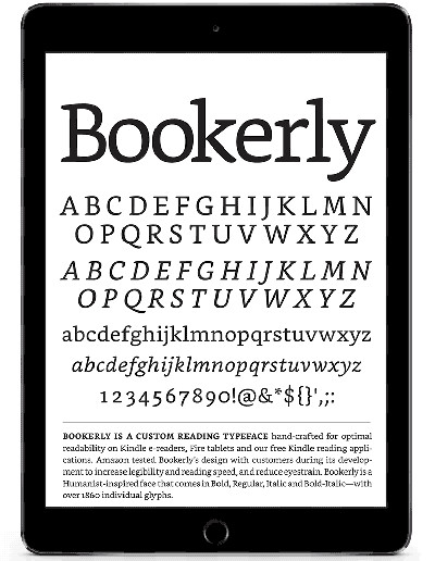
Yesterday Amazon released a major software update for their line of Kindle ebook readers. The update includes a new Bookerly font custom made for Kindles and a new typesetting and layout engine that adds things like hyphens, ligatures, and improved word spacing.
One interesting detail to come out about the new layout engine is that it requires the use of a new Kindle ebook format with the extension KFX.
Most Kindle ebooks come in AZW and AZW3 format. But now there’s this new format for Kindle books with the new enhanced typesetting option enabled.
So if you have a Kindle and want to make use of the new layout engine, you have to manually delete your ebooks and redownload them to get the new KFX format.
But it’s not quite that easy yet. Not all Kindle books support the new layout engine. In fact the majority of ebooks don’t.
The way you can tell if a book has been updated to the new format is to look on the book’s description page at Amazon. There’s a label that shows if enhanced typesetting has been enabled.
From your Kindle, you can long-press on a book from the homescreen and choose to view the book description.
However, I’ve come across a bunch that say enhanced typesetting has been enabled but it doesn’t work and still downloads the AZW3 file instead. I finally came across a book that works with the new layout and it has a KFX extension. It looks like Amazon still needs to get the kinks worked out.
The new KFX format will obviously only download to devices that support the new layout engine, so the other formats will continue to stay around unless Amazon decides to update all older Kindles as well. This also shouldn’t affect DRM removal at all since the Kindle for PC application doesn’t support the new layout engine.


Wow, glad to see Kindles can has hyphens and improved word spacing. My NST had these since I purchase it in Dec. 2012. Why is Kindle the dominant ereader in the US again?
Yeah, this update should’ve happened years ago, but at least Amazon does regular updates and keeps adding new features, unlike B&N. They haven’t updated or added any significant new features to Nooks since like 2011.
I guess you are right about that. Of course as stated, B&N had some of Kindle’s “new” features 4 years ago so there was no need for an update to add them. Also, I have added so many new features to my rooted Nooks that I must have forgotten B&N hasn’t released a new firmware update in a while.
Love the Bookerly font on the Voyage but otherwise a garbage update that’s not ready for primetime. On the very few books that support hyphenation, it gives you fewer words per line vs. calibre hyphenate this and also the indentation is off. There is a larger gap on the right side of the page vs the left which is awkward and annoying. Not impressed at all. Waited too long for this garbage.
If you are deleting titles you already have purchased and trying to re-download the newer version you will probably need to request the updated file from Amazon. They don’t generally deliver it automatically to customers who already own it due to the inherent loss of bookmarks, notes, etc.
So this is probably what’s happening for titles that show enabled for enhanced typesetting but for which you’re still getting the older AZW. Unless they’re just really screwing things up, of course, which isn’t unlikely either.
Kindle should introduce a font thickness option (as Kobo has). This new font isn’t appreciably heavier than their existing fonts, and sits stylistically between Caecilia and Palatino. It is thus without notable distinction. Kindle’s onboard fonts are thus, still, one its weaker features. (I make use of Calibre to introduce a “publisher” font of my choice, in boldface.)
A boldness slider would be great on Kindles. Like at night when reading before bed, I don’t care how crisp and clear the font is when my eyes are tired and bleary, I want a bold font that’s dark and easy to read.
What i do love about the bookerly font is the fact that it’s clean and uniform. It’s straight and not jagged, a lot of the other font like Palatino for example are crooked. A lot of sideloaded fonts through Calibre are perhaps a bit thicker but crooked.