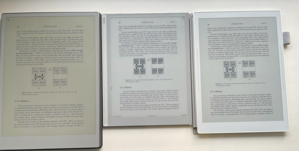
Over on reddit, someone posted side-by-side pictures of the new Remarkable Paper Pro (left) next to the Boox Go 10.3 with a Carta 1200 screen (middle) and the SuperNote A5X2 with Carta 1300 (right), and it’s hard to believe how much worse the Remarkable’s color screen looks compared to regular black and white E Ink screens.
I’ve been suspicious of the Remarkable Pro’s new Gallery 3 color screen ever since it first came out, but I wasn’t willing to shell out $600+ just to see a Gallery 3 screen in person (and I’ve always detested the Remarkable’s abominable reading software).
The Remarkable Paper Pro is the first eNote to use E Ink’s Gallery 3 screen technology with colored micropixels instead using a color filter layer over a black and white screen like E Ink’s Kaleido screens on devices such as the Kobo Libra Colour and Kindle Colorsoft.
Some people like Kaleido screens for the added color, but others don’t like the darker quality of the screen created by the filter layer, and you can even see the filter if you look closely and some people find the visual noise of it distracting.
When the new Remarkable came out with the Gallery 3 screen, people were thrilled to see an alternative to Kaleido screens, and many just assumed Gallery screens would be superior in every way, but there are good reasons why ereader companies aren’t all switching to Gallery screens now.
Having colored micropixels sounds like a good idea on the surface, but in practice having colored ink completely compromises the quality of black and white ink.
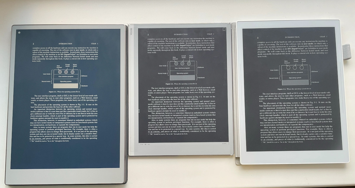
Next to regular BW E Ink screens, blacks on the Gallery 3 screen look more like dark blue, and the white color is a lot yellower and darker. Given all the recent hate for yellow frontlights on the new Kindles, people’s heads would explode over the yellowness of a Gallery 3 Kindle. And I don’t think very many people would be cool with changing Dark Mode to Dark Blue Mode, and having to give up nice dark black text for a weird blue color.
The real kicker is all the uniformed naysayers online decrying the value of E Ink’s Kaleido screens, saying they’re pointless now and how Gallery 3 screens are far superior. Wait for Gallery screens if you want color E Ink, they say. Gallery screens are much better! Yeah, right.
I think the simple truth of the matter is color E Ink is always going to come with some compromises. It’s just the nature of the technology. Color E Ink is never going to fully supplant black and white E Ink.
Check out this post on reddit for some additional pictures and to see the above images in higher resolution.
I always wondered why Gallery is not using CYMK, but using CYMW (white particles instead of black ones).
Wouldn’t using black particles instead of white ones solve all that?
Maybe Remarkable got those screens for a bargain as the other potential products, the Bigme Galy, Pocketbook Viva and Sharp 8 were discontinued or cancelled.
I don’t think the Kaleido screens are nearly as dark as the old Vizplex panels anyway – then again 99% of the reader market never used any of those, so they don’t know how gray everything used to be.
I have a Remarkable Paper Pro. The display sometimes get that dark yellowish hue as on the picture, but since the most recent updates this problem is mostly gone (so it somehow can be cured in software). The screen background now matches almost perfectly the color of the bezel. It is still noticeably darker than Carta, but not as catastrophic as the picture shows.
I don’t know where you live, Nathan, but at least some Best Buy stores have the reMarkable tablets on display.
I’ve never understood why reMarkable doesn’t at least add a dictionary to their software.
I didn’t know they had them on display. I might have to stop by and check it out the next time I’m near one.
Well, I would compare Gallery 3 with Kaleido 3 screens instead, and it seems like it has the advantage there in terms of contrast.
I don’t know if Gallery screens would have better contrast when the text isn’t even black and the white is yellow. The screen is probably brighter without a frontlight but the fact that blacks aren’t really black is a pretty big deal-breaker. Dark Mode looks really good on Kaleido 3 screens with deep, dark blacks. In fact, Dark Mode looks better than regular mode because you can’t see the grid layer when the screen is black, and with the frontlight cranked up in regular mode contrast is similar to Carta screens since Kaleido screens are really just Carta screens with a filter layer. I’m still skeptical about these Gallery screens every being up to par for ereaders. The screen refresh is still pretty slow and janky too. I guess they’re okay for eNotes but I’d have a hard time reading on a screen that looks like that.
Here’s a good comparison of these 2 screens: https://www.youtube.com/watch?v=G8AOc3YP_hs
Apparently, both have problems but Kaleido 3 looks better than I expected in comparison with Gallery 3.
That video is a good one, thanks! But it’s sad Pocketbook doesn’t improve the speed of its e-readers