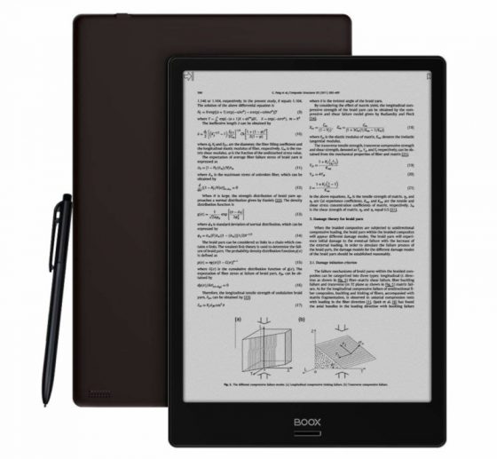
Onyx has dropped the price of the original 10.3-inch Note down to $499 at Amazon.
It started out at $550 when it was first released. Then they dropped it to $530 awhile back, and now it’s $499 with free shipping, making it the best value large-screen ereader on the market. It also comes with a free case, as noted in the special offers section on the product page, so that’s a nice bonus.
That’s $100 less than the Sony DPT-CP1 and Remarkable, and I would consider the Onyx Boox Note the best device of the three.
While the overall design and build quality isn’t quite as nice, the reading software is a lot more advanced than either, and it’s open to install Android apps, which neither of those devices can do.
I’ve been annoyed by the fact that the recent firmware updates made the Kindle app not turn pages properly, but apparently it still works fine for other people so I don’t know what’s up with that.
Regardless, it’s still a great PDF reader and really good note-taking device. But what I like most is the large 10.3-inch E Ink screen—it’s great for reading.
Granted, $499 is still pricey compared to tablets but it’s one of the cheapest options for a large-screen E Ink ereader. Check out my Onyx Boox Note Review for a closer look.
The Boyue Likebook Mimas might be able to give it a run for the money with the addition of a frontlight, but it hasn’t been released yet and Onyx’s software is a lot more advanced regardless, especially when it comes to reading PDFs. But if Boyue prices it right it might be able to surpass the Note in terms of being the best value. It’ll be interesting to see how the two stack up.

$300 is the sweetspot. There needs to be more competition in this area, it has been years now and they are still all ridiculously overpriced.
Absolutely agreed. I like these devices (e-ink Androids) but in a market when a 10″ color tablet can be $200 (or less), these c. $500 prices (for a device with no front light–is this a 2010 prototype?) are still wacky.
You have to remember these are the very first generation of 10″ ereaders with flexible E Ink screens that are a lot lighter and more durable than regular E Ink screens, so naturally they’re going to be more expensive. Onyx has the cheaper 9.7″ Note S for $350 and it’s been closer to $300 a few times, but the screen isn’t nearly as nice as the screen on the 10.3″ Note.
For the Kindle’s page turning problem, I found that the problem happens for certain types of books with new page flip features.
I found that if you manually downgrade Kindle app to 8.6, the page can turn properly. Any version after that has the problem.
I am considering a Boox Note.
One thing (other than the current pricing) that makes me hesitate is the display resolution.
Onyx’s own website advertises it is 300ppi, but it is actually 227 ppi.
(don’t they care about such important facts?)
If you are used to a 300 ppi 6 inch reader, would you easily notice the lower ppi on these 10″ Onyx Boox Notes?
Higher ppi is less relevant on larger screens. Personally I hope they don’t go up to 300 ppi because it would just be a waste of battery power. 227 ppi is perfectly adequate on a 10″ screen, but others may disagree. It’s one of those things you’d have to judge for yourself.
I’ve used both Oasis 2 and Onyx Note for much of last year, don’t experience any visual distinction other than screen size and refresh characteristics. ( I much prefer Note’s larger size especially for prolonged reading. But Note’s refresh is variable, tho changing A2 mode on/off generally resolves.)
Placing the Oasis and Note side by side with same text in same font (Bookerly, using Note’s Kindle app) in same size, shows no difference in character clarity, and tiny diffs in kerning.
Thanks guys, that’s very useful information.
The 300dpi info is in the first large bulletpoint here:
https://onyxboox.com/boox_noteplus
https://onyxboox.com/boox_notelite
For the Kindle page turning problem I got it “working” by using the A2 screen mode, just a single tap in the toolbar near the clock when using Kindle, and another when exiting to use the other apps.
Granted it looks ugly and doesn’t clear up the background, I just imagine is part of the experience of a paper book where you can sort of see the text behind the page.
Optimal solution would be that Amazon sets a setting to disable the animations on the Kindle app. That’s the origin of the problem I think.