Late last year E Ink announced that they would be releasing a new Print Color screen technology designed for ereaders and other portable devices.
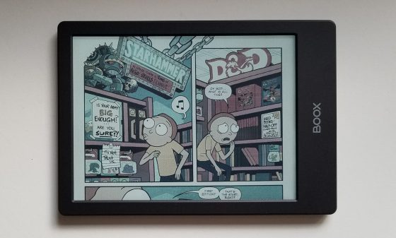
Surprisingly, a few companies have already released ebook readers that use E Ink’s new Kaleido color screens. A couple were released in China earlier this year, and now Onyx has released the Poke2 Color (shown in the pictures and video) and there’s also the PocketBook Color.
E Ink’s first attempt to produce color screens for ereaders happened back 2010 with their Triton displays, but the colors were washed out and the screen was rather dark (that was before frontlights existed) so it failed to gain any interest in the market.
I’m not sure if things are going to turn out better this time around, but E Ink’s new color screens definitely benefit from the advancement of frontlights, as these new color screens are still darker than regular E Ink screens.
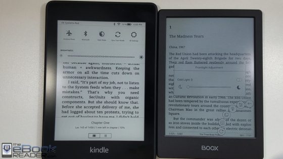
This is because they have a color filter applied over the top of a regular E Ink screen. Here’s a picture comparing an E Ink Kaleido color screen with an E Ink Carta screen on the Kindle Paperwhite 4:
Both have 300 ppi for text but the color screen is a clear downgrade from a regular E Ink screen, both in terms of clarity and contrast.
Screen Door Effect
The main drawback with E Ink’s new color screens is the fact that the color filter slightly degrades the clarity of the screen, and it makes everything appear darker.
But what’s worse is you can actually see the color filter as a grid of tiny dots on the screen. It makes it seem kind of like you’re reading through a screen door.
If you’re vision isn’t the greatest you might not see the grid, or once you get into the flow of a book you might be able to forget about it, but it can be a little distracting to the eye. It gets more noticeable at higher frontlight settings.
There are times when the filter isn’t as visible, like at night with the frontlight turned down low, and it almost disappears when using white text on a black background, but you can still see it a little in the white.
Color Quality
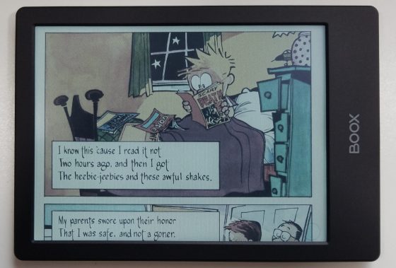
Having realistic expectations, I’m actually surprised by the quality of the color for an E Ink screen. Comics and images are more colorful than expected, and are reminiscent of how newspapers used to look. E Ink claims the screens can display 4096 colors.
While the colors aren’t bad, the resolution is lower with color content. Black and white content has a resolution of 300 ppi, but with the way the color filter works, color content is only 100 ppi. You can see in the video below how colored text looks different from black text.
Larger Screens?
Considering most color content—magazines, comics, news—is better suited on large screens, I never understood why they chose the 6-inch size for the first color screens, but I think it’s mostly an experiment to see if there’s a market for this kind of thing.
I can see them releasing an 8-inch version at some point because those screens are also 300 ppi, but the problem with large E Ink screens is they are lower resolution than their smaller counterparts. E Ink would first need to come out with higher resolution screens to achieve the same 100 ppi for color. Otherwise the color filter is going to be even more noticeable with less pixels.
Conclusion
Personally, I find these new color E Ink screens fascinating and think they’re pretty neat. But if you handed one to the average person they would probably think there’s something wrong with it, being used to typical LCD screens. If you’re familiar with how E Ink screens function it’s pretty cool how they managed to get these color screens to work, and the color quality is better than expected.
However, I’m still not sure there’s going to be much of a market for ereaders with color E Ink screens considering the fact that you have to sacrifice some contrast and clarity when it comes to regular black and white text. For me it’s hard getting used to the screen door effect when reading regular ebooks; my eyes keep getting distracted by the visible grid. Unless you primarily plan to read color content, a device with a regular E Ink screen is still going to be better for reading text.
If you don’t care about the downsides and want to get an ereader with a color E Ink screen, I would recommend the Onyx Poke2 Color, mainly because the open Android operating system is a lot more advantageous for color content, being able to install different types of apps. However, the first batch sold out in one day so it might be a while before they get more.
If you’d rather get the PocketBook Color it’s going to be available via Newegg soon, but without being able to install apps it’s limited to common book and image formats for color content.
Update: Here’s a link to the full Poke2 Color review for a closer look at the color E Ink screen.


Thanks for that review. I am probably going to be tempted if a larger device emerges-not sure I can live with less clear text.
With my eyesight not what it used to be I use my don’t on large, a loss of resolution isn’t a big deal to me. Why don’t they use this tech in user-customizable smartwatches? The one thing I don’t like an it smartwatches is the black screen.
Thanks for the review I especially appreciate your candidness in regards to the downsides. I just finished the ebook “21 Lessons for the 21st century” by Yuval Noah Hararri and even though it was non-fiction a color eReader would not enhance the experience except if you wanted to stare at the cover rather than actually read the book. I imagine this is the case for the vast majority of ebooks.
I am about to read a more technical math book and even that, with highly specialized symbols, is fine without color .
I see no reason to buy a color eReader, thanks.
Thanks for this close look at what it’s like to actually use this new color tech. Yoyo bad about the seven door effect. That might be a deal breaker for me, but we’ll see when a larger device comes out.
I’m afraid that companies are going to try too hard and throw too many finite resources at this to make this work while ignoring other, more necessary improvements – battery life, contrast, and clarity being the first 3 I can think of.
Thank you for the review, Hope you can do a comparison between BooX and pocketbook color. I think a 10 inch color can be more useful. Waiting for nova or note with color. Always trust your reviews.
I probably won’t compare the two since they both have the exact same screen. I don’t really know how I would review the Pocketbook. The only way I can review the color on the Onyx is by using apps. The vast majority of PDFs and ebooks don’t have much if any color content. I don’t know where people are getting comics in CBZ and CBR format—I can’t find anything respectable. That’s why I recommend the Onyx over the Pocketbook if you really want to make use of the color screen.
Thank you for the review, please update the battery life in view of using it for color documents/comics. I opted the poke 2 B/w a month ago as I thought the first gen color will be struggling, also poke2 form factor is better than the color poke. also I am interest in 8 or 10 inch color at least to benefit from it in illustrated books or comics.
Always trusting your honest real review.
Battery life isn’t going to be any different on the color version than it is on the regular Poke2. It has the same battery and both have 300 ppi. The color filter doesn’t use any battery power.
How did you get one so early? (my order is still in China)
It was available to purchase on Amazon from a reseller a few days before it was officially released.